A logo is the first thing anyone sees and connects to your brand. It should be simple, yet representative of what you stand for as a business – creative without being too overbearing or complicated; visually appealing but not distracting from other important aspects such as color usage.
A good design tells its own story. It should not only build the brand’s recognition but also remain simple, appropriate, and memorable.
Let’s understand what and how important are colors in logo design.
Keeping your colors in tune with the overall branding strategy of the business is vital. If you are not careful, choosing an incorrect color can have a negative effect on what customers see when they look at your company logo.
It is important to know the impact of colors on logo designs, as they can make or break your brand. Color meanings vary depending on culture and personal preference which means that these decisions should be made with a full understanding of what you are looking at when designing logos in order not only to create a good design but also effective marketing strategies too.
Logo designers must know the power of colors if they want their designs to be powerful and memorable. In this segment, we explore how certain hues can make your brand stand out from competitors.
Brands advertise on different platforms; social media, TV adverts, Newspapers, and Billboards. According to research done on marketing strategies, the first thing that people notice in brands’ logos is the colors used.
80% of the memories the logo creates for individuals are based on the colors presented.
The color you choose for your logo should be an easy-to-remember, attention-grabbing color. It’s important to use simple combinations like bright hues because they’re noticeable and draw people in quickly – both at first glance or when they try to remember where they saw that brand before.
Colored logos have been used to target different clientele based on various factors such as their age, gender, and physical location.
Before settling for the colors, brands should be aware that colors portray different meanings depending on the location, so researching prior is critical.
The colors of sports brands are so popular that they can be identified without the name being written anywhere. The power of color preference in branding has spurred many companies to trademark certain hues associated with them, and even more interesting is how this strategy affects consumers.
Through color, logos can evoke different kinds of feelings to an audience and customers are more likely to remember how they felt when seeing certain brands or products with emotional reactions from their initial encounters with them later on down the line.
To make sure that we aren’t missing out on potential consumers because our colors don’t connect well enough; A company needs to think about what kind of impression each specific hue may give off before deciding which ones best suit its target market.
Below, we discuss different logo colors and how they influence brand awareness based on their universal perceptions.
Warm Colors: They include energetic colors such as red, orange, and yellow. Usually, they evoke excitement, warmth, and eagerness.
Cool Colors: These are the natural colors we notice in the environment daily. They include green, blue, and purple.
The choice between a single color or more is difficult for logo designers.
A minimalist and straightforward design can be easy to recall, while also being compatible with most backgrounds.
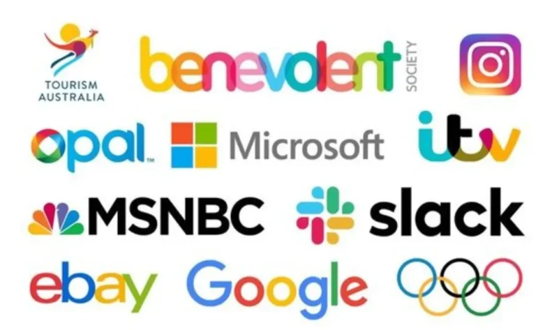
Multiple color logos are more complicated to use than single-color ones. For example, they require a deep understanding of the meaning and significance behind each individual color you want them combined into your design for maximum impact.
Most brands that use multiple colors in their logos offer numerous services and target different people globally. This ensures the logo provides diversity, so it can be inclusive of other demographics too.

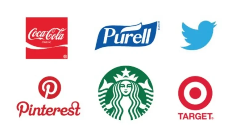
The color red is among the most powerful that can be used in a logo design. It has a range of feelings associated with it, one being power and passion.
The intensity makes people want to keep going no matter what comes their way while also having warmth which means they’ll feel safe when near this symbol or signage because you know there’s going to be an end goal at some point soon enough.
It captures attention easily so many signs use compulsory signals like STOP lights alongside danger symbols indicating imminent danger
Red is the universal color of emergency and danger, which means that it can grab your attention in an instant. Red signs are used for all kinds of emergencies to call people’s attention like ‘END OF YEAR SALE’ or ‘BUY NOW’.
Its appetite-increasing factor makes it a preference by most eateries, therefore they use red in their logos to get more clients.
Due to the broad nature of emotions it evokes, red has been continuously and widely used by brands in the entertainment sector, general retail business, and food industry.
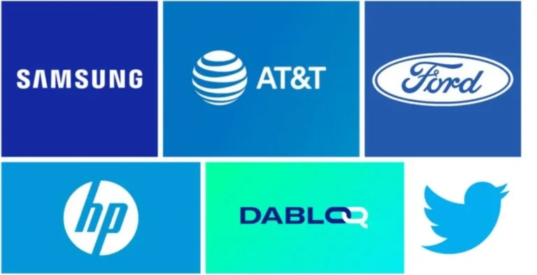
Blue is a calming and trustworthy color that can be used to represent any company. Blue logos have been seen in hospitals, financial corporations, government facilities, or technology companies because it brings stability with simplicity.
The slow pace of life leads people into feeling calmness which creates professionalism as well integrity – all qualities someone would want from their logo.
There are higher chances for potential clients to build trust in your brand and the services you offer when it’s a blue logo. It boosts confidence, dependability on both genders.
However, brands needn’t worry about being too mature because maturity can sometimes mean staying away from bright colors like red or pink; These have negative connotations depending on who sees them so use caution with these two choices instead if necessary.
Some shades of blue can be dramatic, and others come across as cold and self-centered.
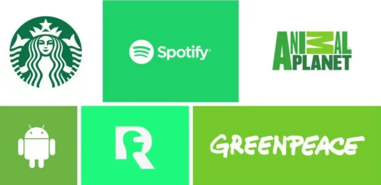
The color green is associated with new beginnings, renewal, and peace. It’s commonly used by brands who support environmental conservation like organic products or alternative energy sources like solar panels because they want to represent their brand in all things eco-friendly without being too vague about what those items are exactly.
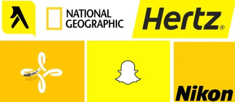
The color of warmth and energy, yellow is one of the first colors that humans came up with through mixing other shades. It’s bright like sunshine on a hot day or golden fields ripe for picking fruit.
A brand that chooses yellow as a logo design color will undoubtedly stand out, show accessibility, and attract consumers’ attention.
When used in excess, this intense shade can cause impatience among people and lead to insecurity when used very minimally or against another color with more contrast like blue for instance – which would make them appear less intimidating than they were trying at first glance
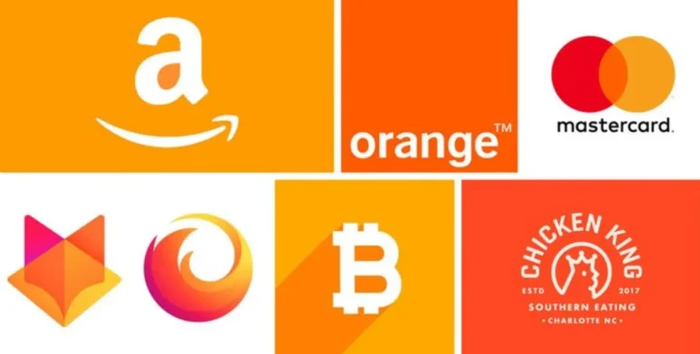
Orange is an excellent, cheerful, and warm color. It brings out the feelings of enthusiasm for life as well as approachability in people which makes it very popular amongst friends. The downside? Many may see orange’s cheerfulness at times like anger or violence due to its association with autumnal season-a time where nature change becomes prominent (and unpredictable).
Orange is a powerful color that brands can use to create logos with an eye-catching style. The orange hues are linked not only to the food industry but also to products made for children.
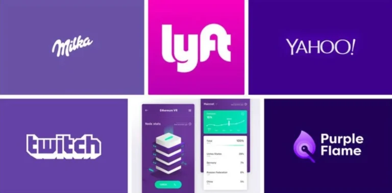
Purple is a rich color that symbolises royalty, luxury, and wisdom. It has been associated with the church because of its connection to spirituality as well as dignity or purity in some cultures’ beliefs systems
Brands that use purple in their logos include luxury items stores, beauty products shops, and education centers.
It’s an excellent way to draw attention from both the feminine side as well as men.
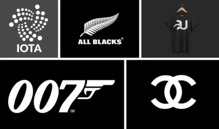
Black is a color that comes with mixed emotions.
To some, it symbolizes bad luck, while in the marketing and branding world – like power, luxury (or elegance), strength; black also feels very modern because of how simple yet sophisticated this shade can be at the same time.
Black is a powerful and versatile color that can be used to boost confidence or hide negativity. Brands must ensure their logo designs are properly paired with this hue so it does not bring forth any negative feelings in the viewer but instead offers them hope for success.

If you are looking for a color that suggests power and maturity, then grey is the way to go. It can be used in its lighter shades or as an accent on dark backgrounds without ever being flashy or attention-grabbing; it just quietly portrays sophistication with every glance at your branding materials.
Brands can use grey in their logos as a background color but should be very cautious about how it is used to avoid visual misinterpretation.
Read this- What Makes Apple The World’s Most Valuable Brand
Lighter versions of the color show the easy accessibility of the brand and are more appealing to potential clients.
Logo designers need to think about the message that their brand wants to pass on and what its goals are before deciding on the color. Colors evoke different emotions in people depending on where they come from, so if you’re designing an international logo with widely varying cultures across countries then understanding how colors will be interpreted is critical for success.
This site is protected by reCAPTCHA and the Google Privacy Policy and Terms of Service apply.