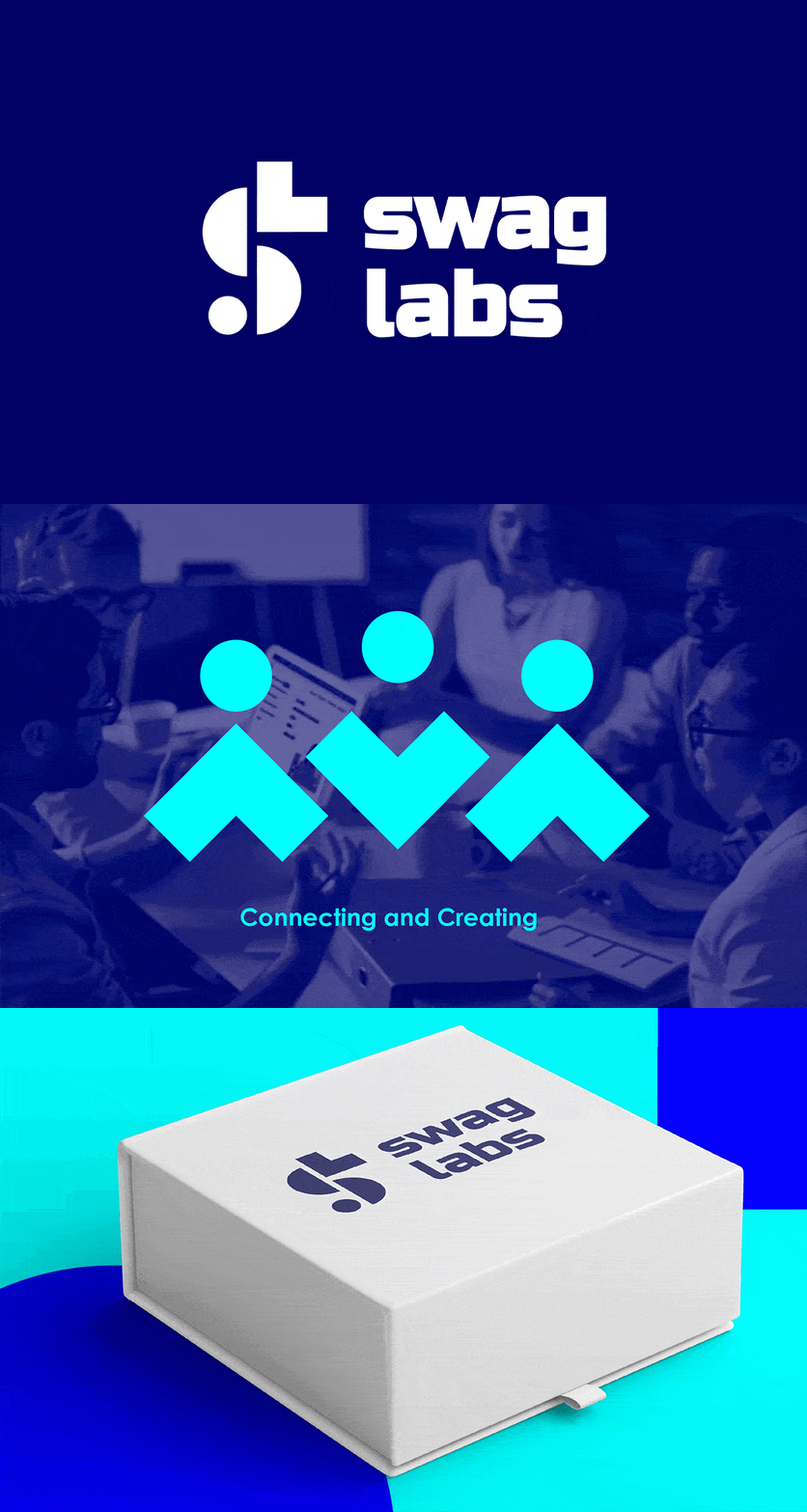
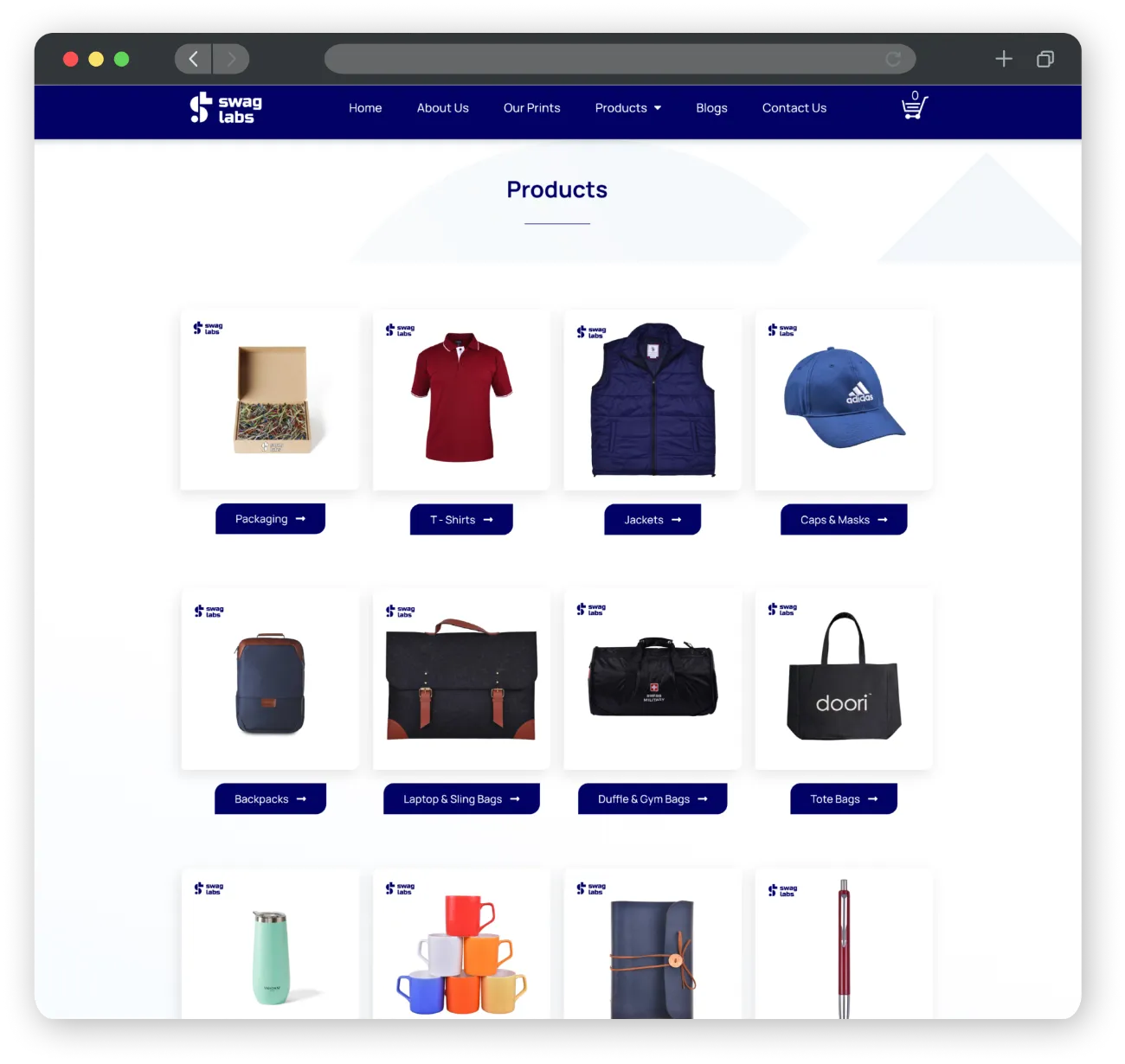
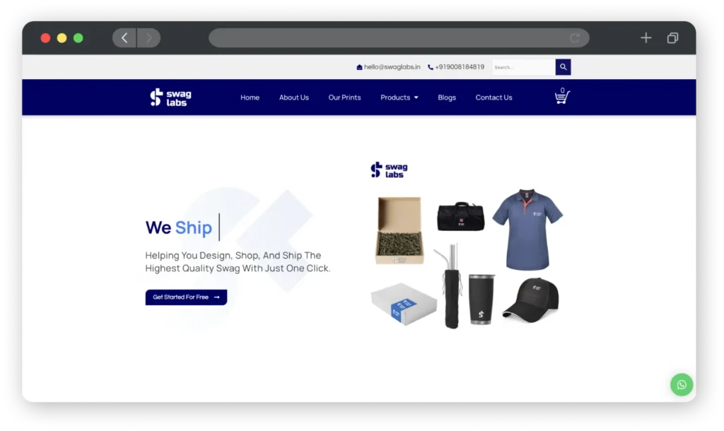
We used vibrant colours to make the brand feel bold. The logo of SwagLabs was derived from geometric shapes that are arranged in a unique pattern that creates the brand’s initials. The whole ideology behind geometric shapes is to introduce dynamism and scale. These shapes can be arranged in infinite ways and be used for communication across the website, on social media, and on any marketing collateral thereby creating a strong brand recall and uniformity while allowing for diverse usage without restrictions.
