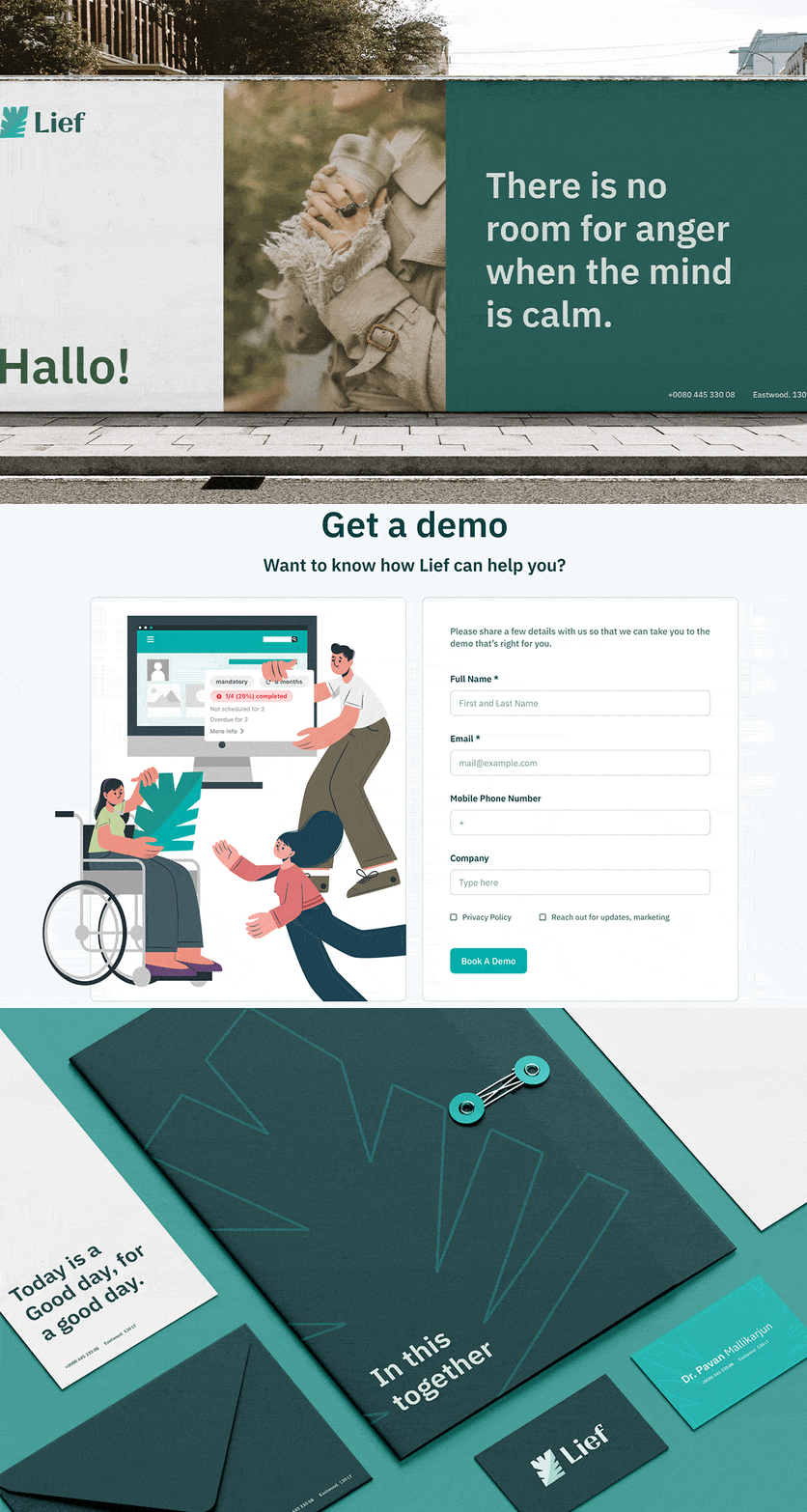
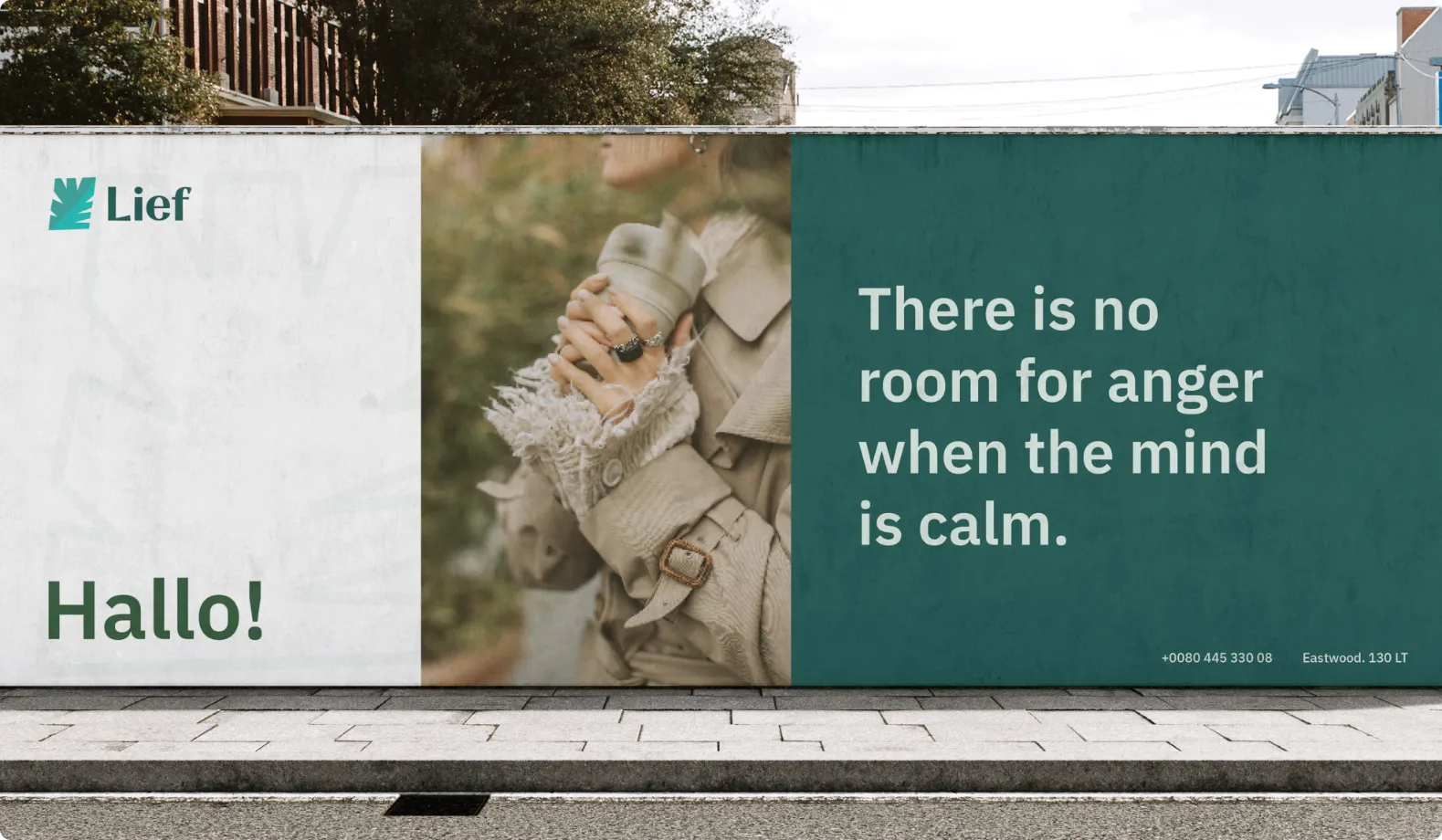
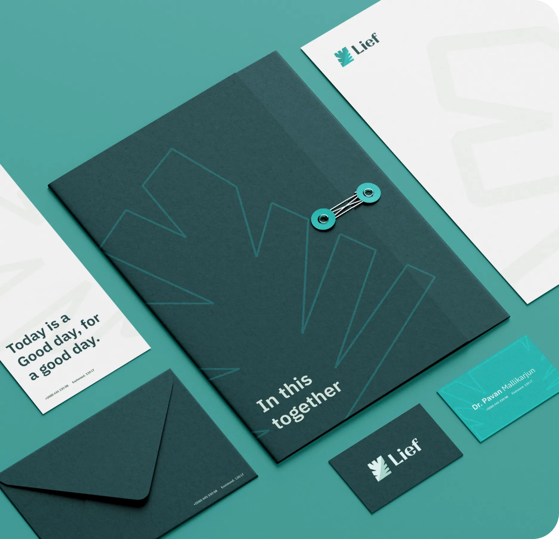
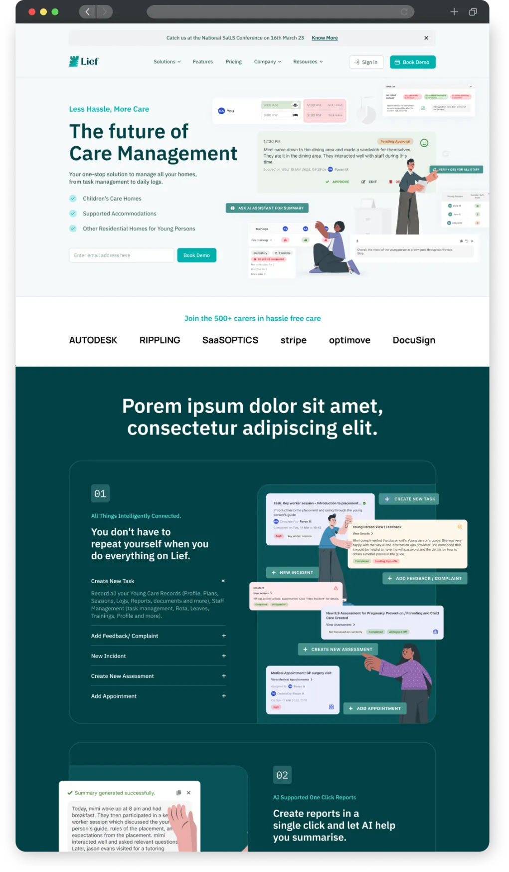
Since Lief sounded a lot like leaf, we crafted a logo that created a recall in people’s minds. Another reason for choosing a leaf as the logo structure was because it signifies hope, growth, peace, and life, which also happens to be the alternate pronunciation of the word Lief (smart, eh?).
