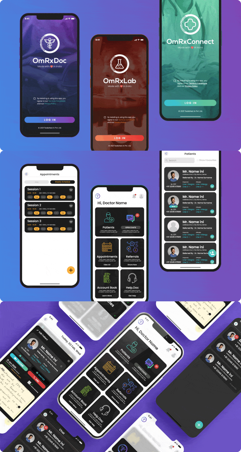
Colour coding has been a major aspect of branding the OmRx suite of apps as the product had to scale into a huge feature set and multiple apps within a suite.
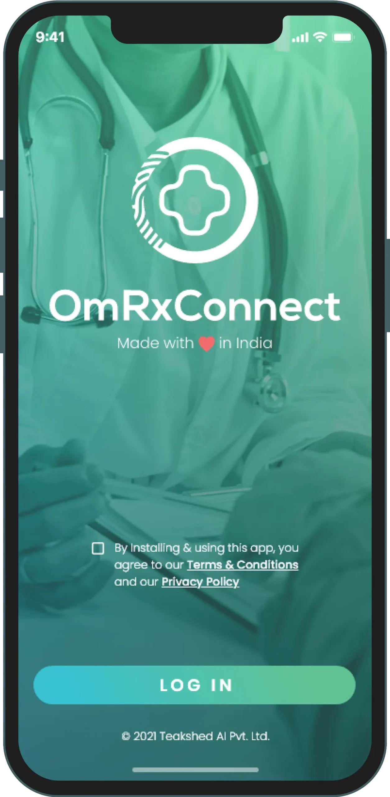
The circle in the OmRx logo represents the healthcare ecosystem and the fingerprint marks on the rims represent how each medical case is unique to itself. The center icon is kept dynamic to represent the app function within the suite.
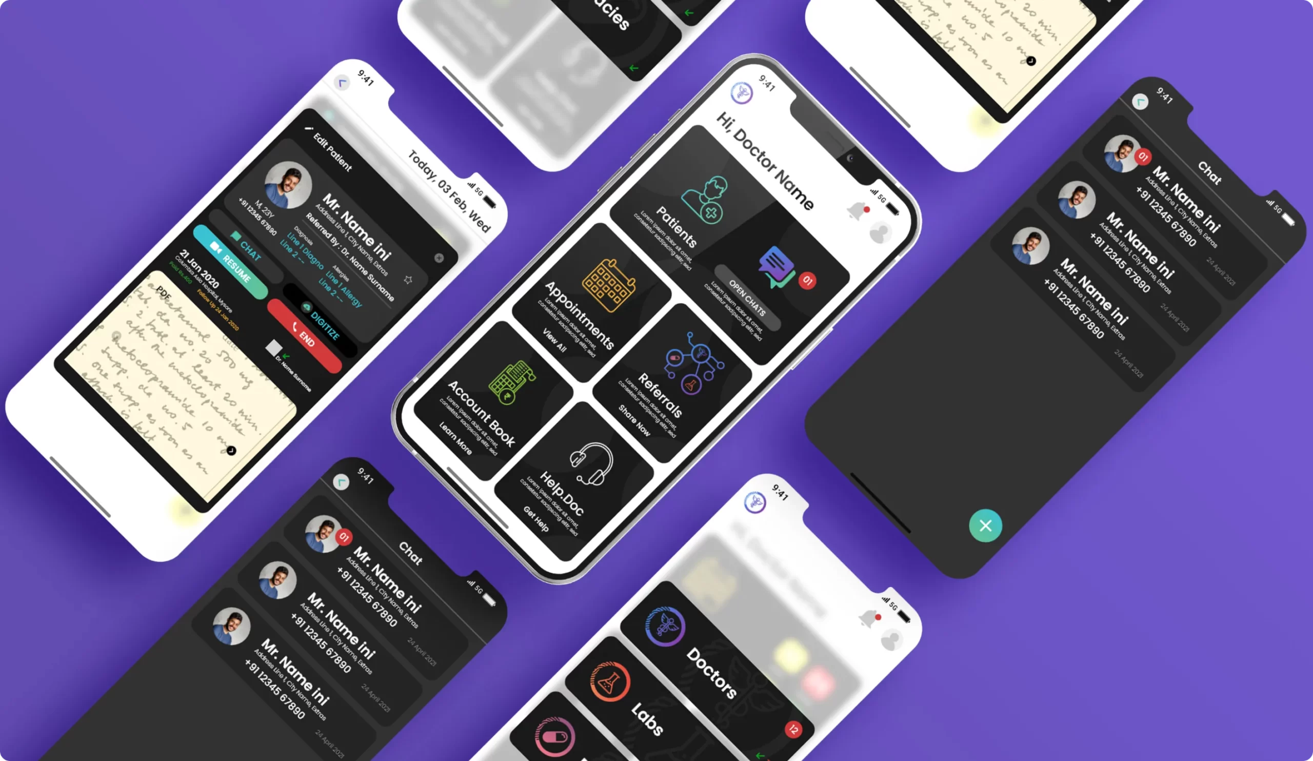
Working with the tech team to figure out the various possibilities and challenges of implementation.
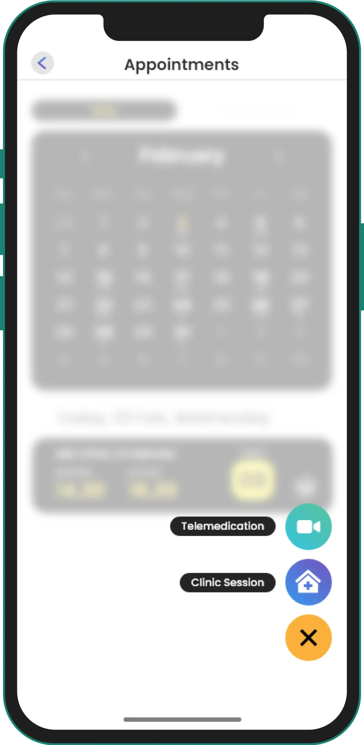
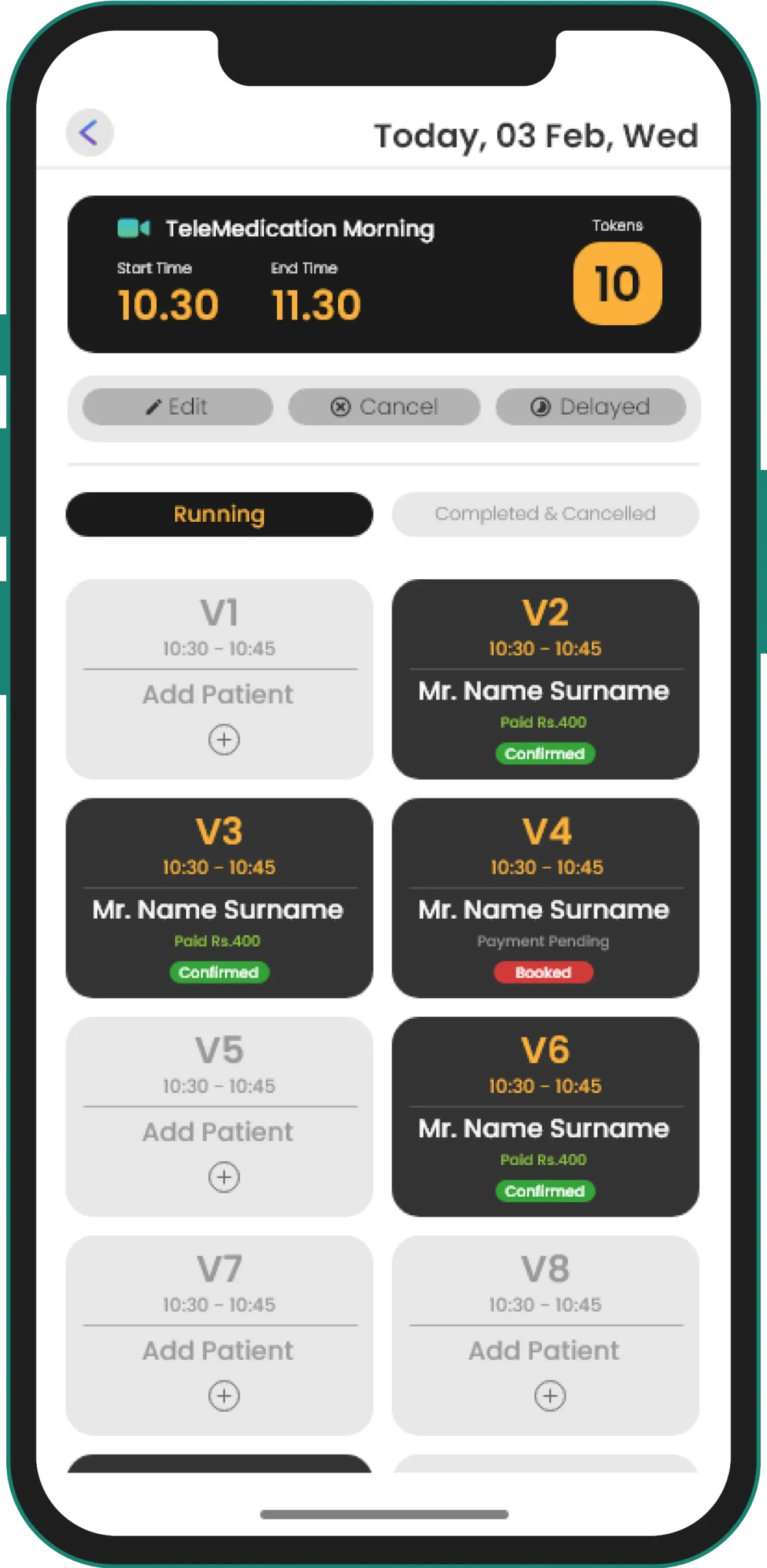
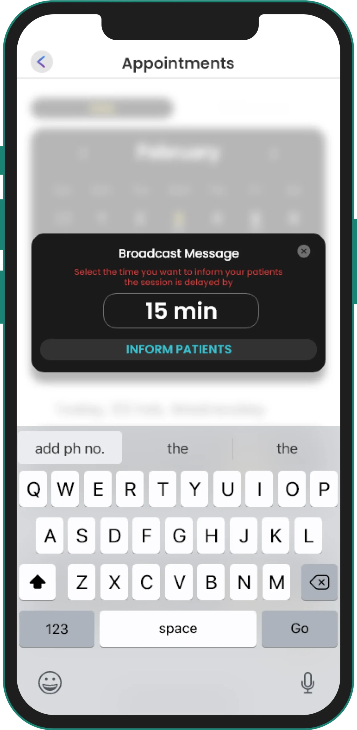
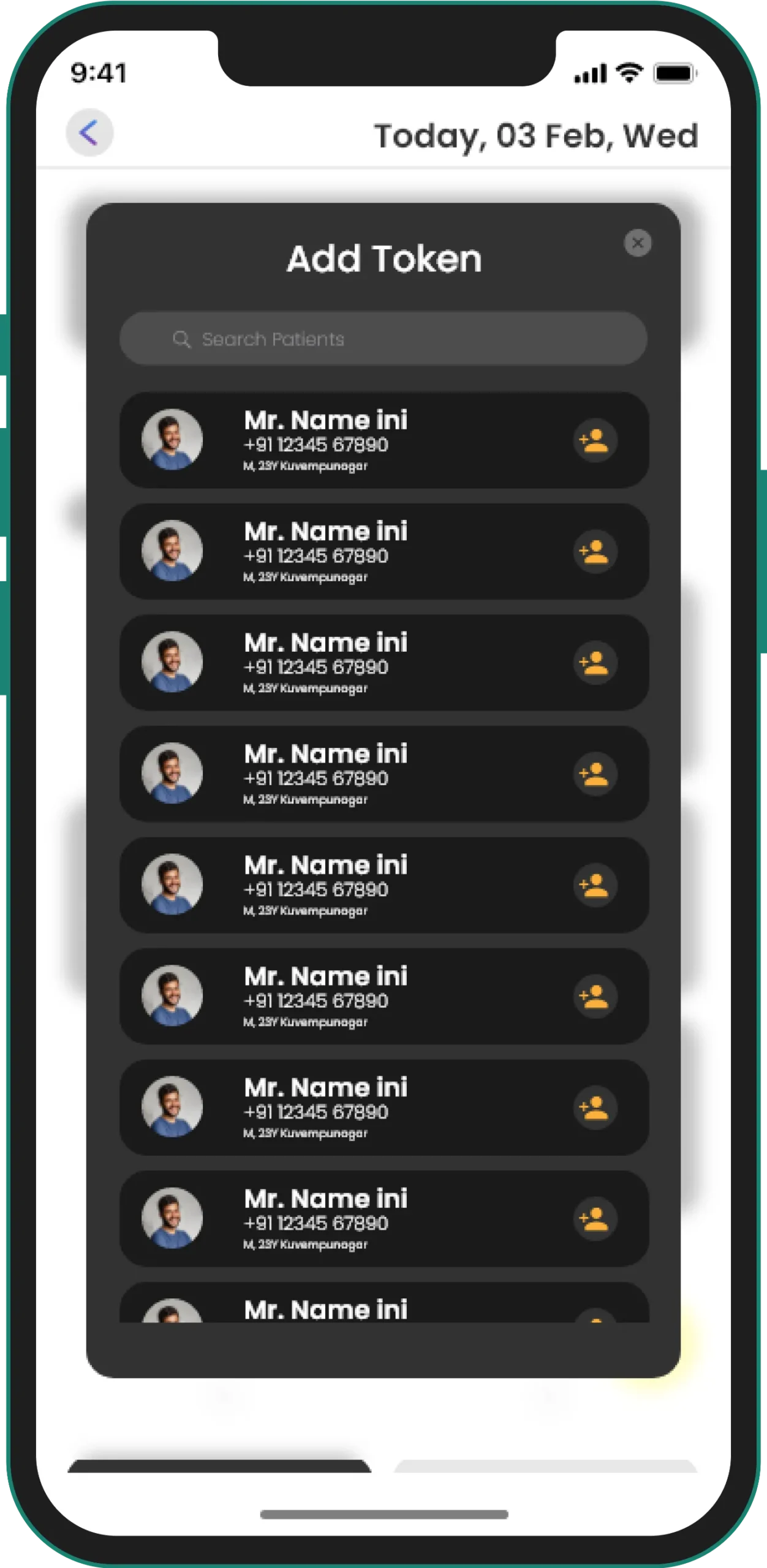
To enable a suitable appointment and communication system between doctors, patients, labs, and pharmacies.
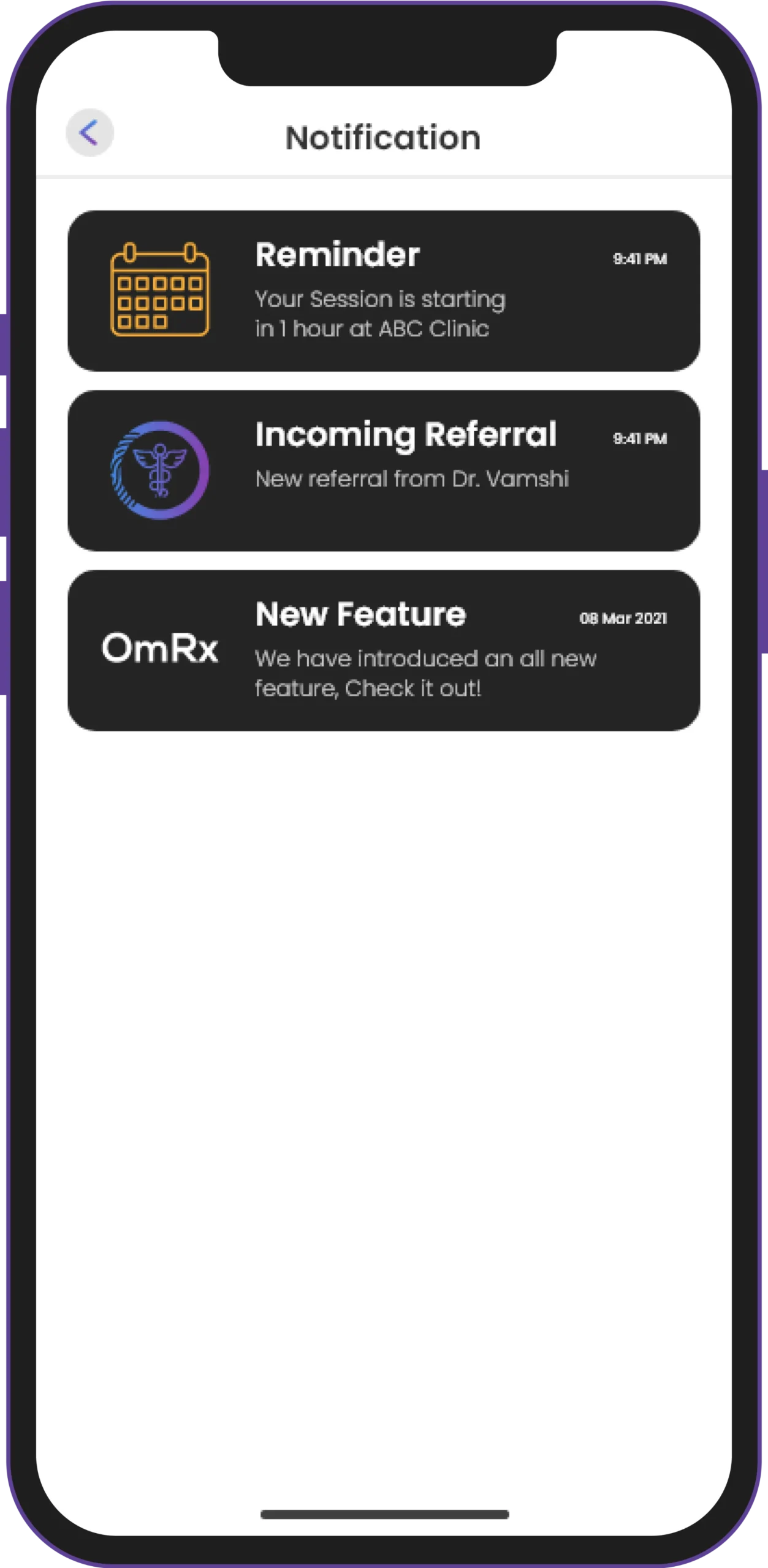
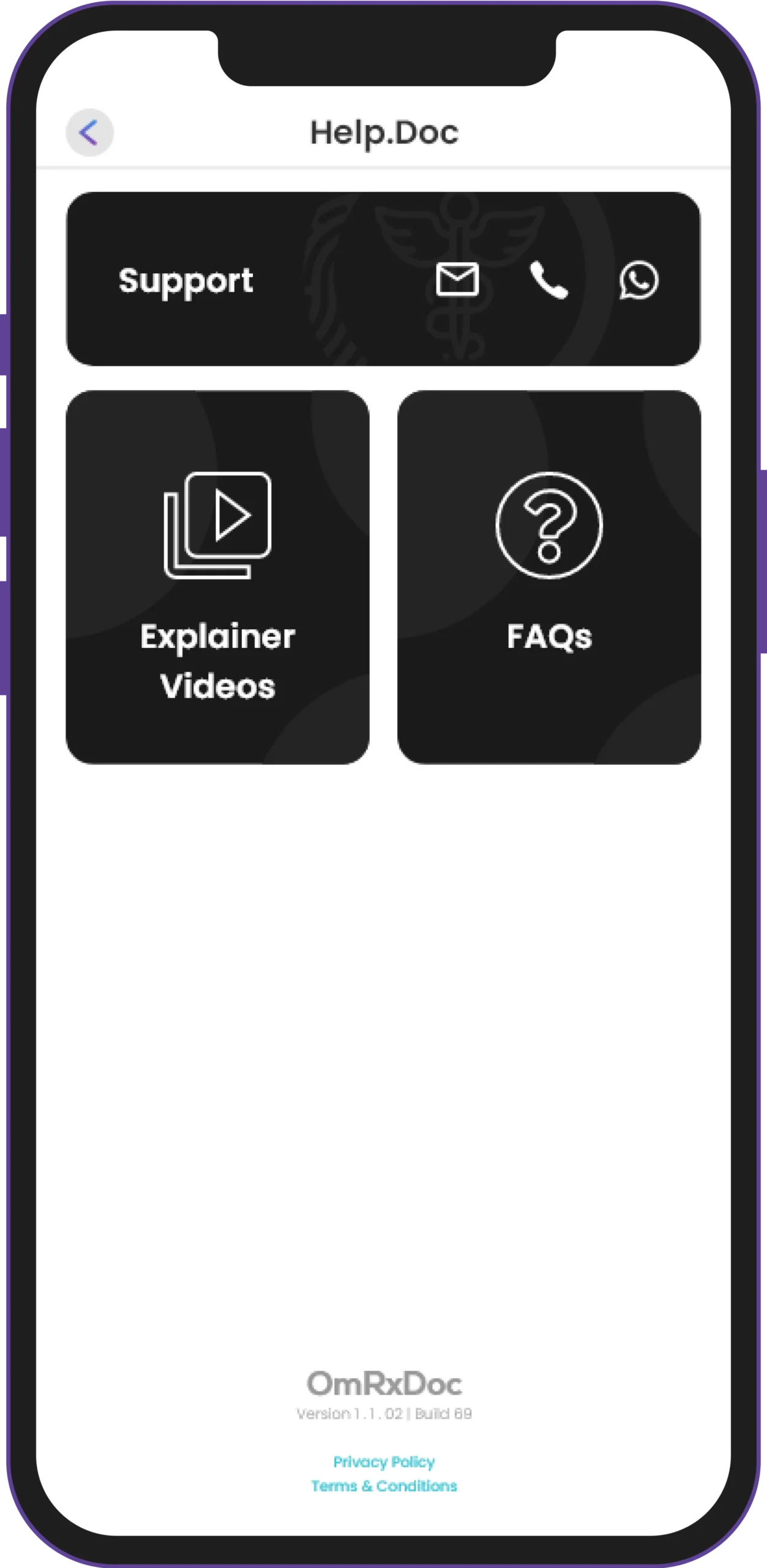
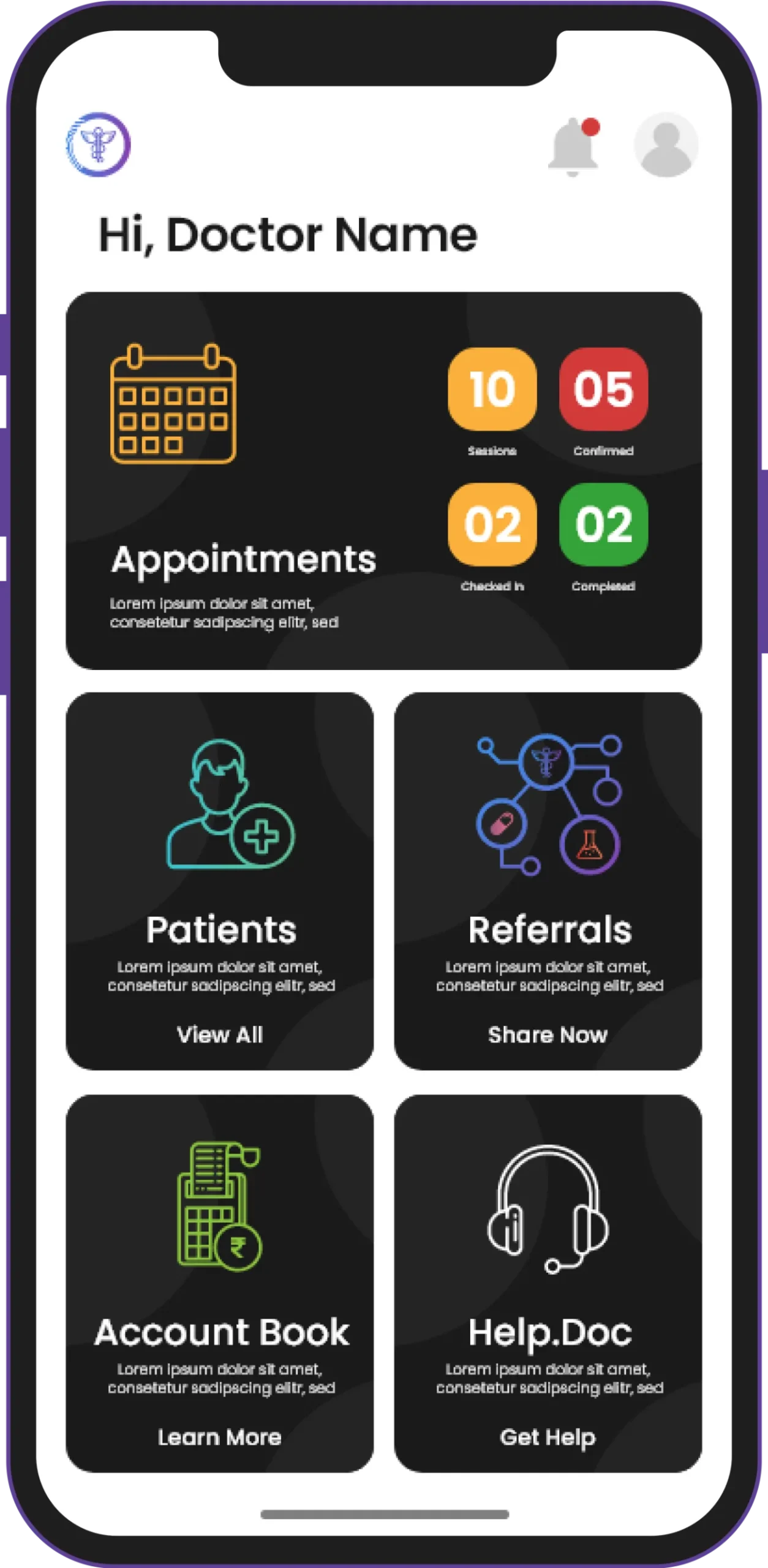
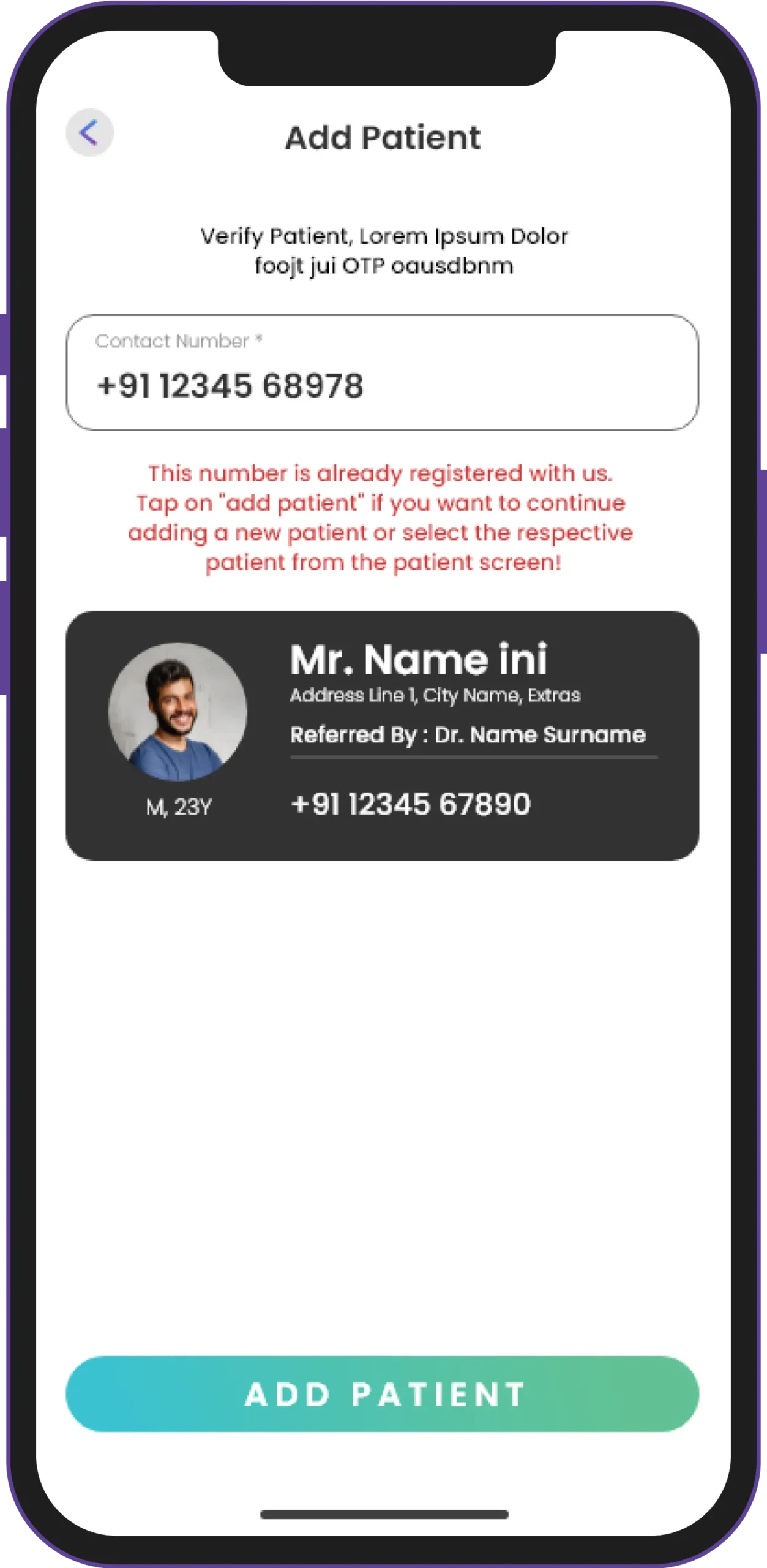
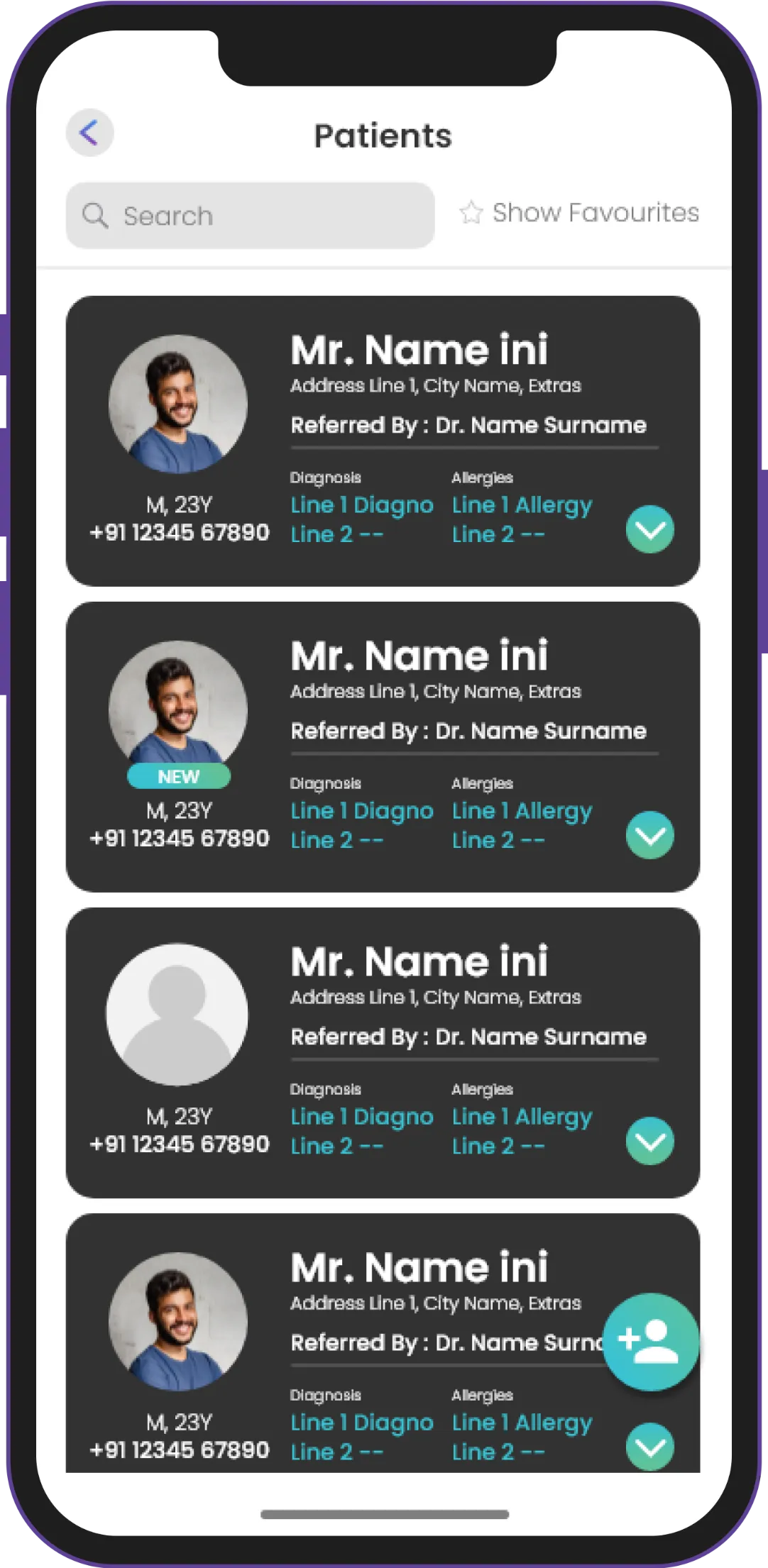
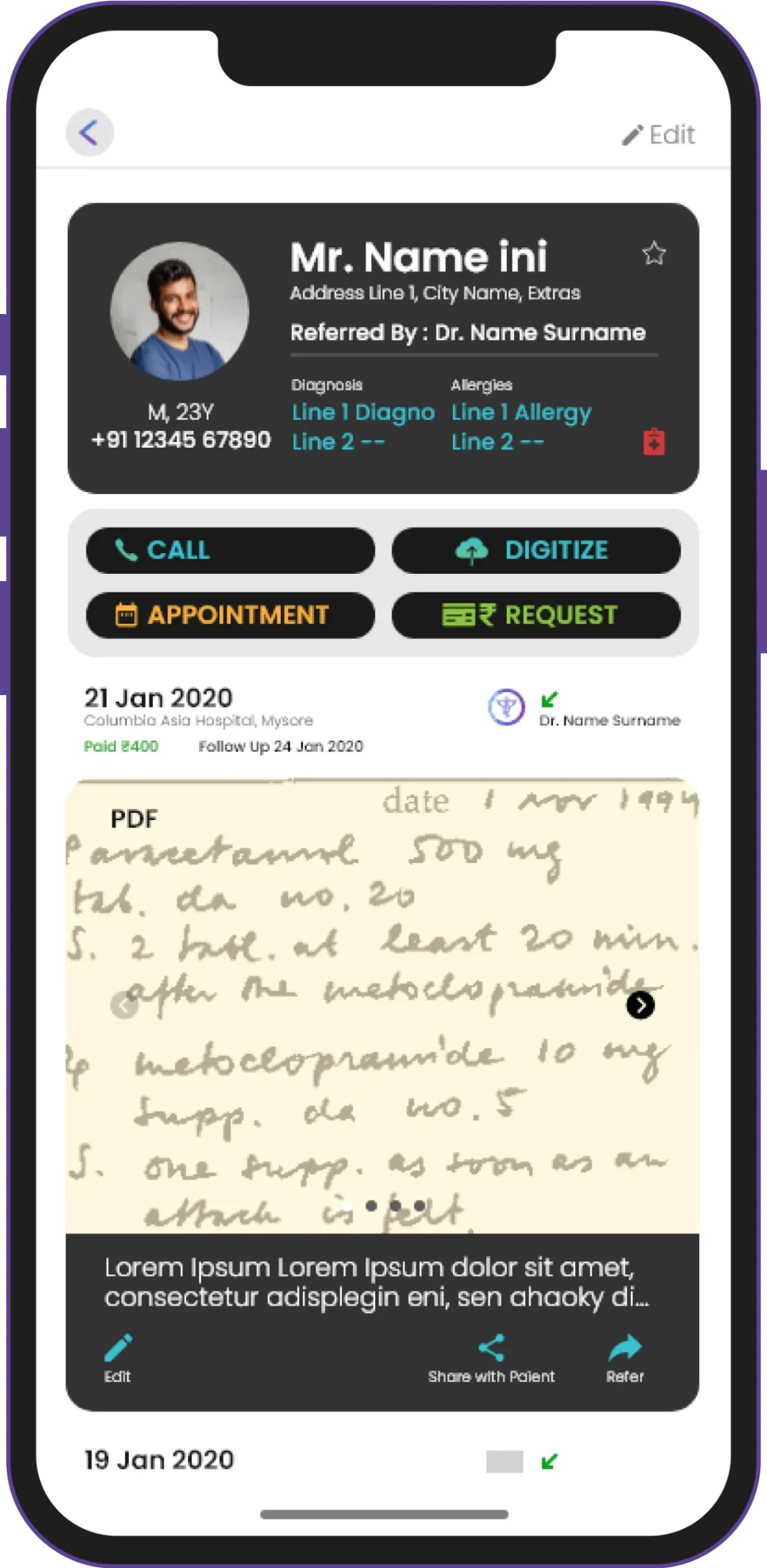
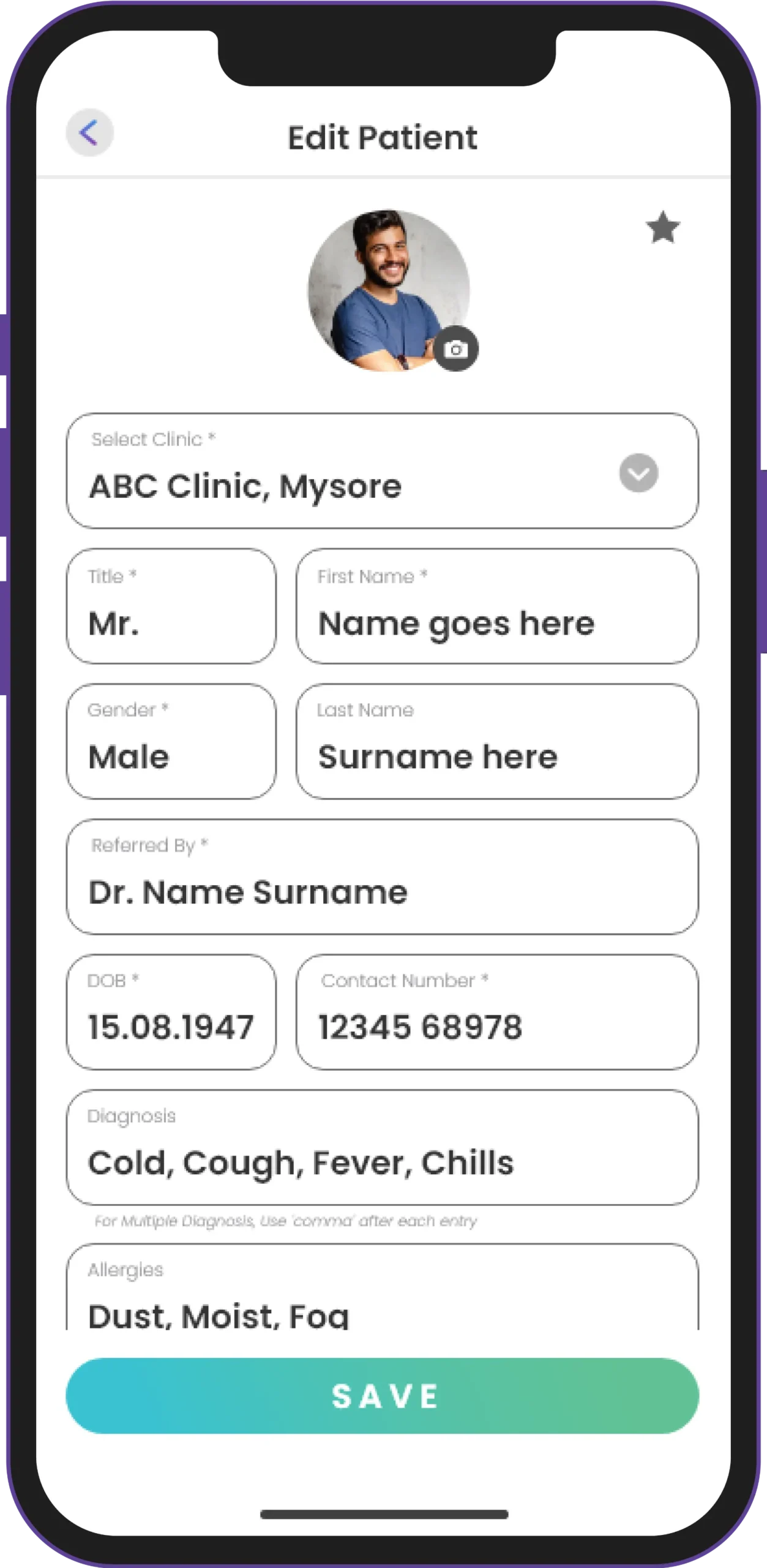
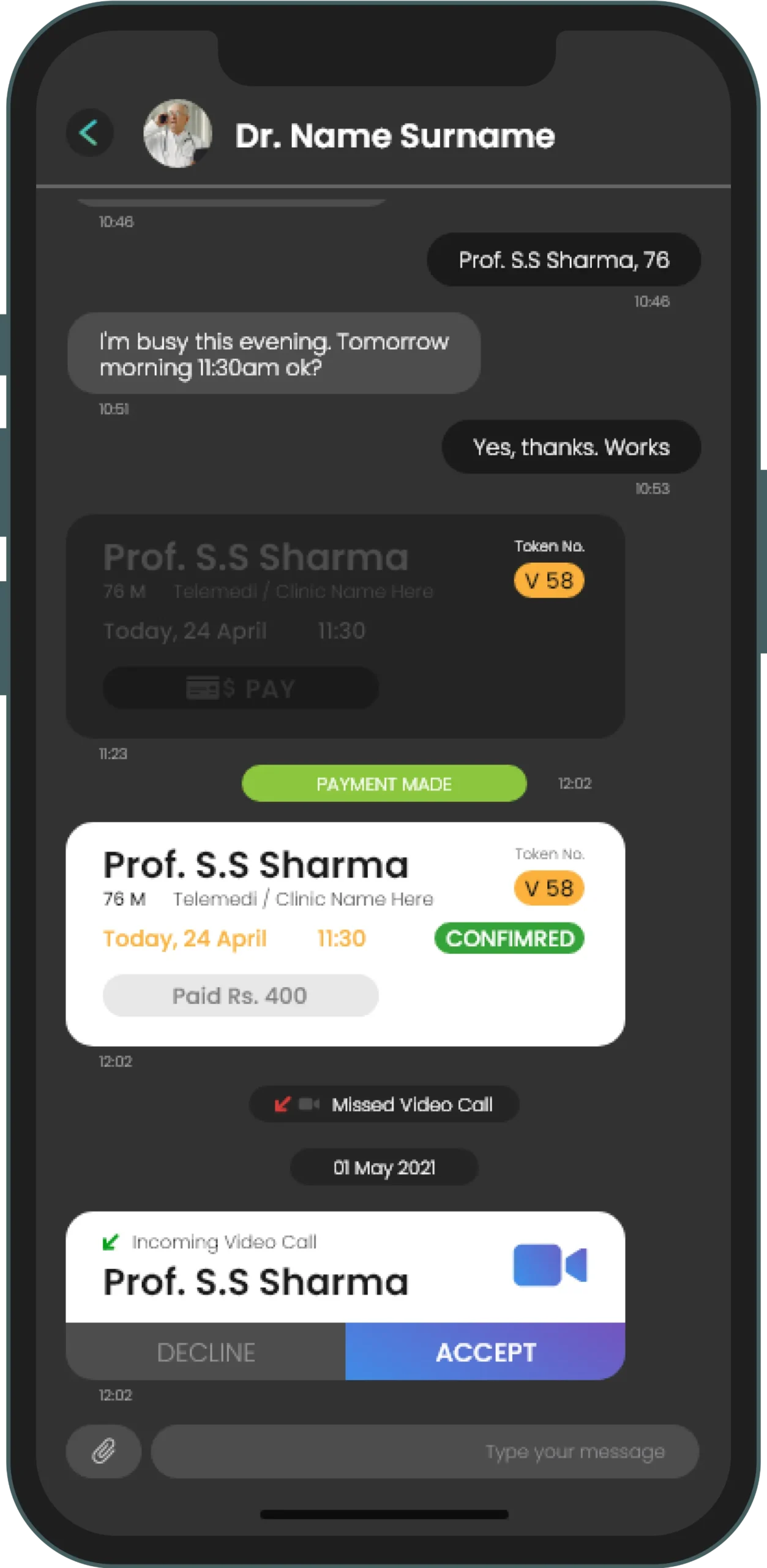
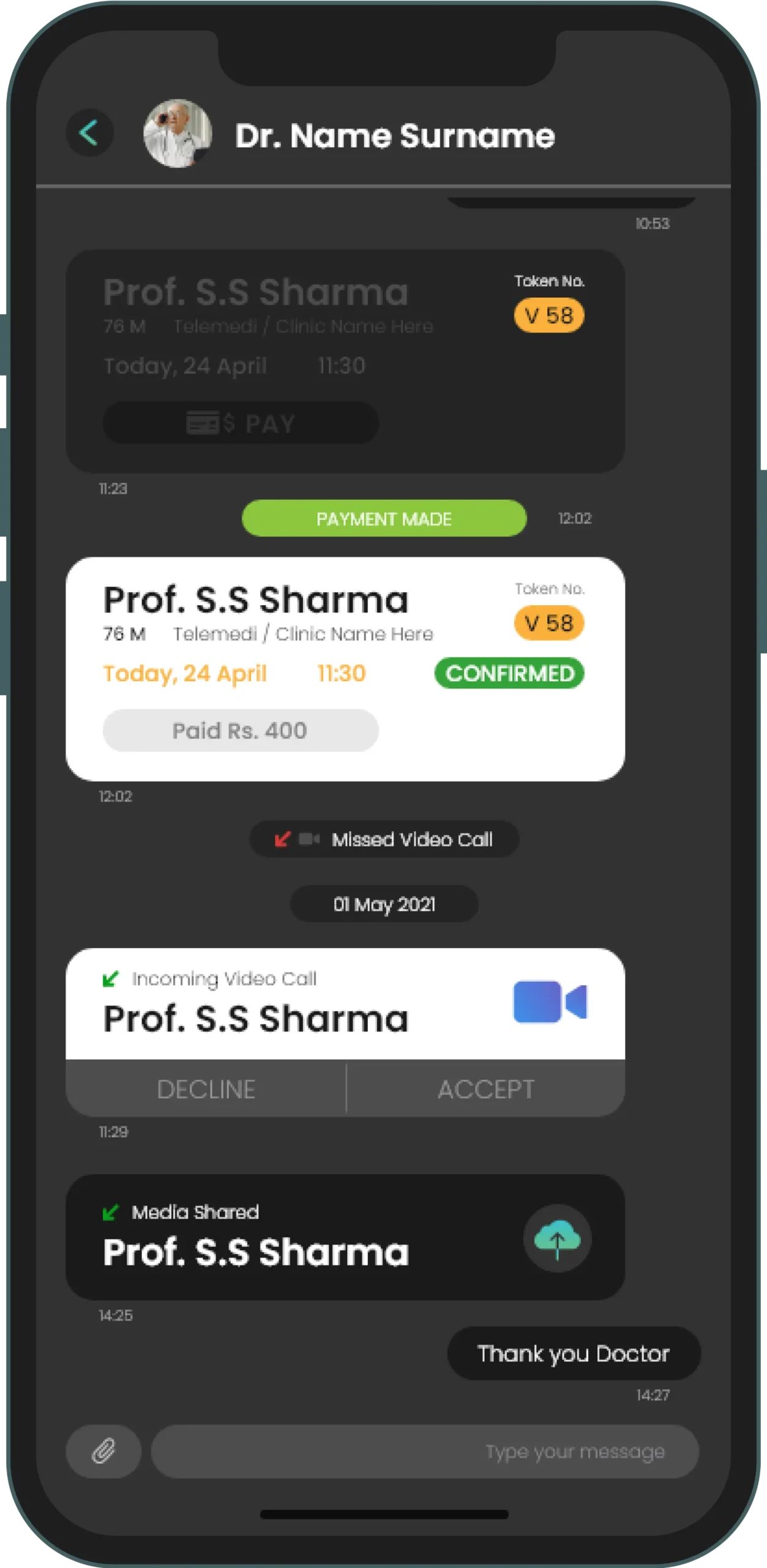
The app ensures seamless connectivity between the patient and his/her doctor, labs, and pharmacies via a simple chat system and smooth information exchange and storage.
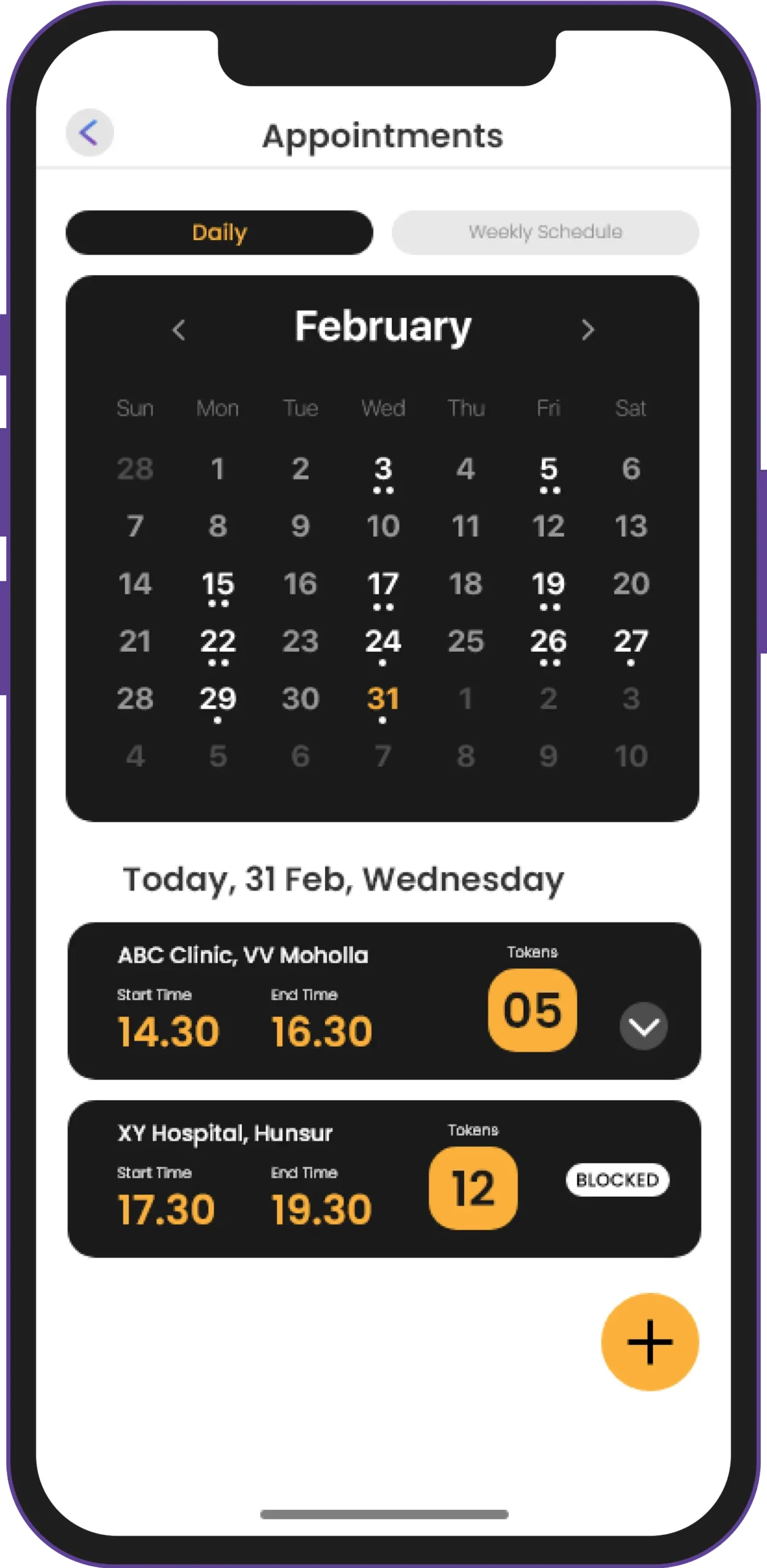
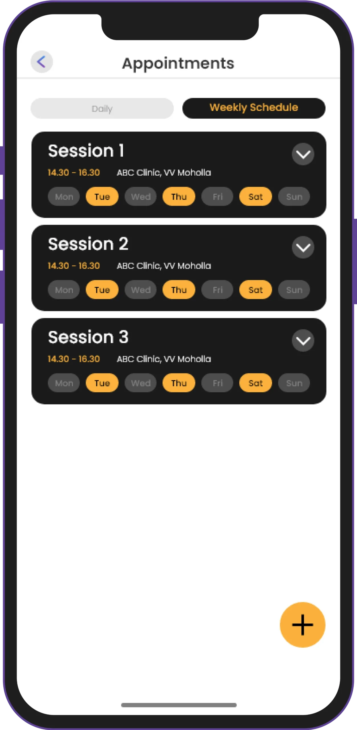
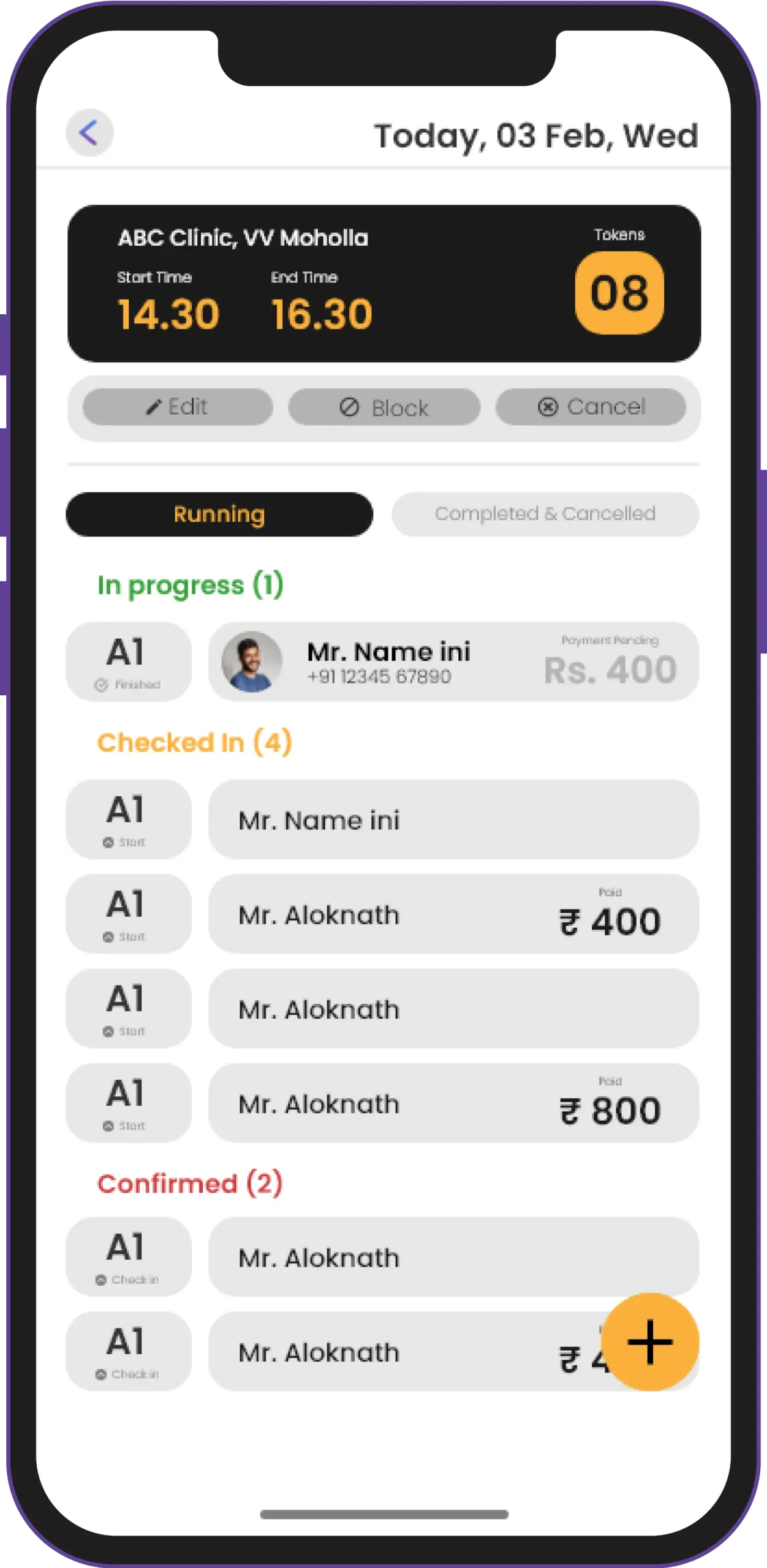
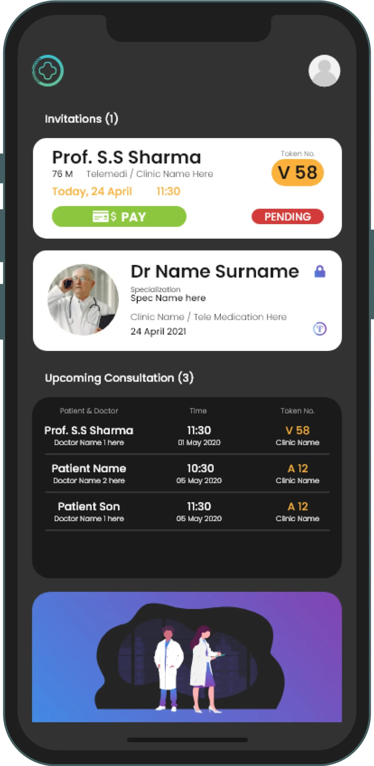
The doctor can see all the patients waiting for him through the app.
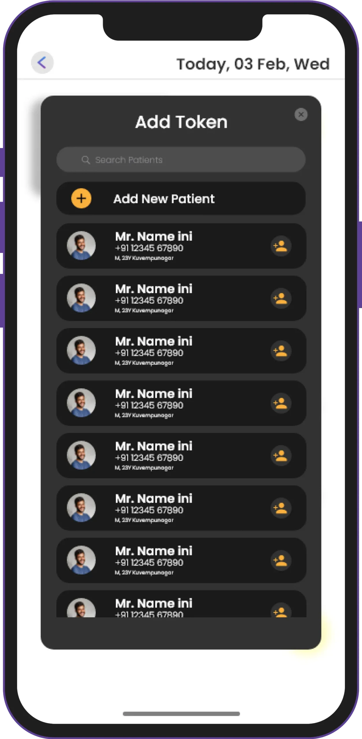
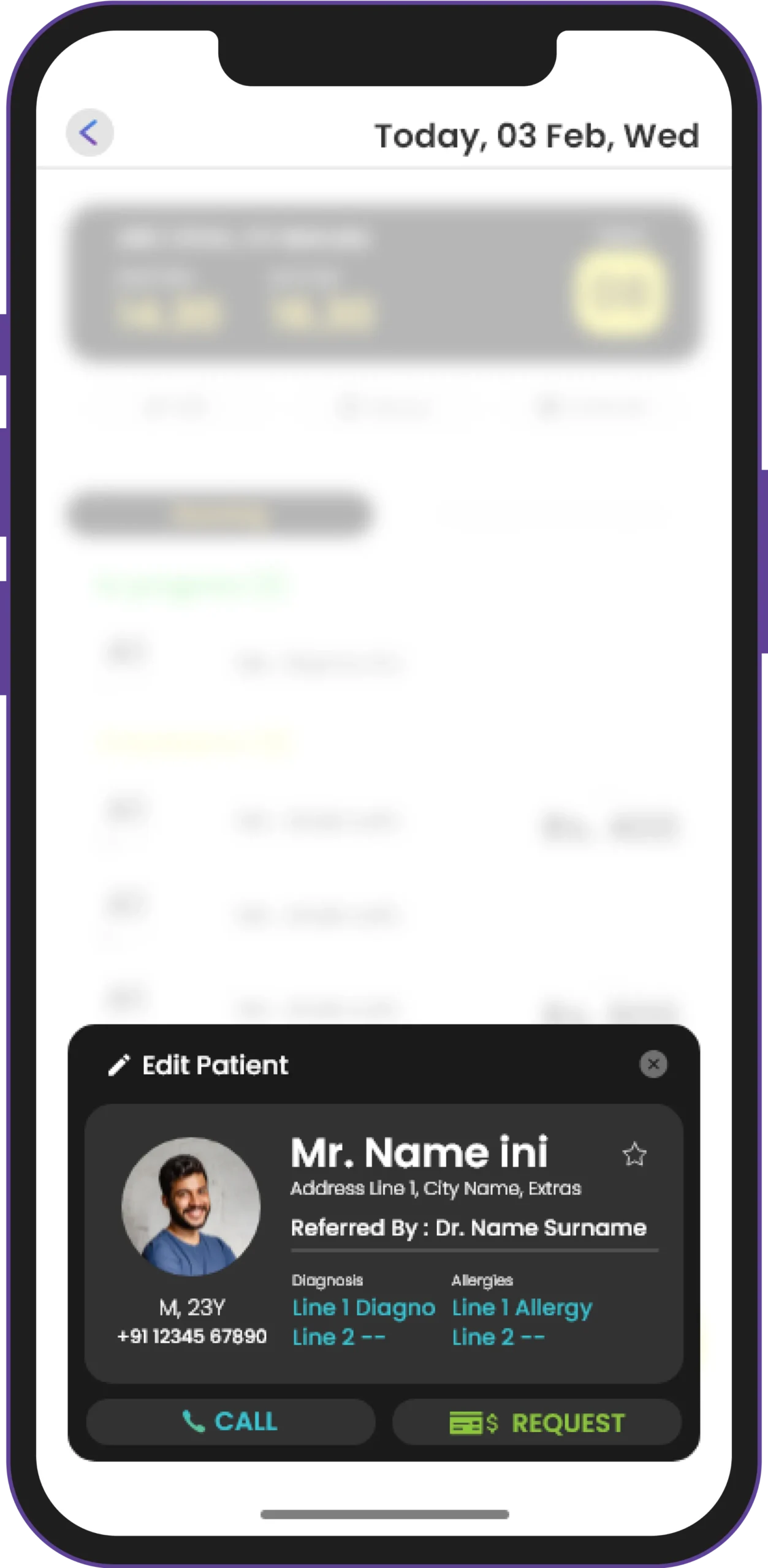
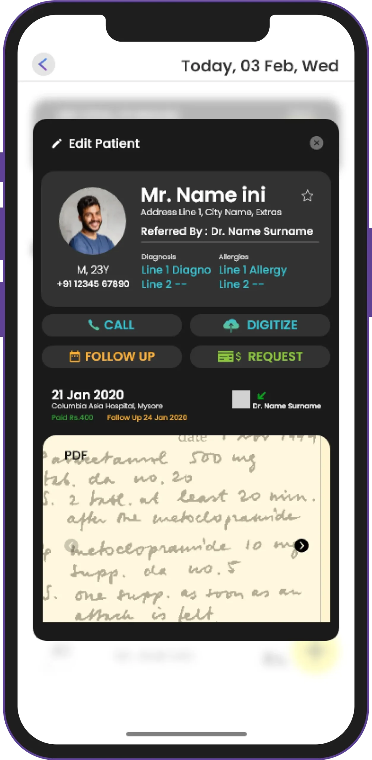
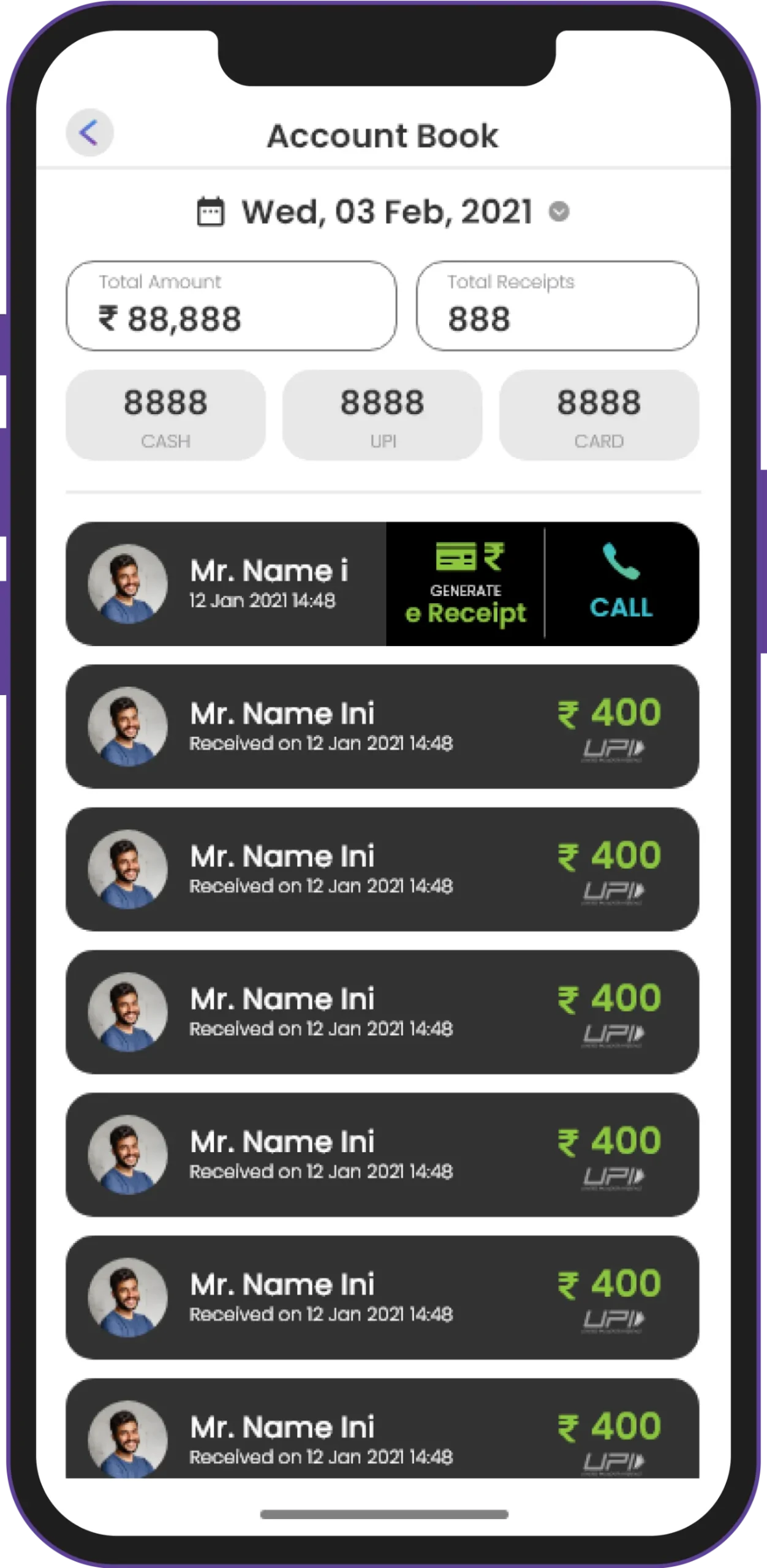
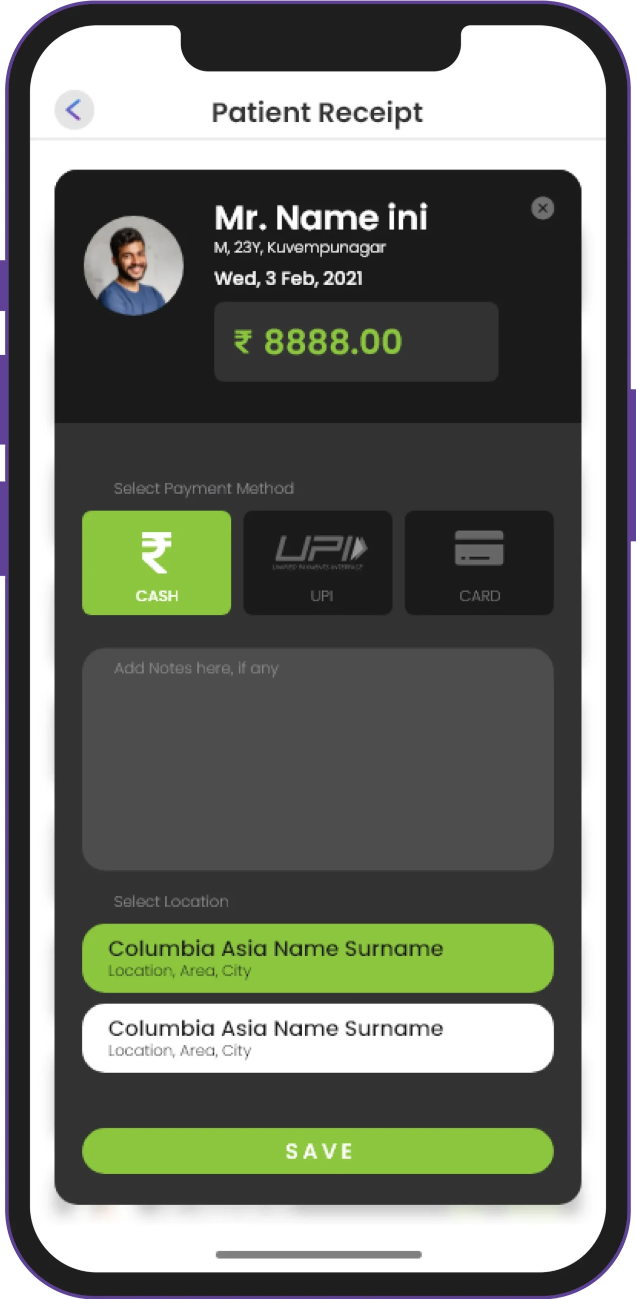
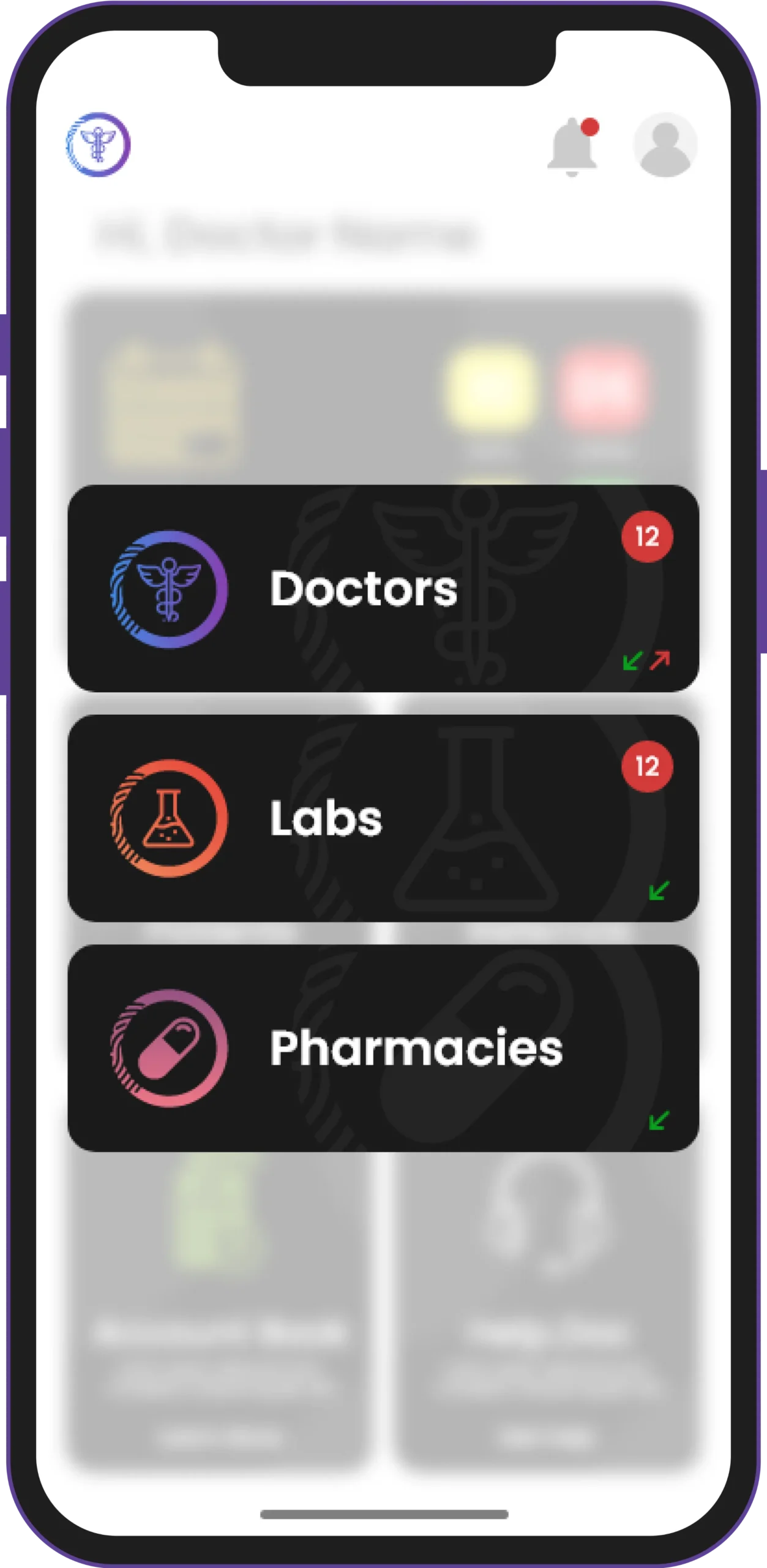
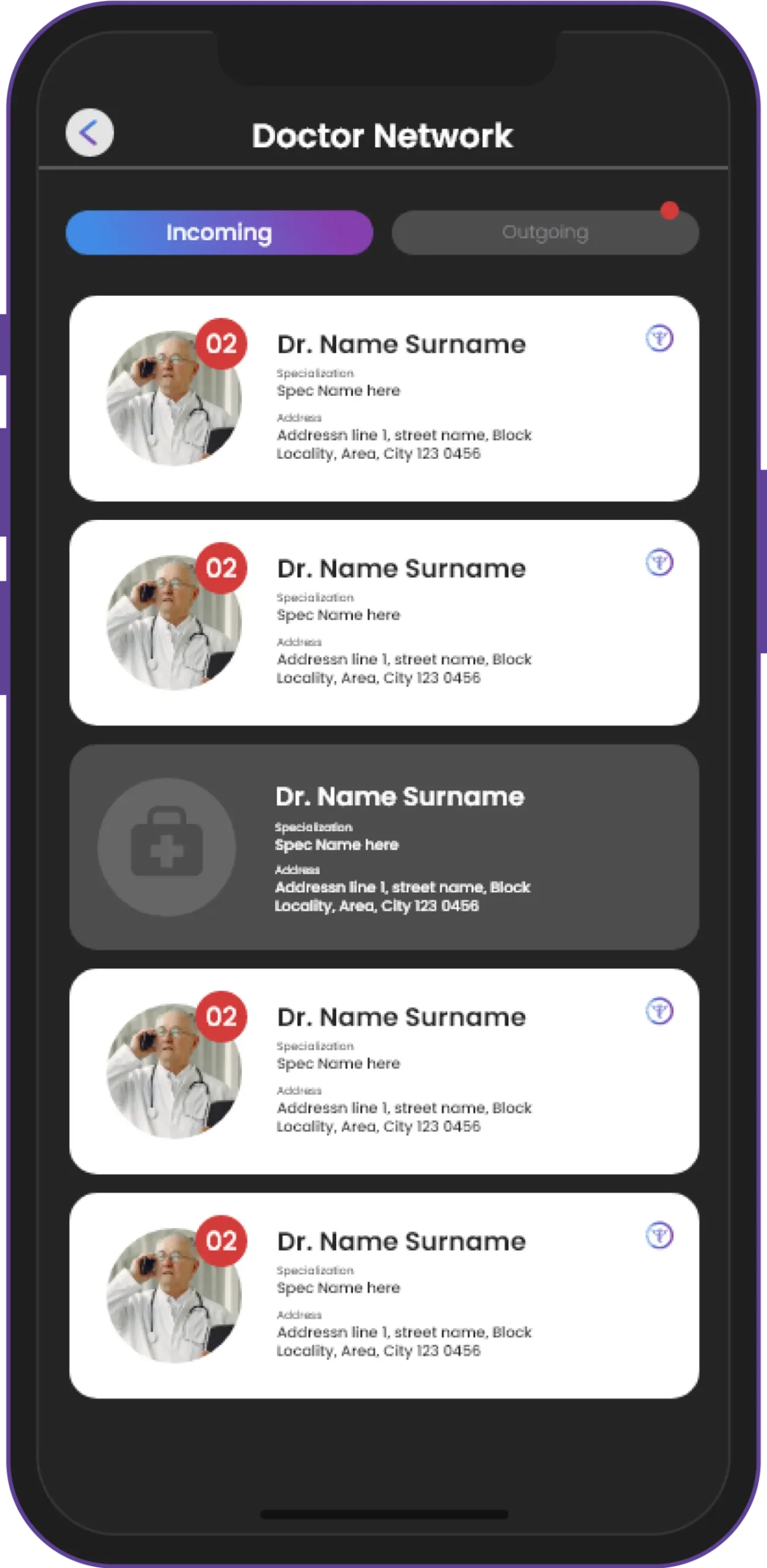
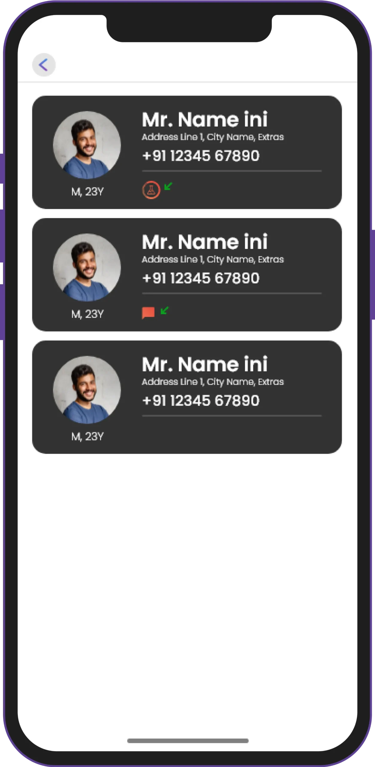
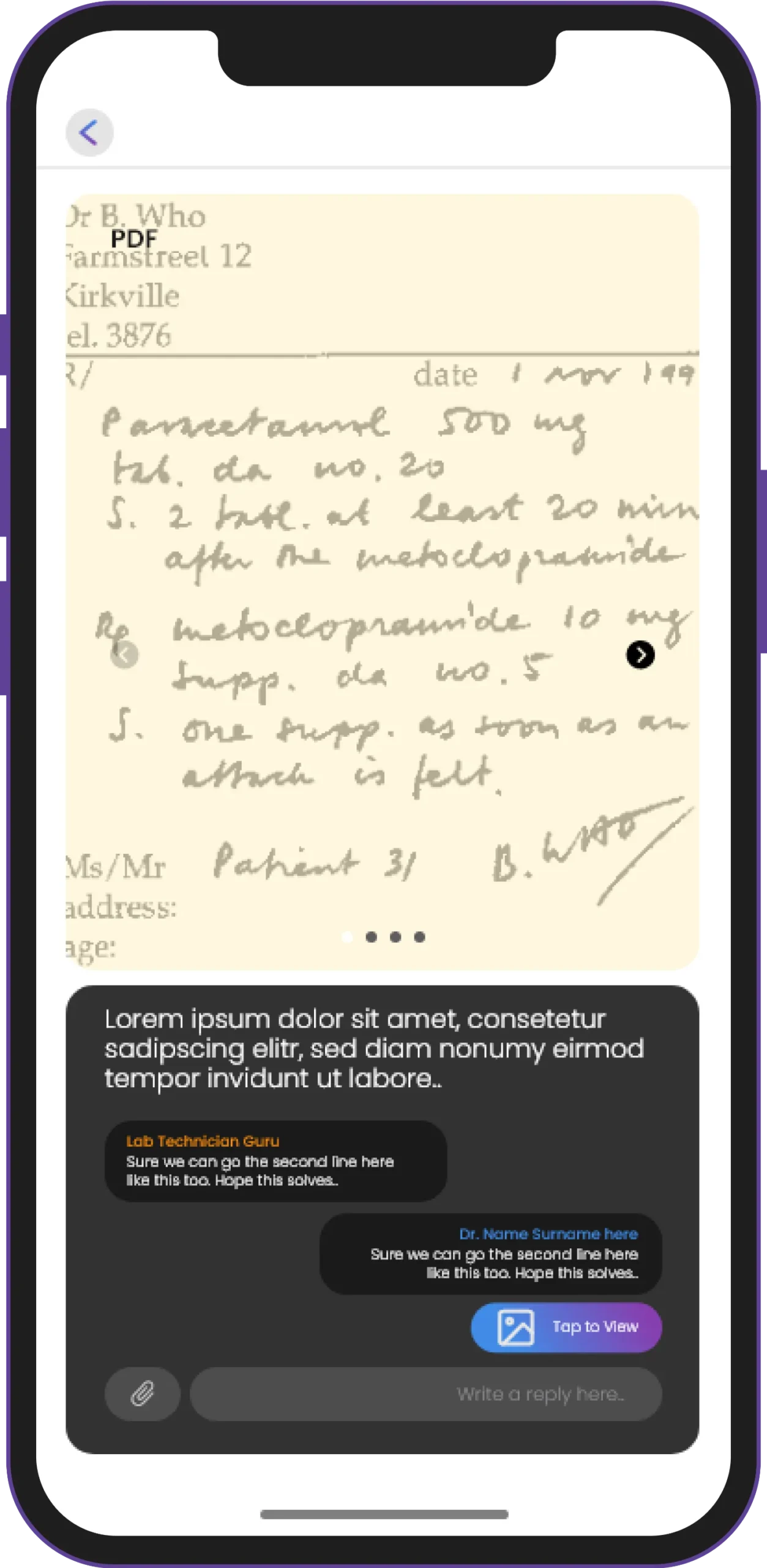
The OmRx app enables doctors to refer patients to one another based on their expertise and specialties. Thus, resulting in enhanced patient care and community growth.
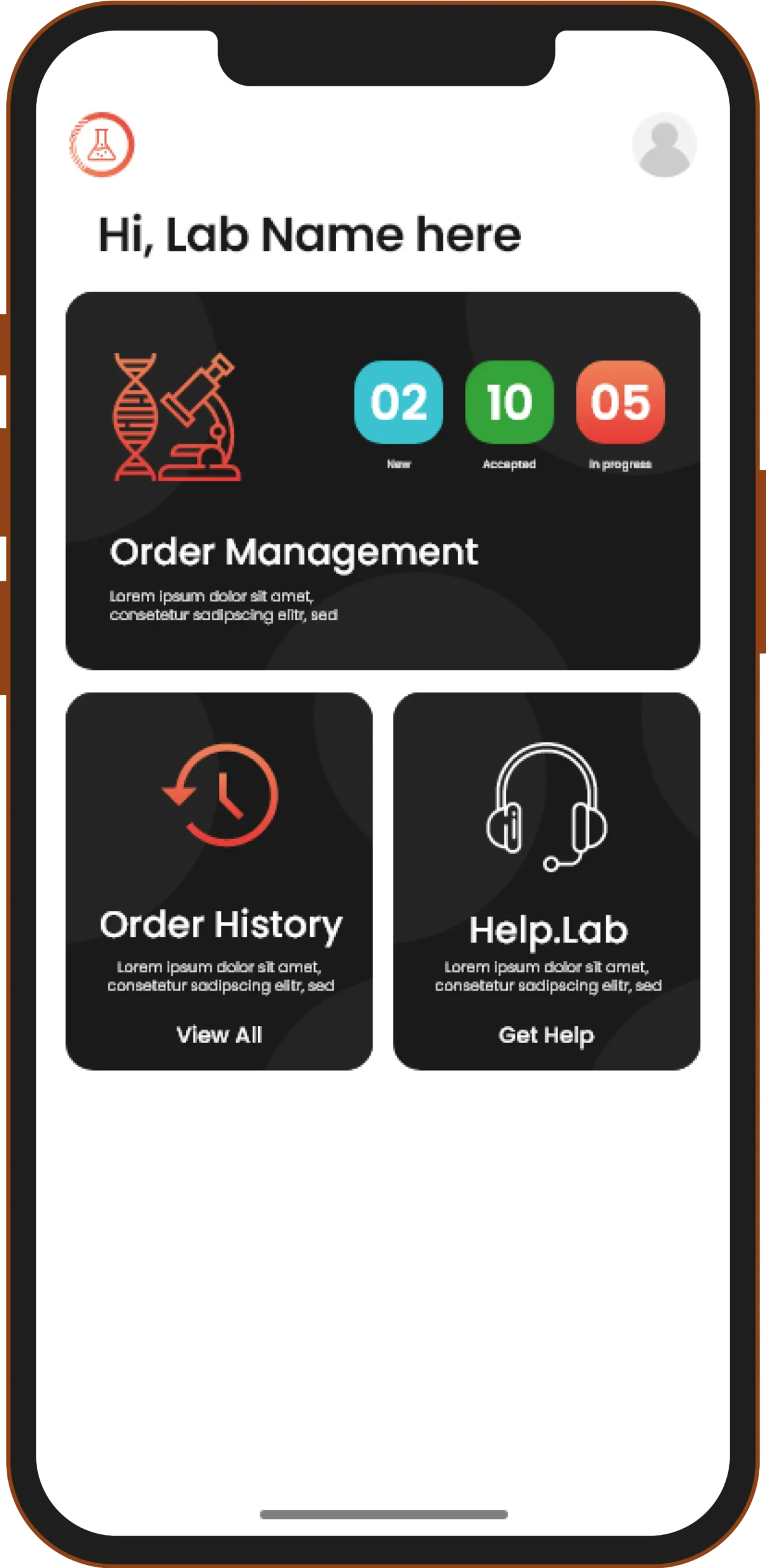
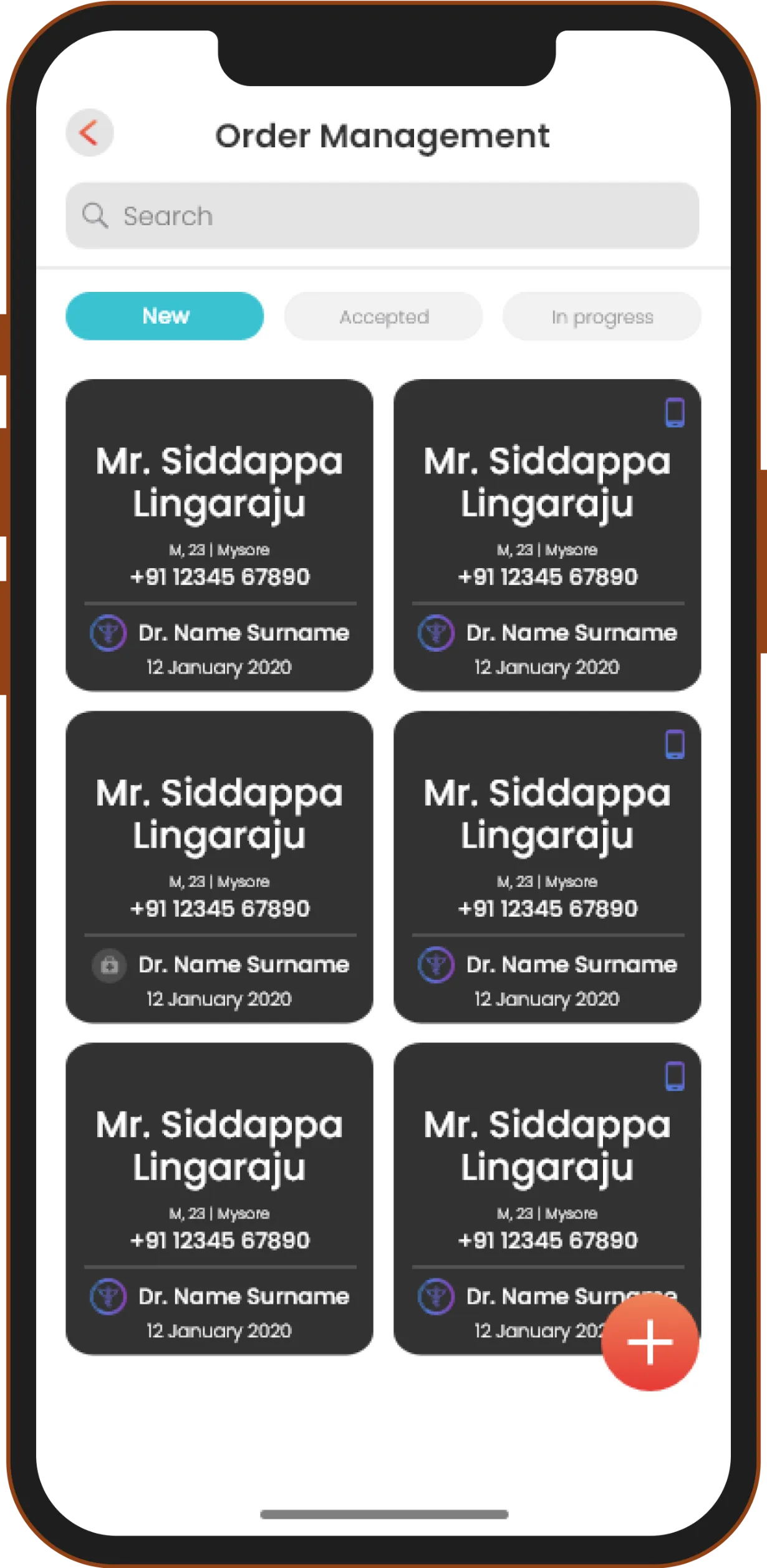
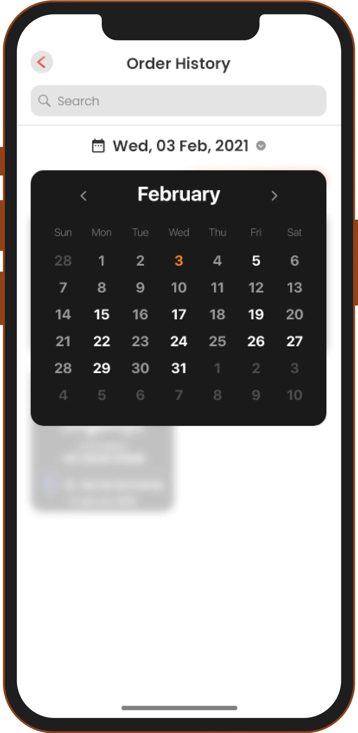
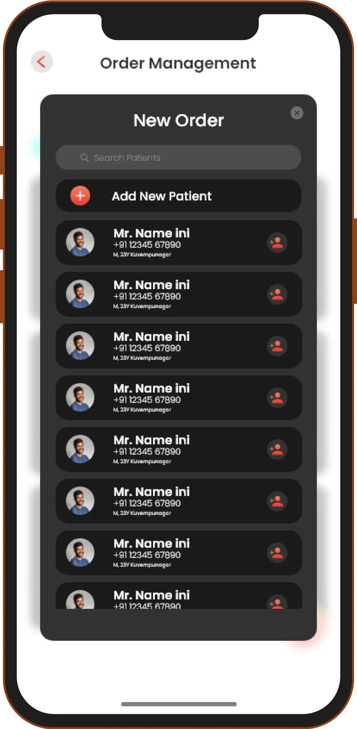
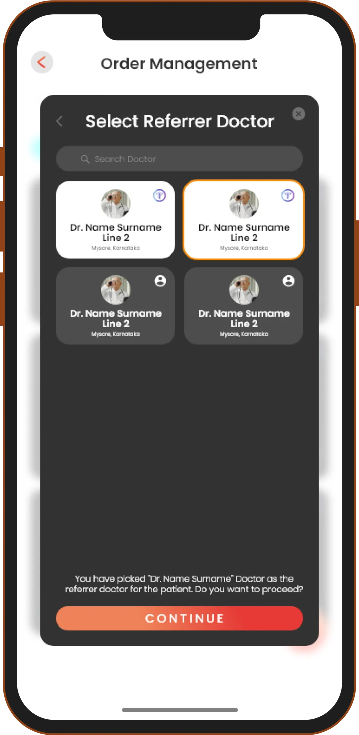
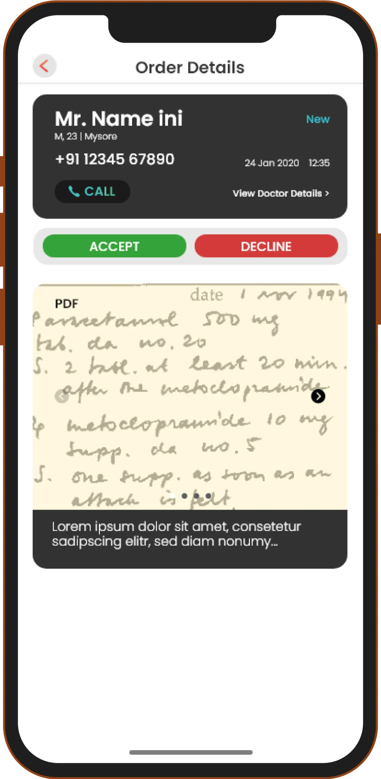
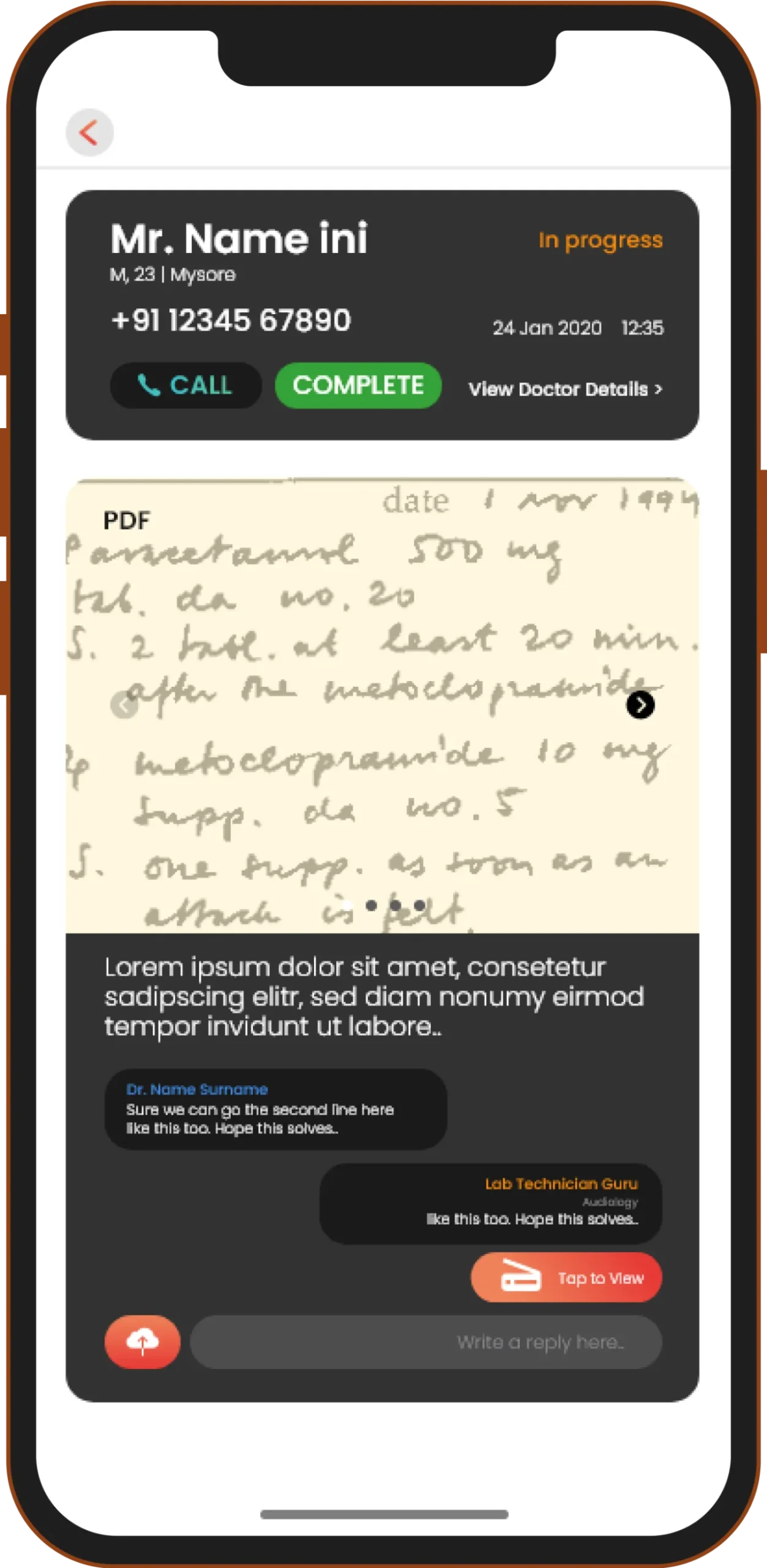
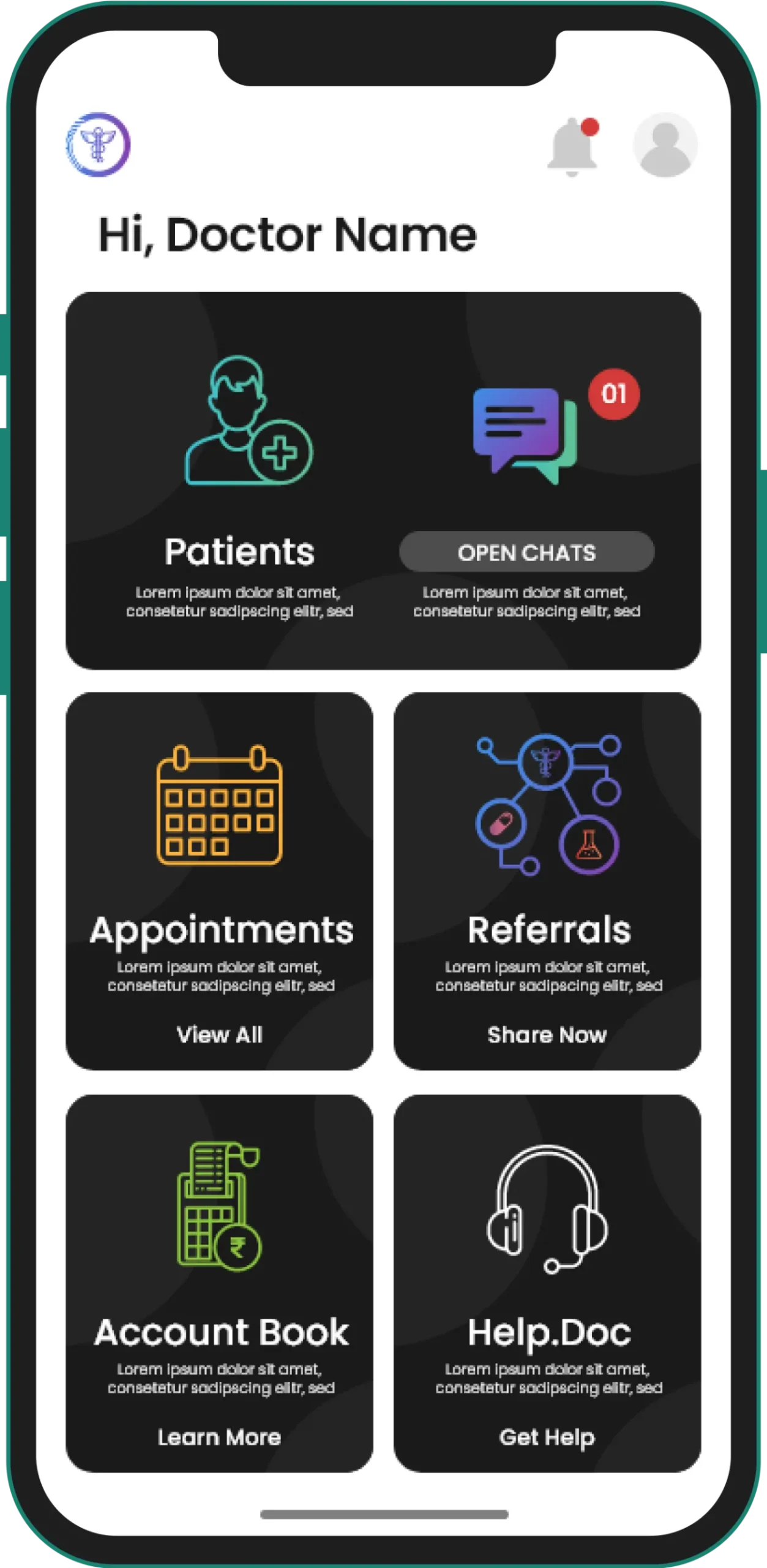
The Connect app (for patients) helps patients to stay connected to their doctors. It enables a one-on-one interaction between the patient and the doctor through a chat interface.
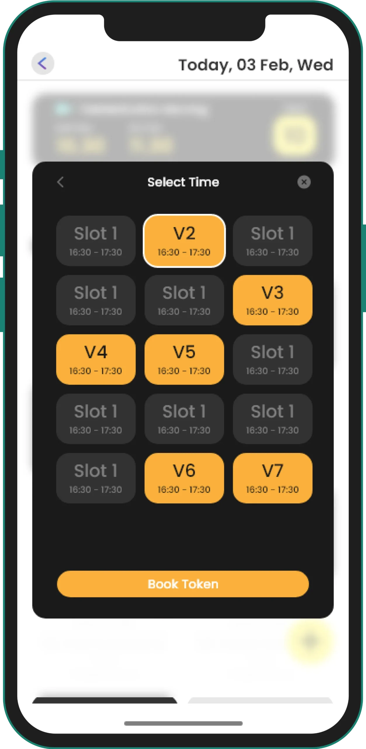
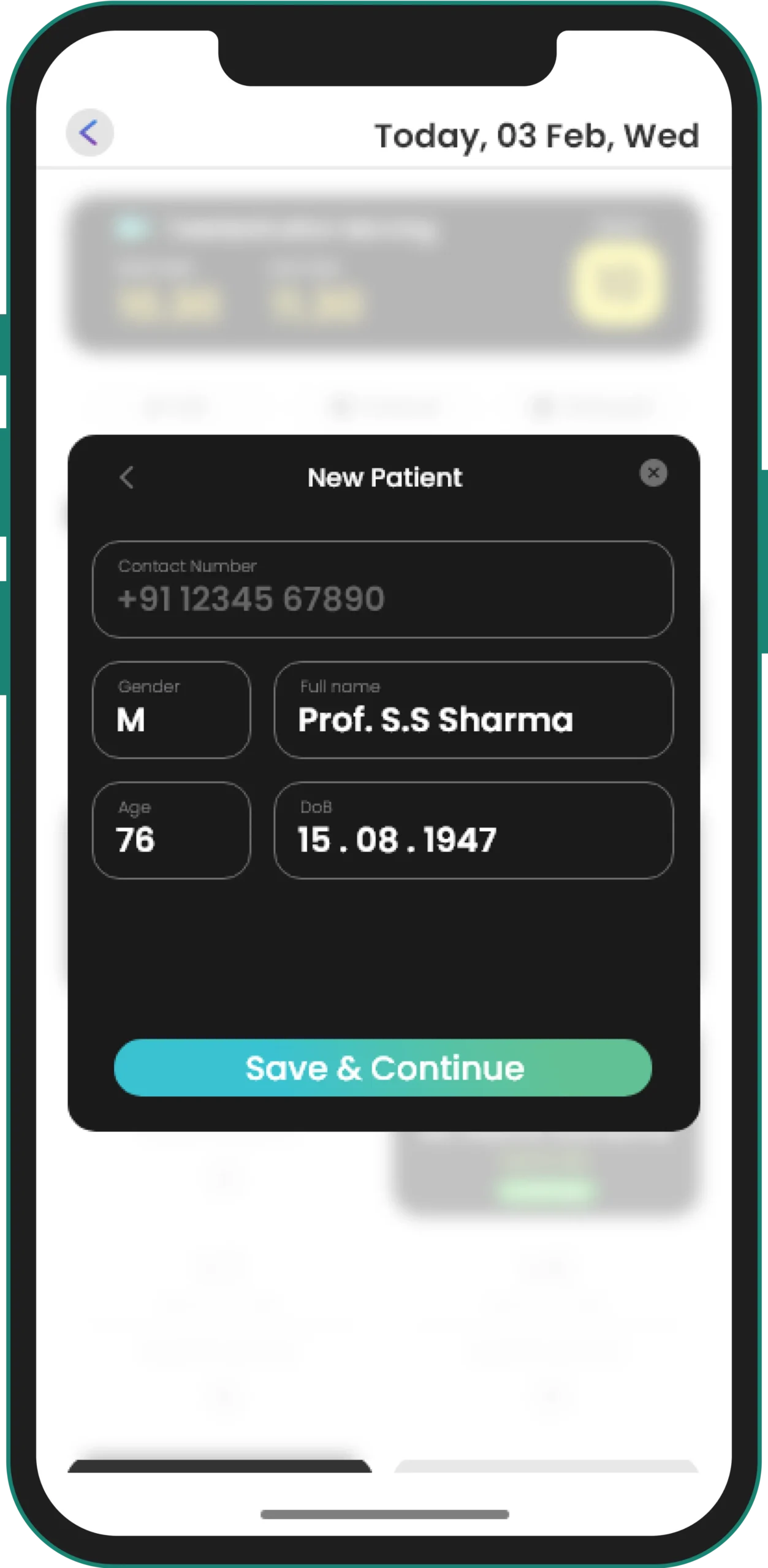
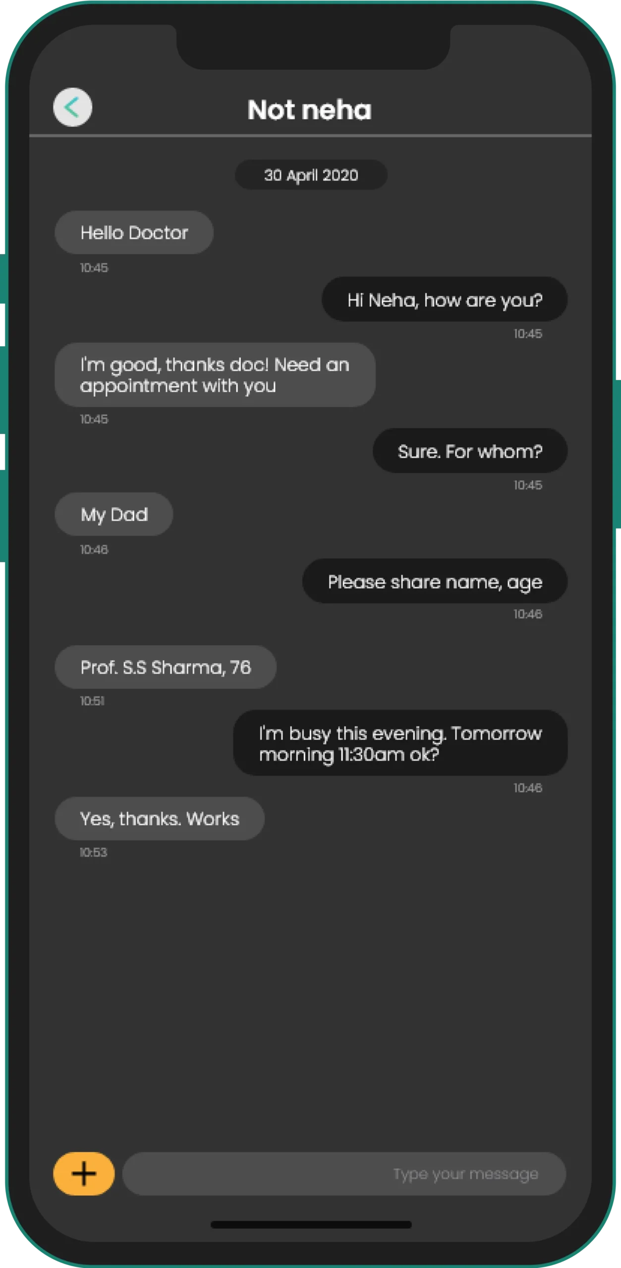
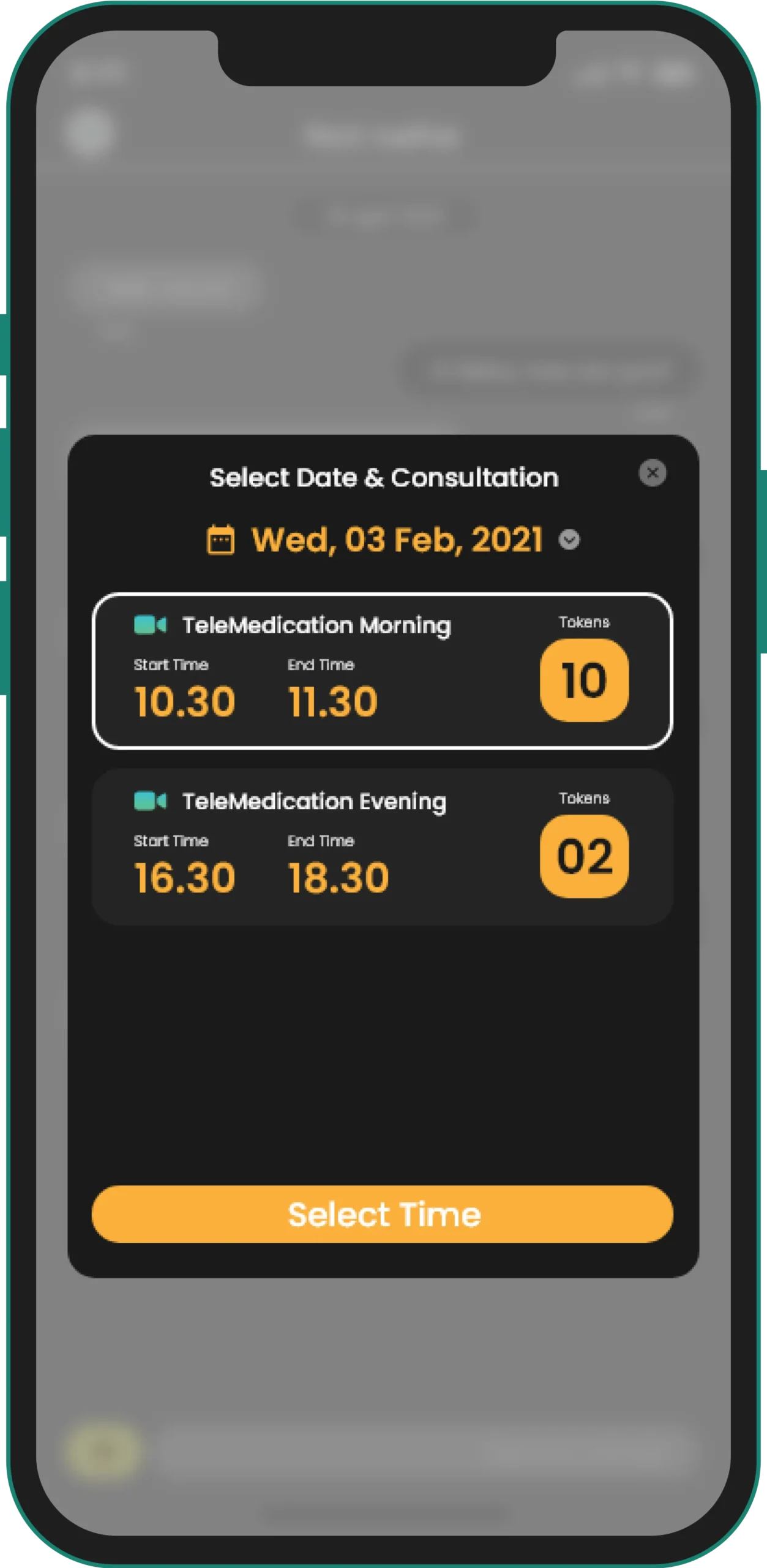
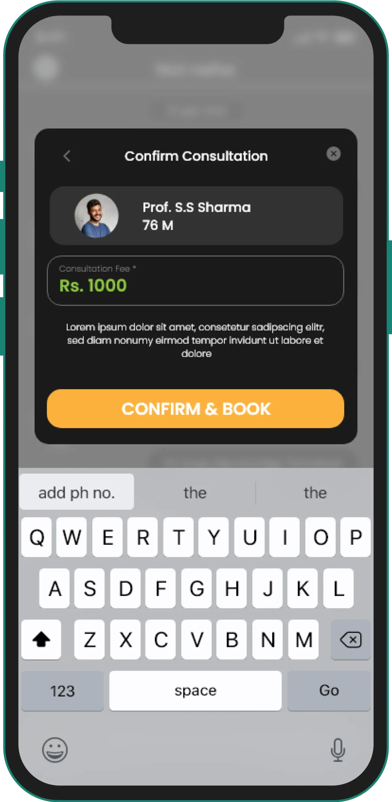
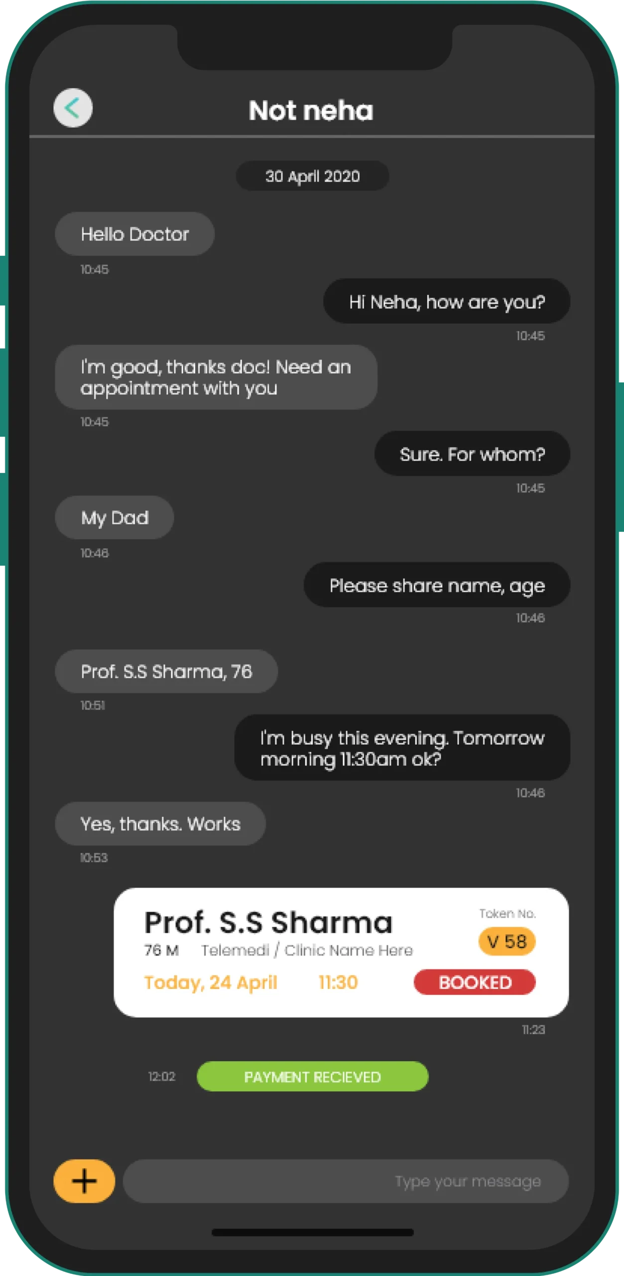
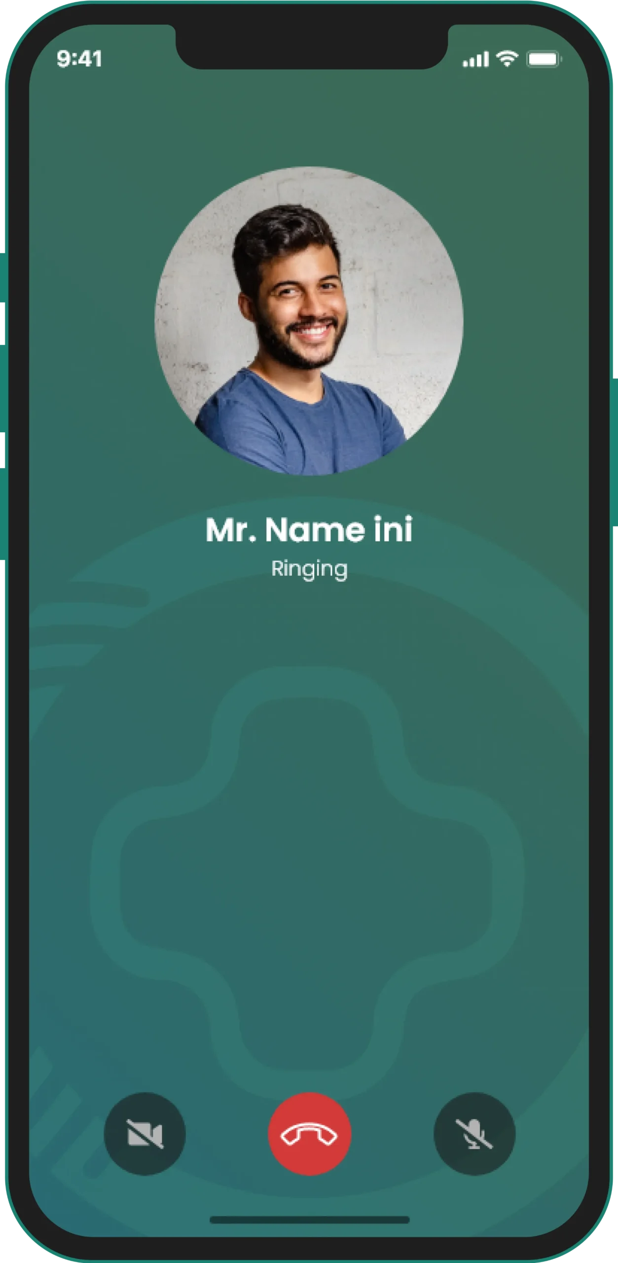
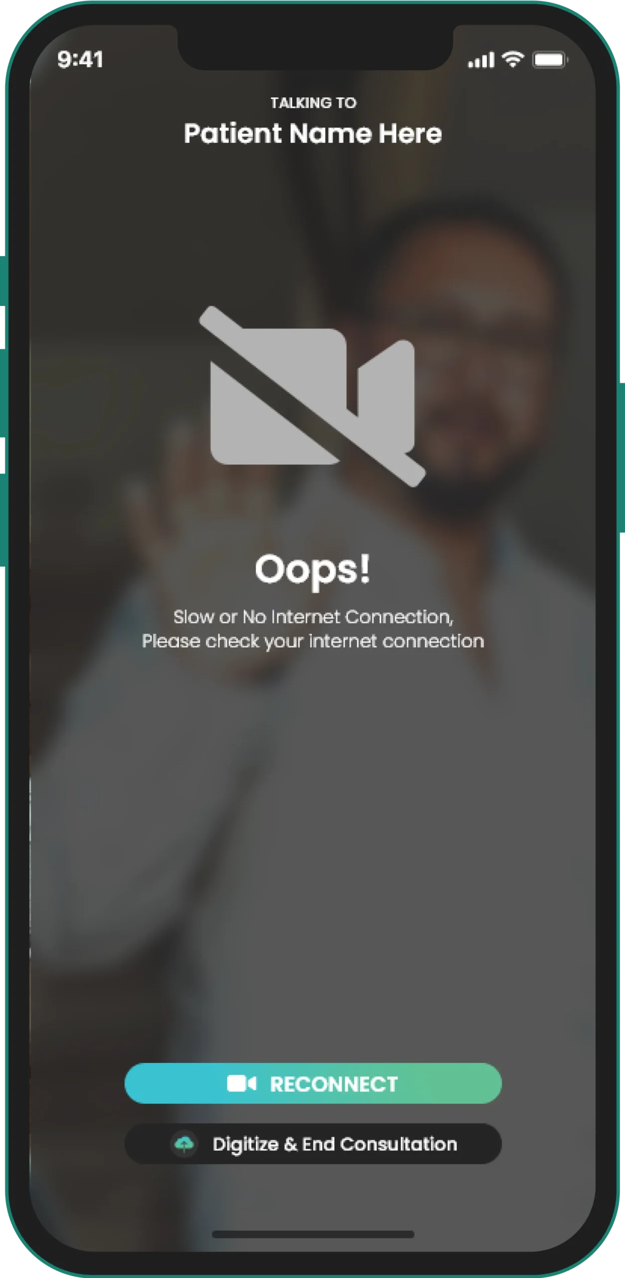
The Connect app enables video calling between doctors and patients.
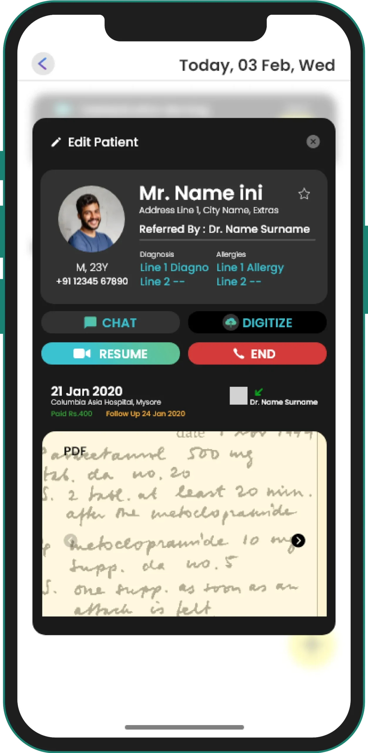
The patient can access all his records in one place.
Though the patient will get access to the doctor through text chat and video chat, the control would still be with the doctor.
As we created the suite, keeping the doctor as the center of the ecosystem.
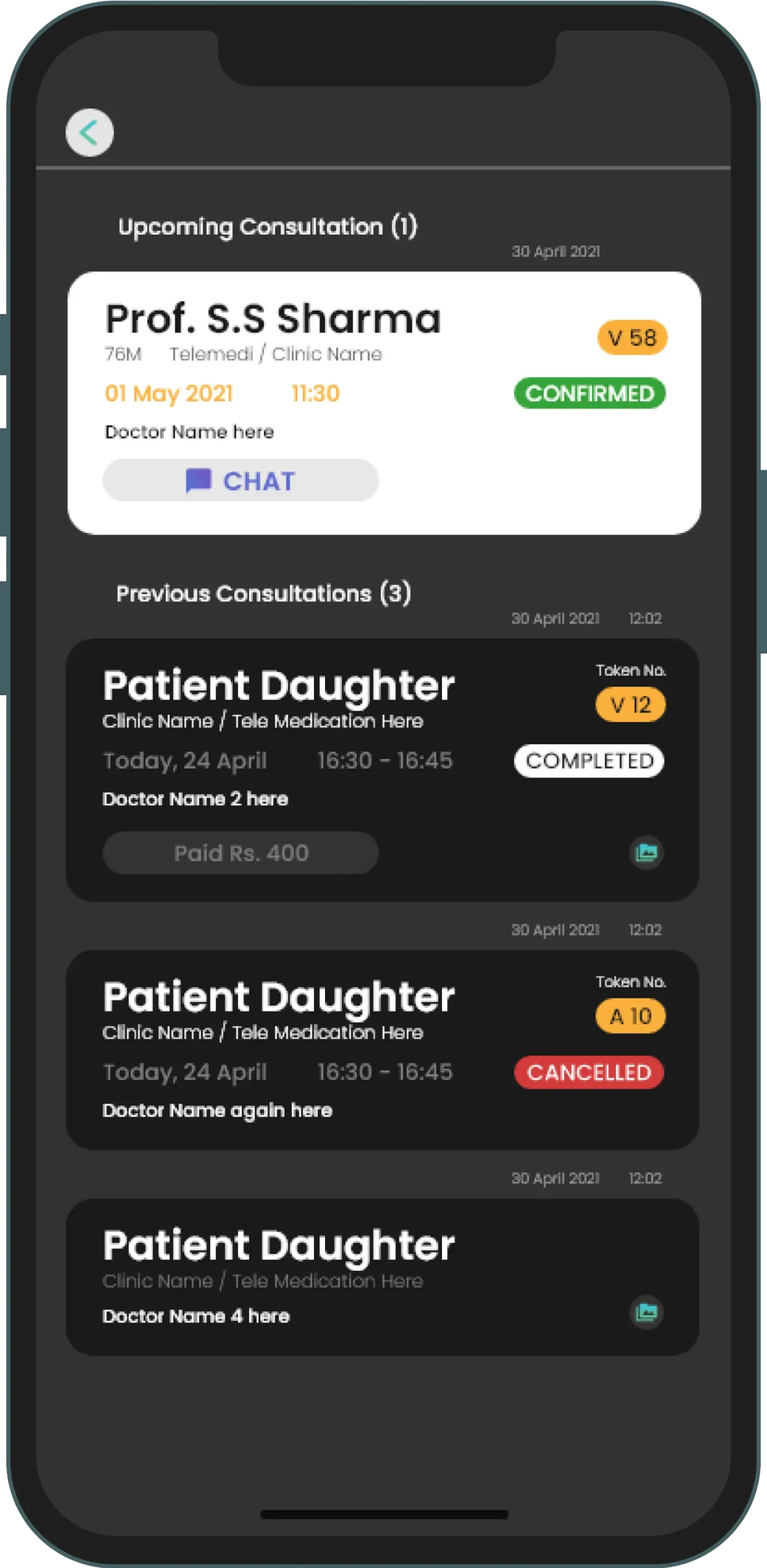
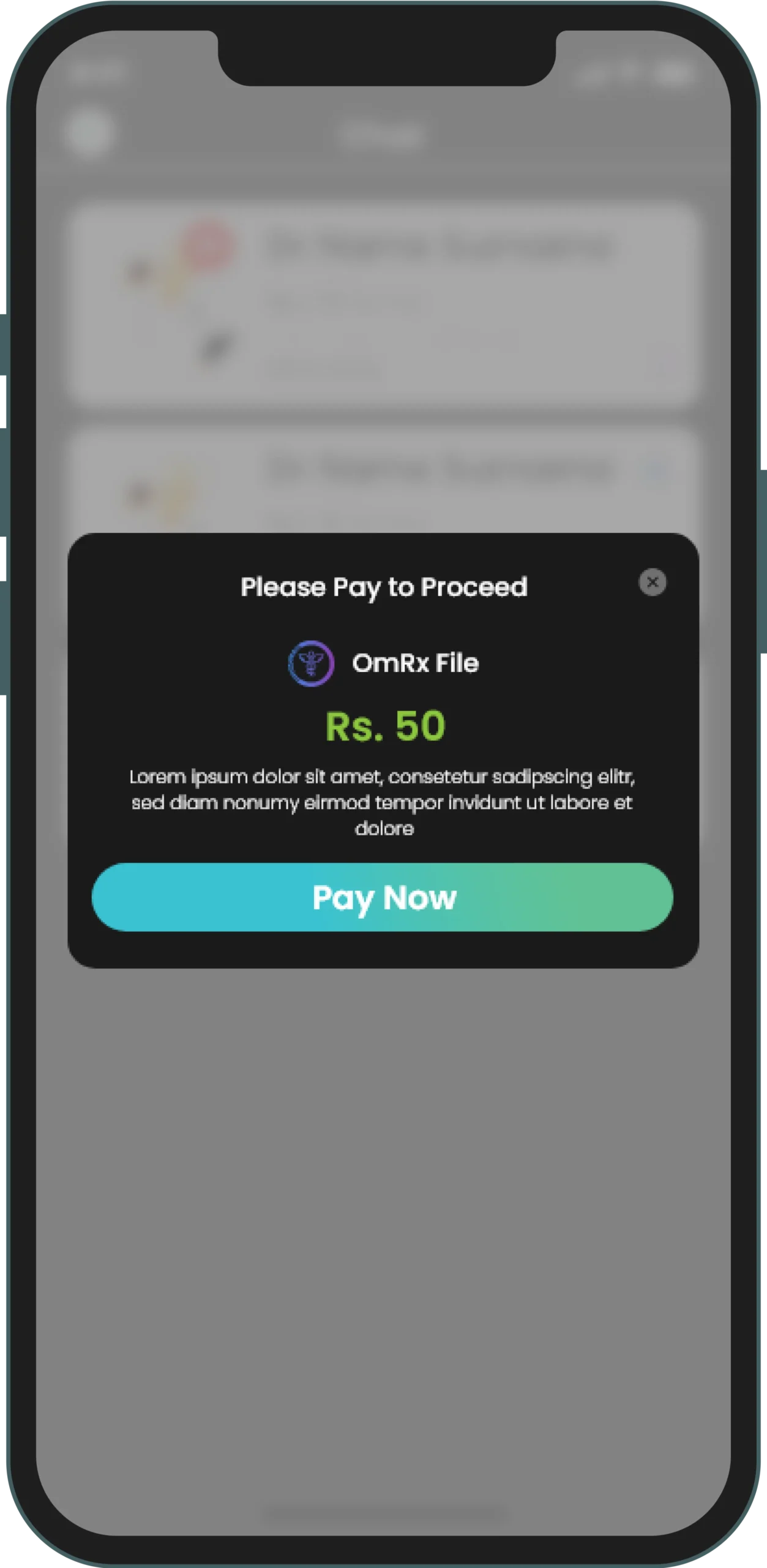
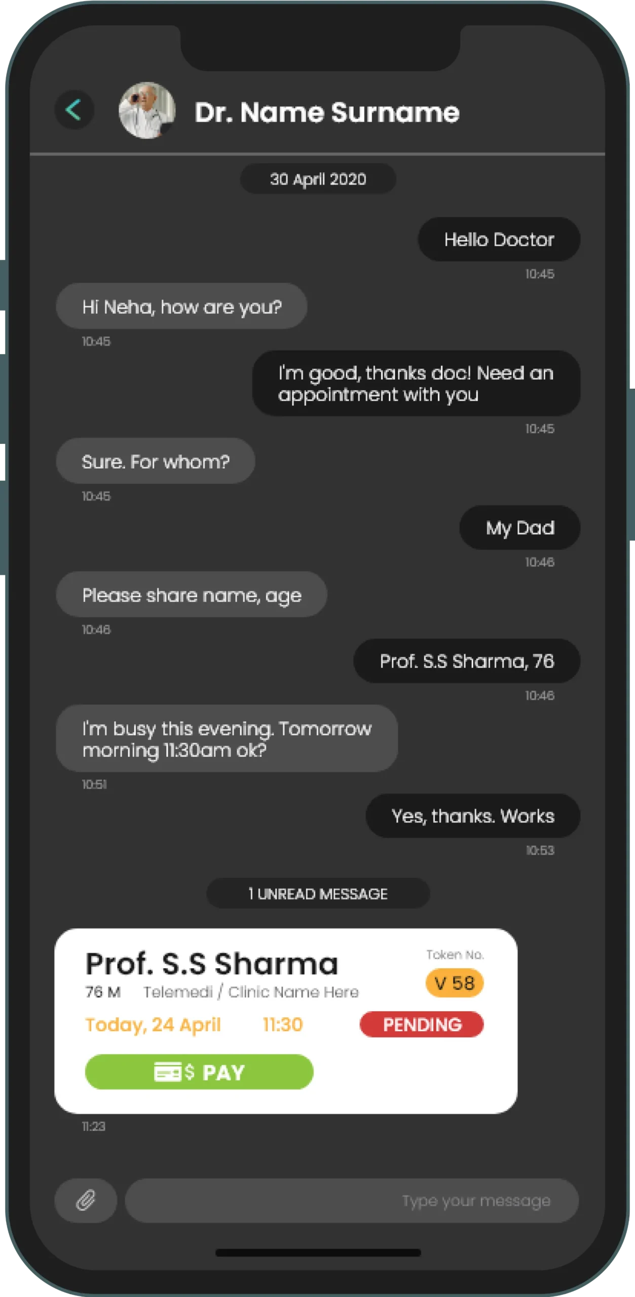
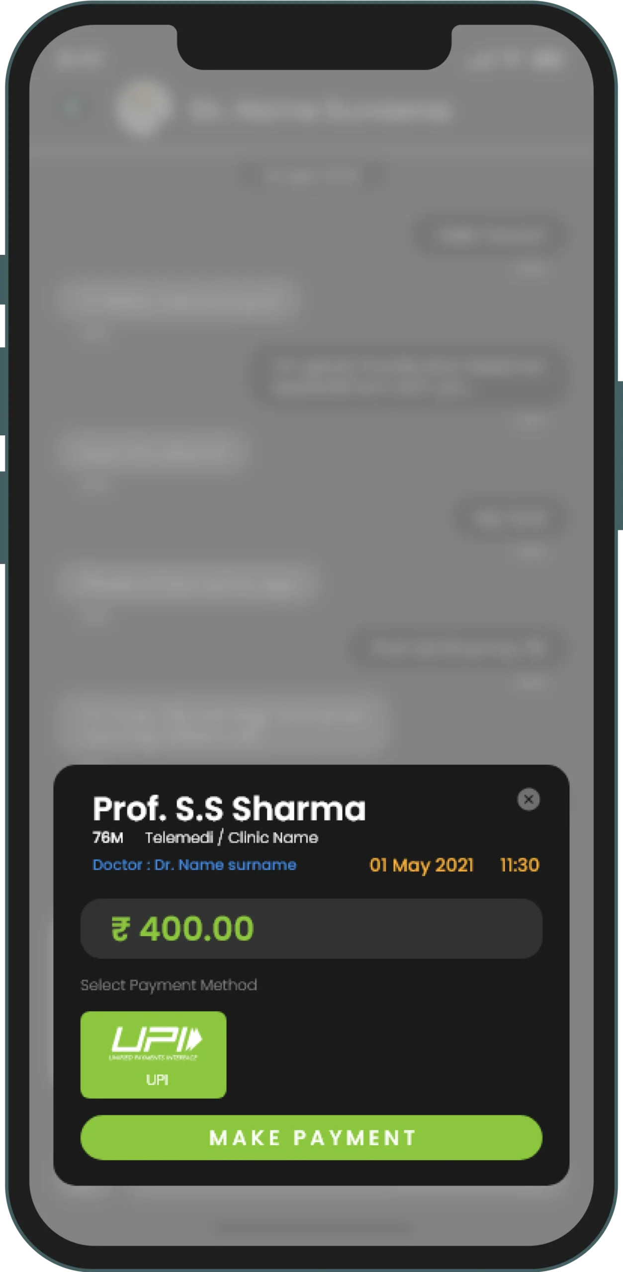
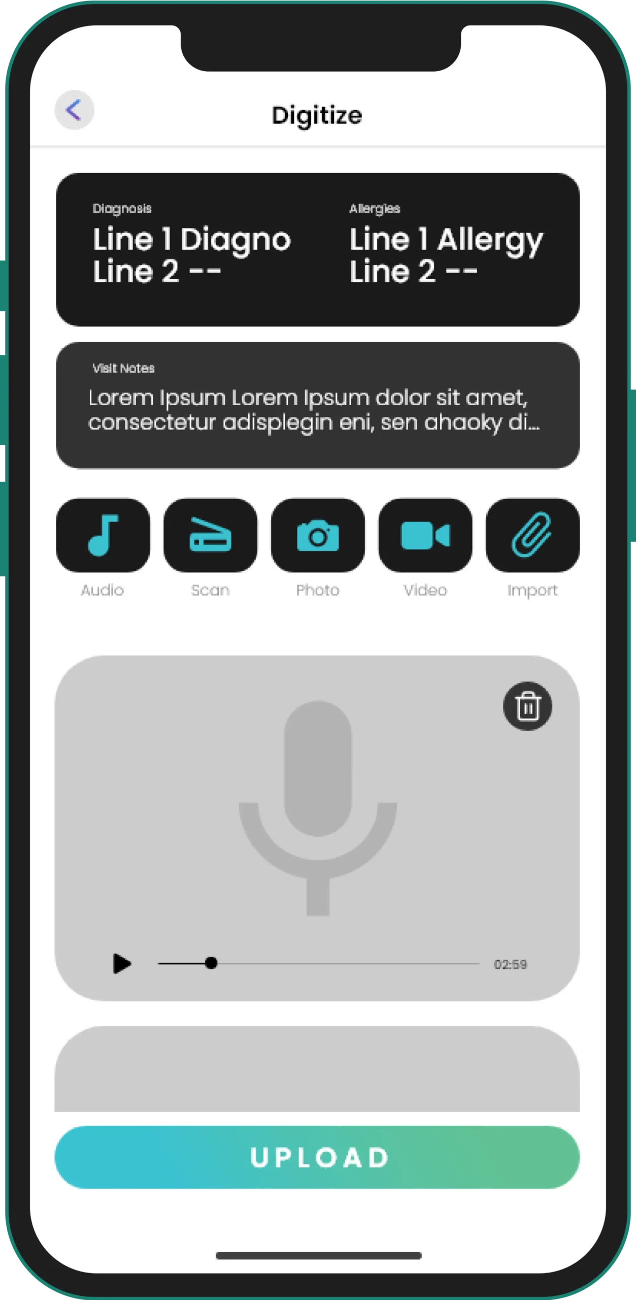
The OmRx app enables the digitization of health data, accounting, and receptionist access across multiple practice locations. This allows the doctor to handle his hospital patients and personal clinic patients, and manage time better creating a healthy work-life balance along with enhanced patient care.
In a very short time, over 3000 doctors joined the platform and the company was able to raise venture capital for their future build based on the UI design that we provided them.