Thank you! Your submission has been received!
Oops! Something went wrong while submitting the form.
Turning Digital Presence Into Personal Brands
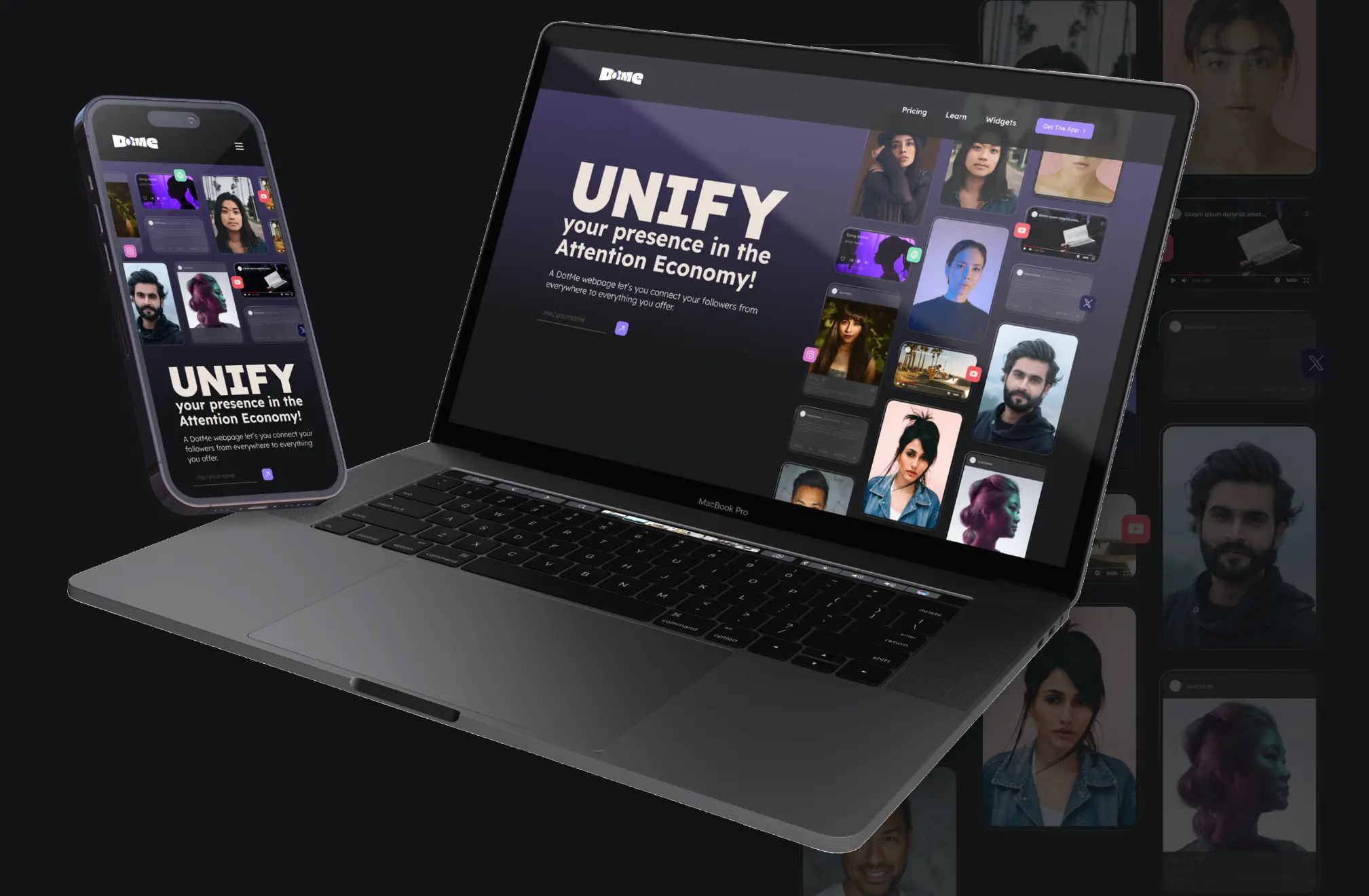
DotMe is not just a link-in-bio tool. It is a digital calling card for the new-age creator. It's a platform that lets your online presence do more than just exist and turn over. It unifies content, analytics, and audience engagement into one seamless, ultra responsive profile. From creator to curator, DotMe turns bios into brands and followers into partnerships.
We built a brand that matched the ambition: sharp, cool, and made to move.
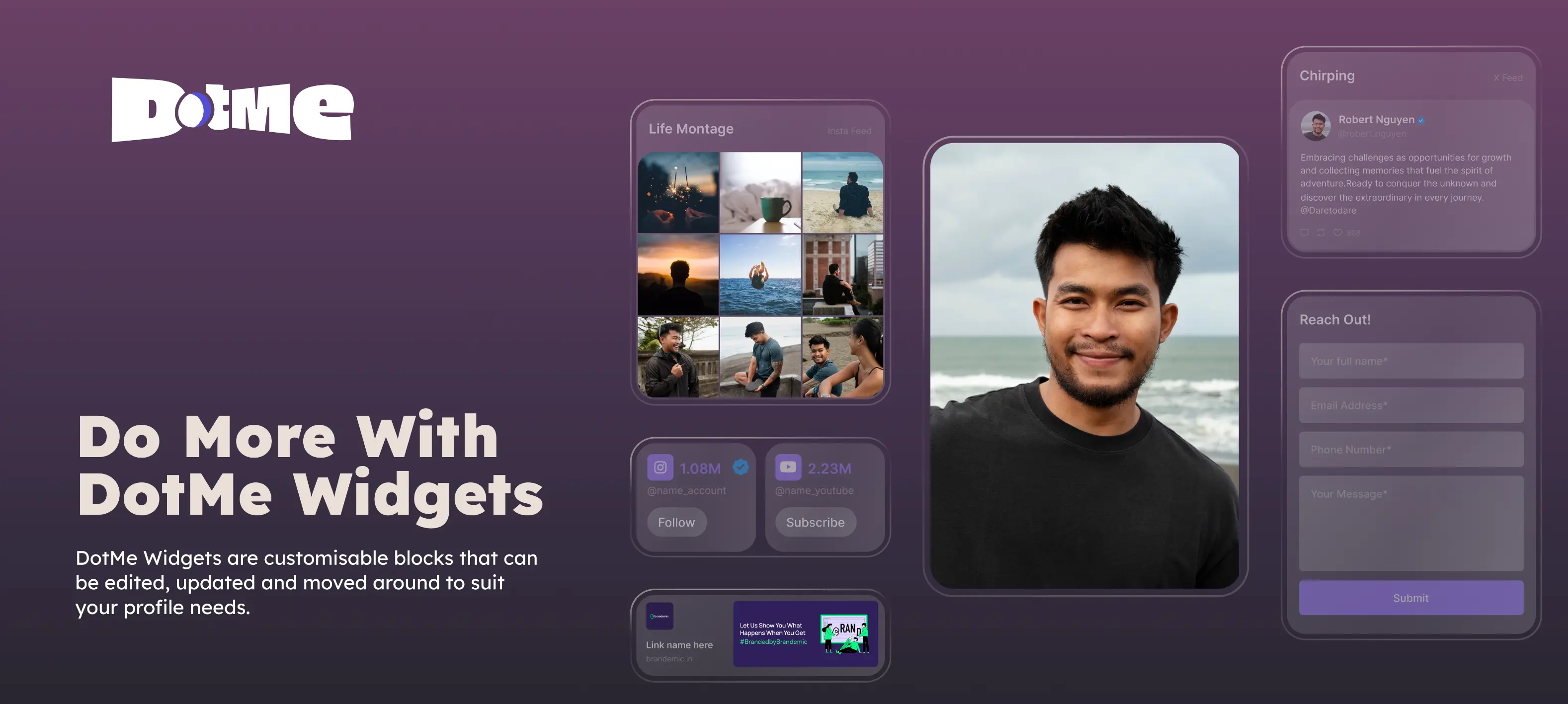
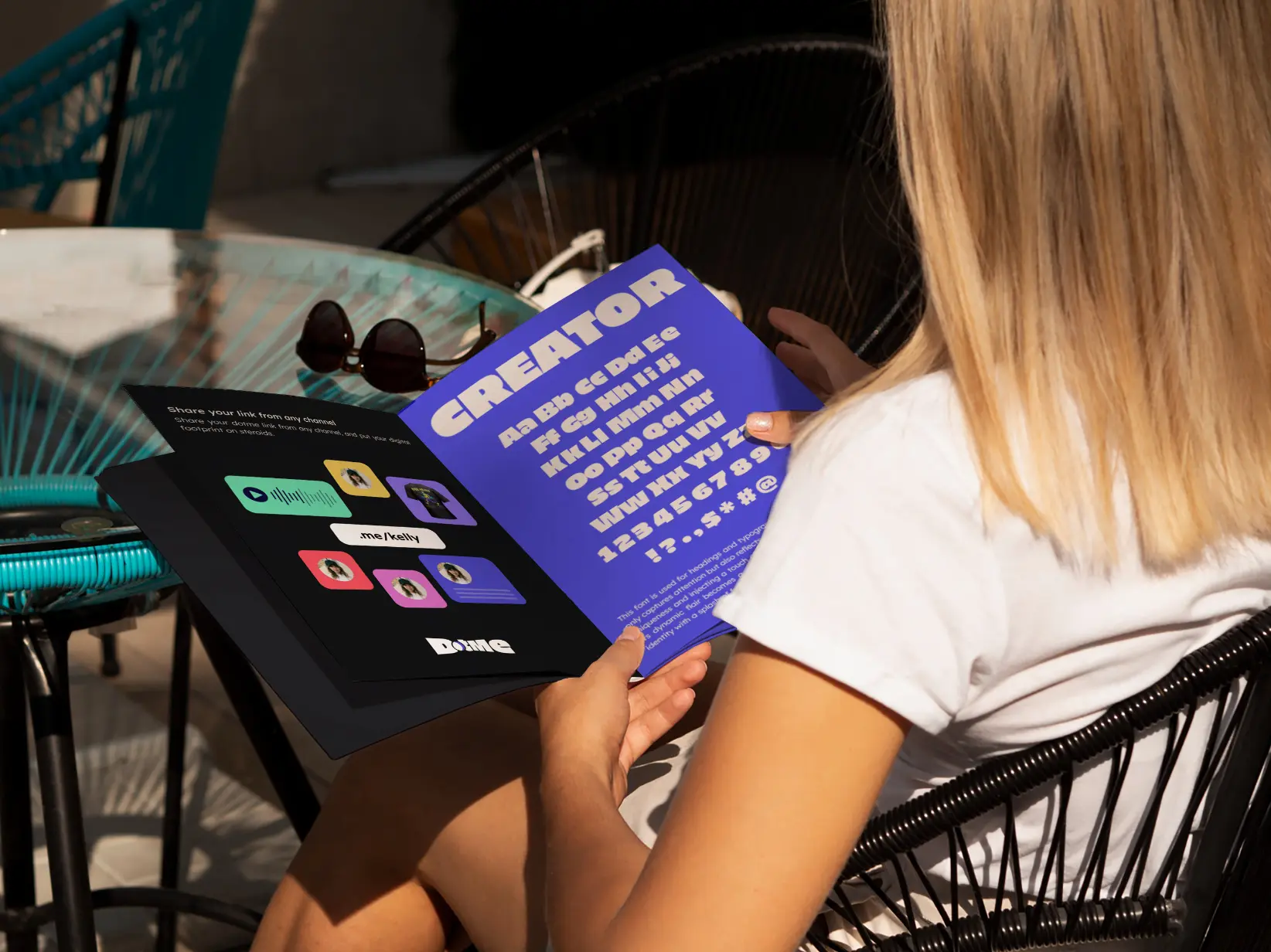

Design an iconic logo with enough edge to be memorable and enough restraint to feel premium.
Create a voice and system that speaks to culture without mimicking it.
Distil multiple functions into a fluid, magnetic user journey.
Execute a fast go-to-market without compromising on craft.
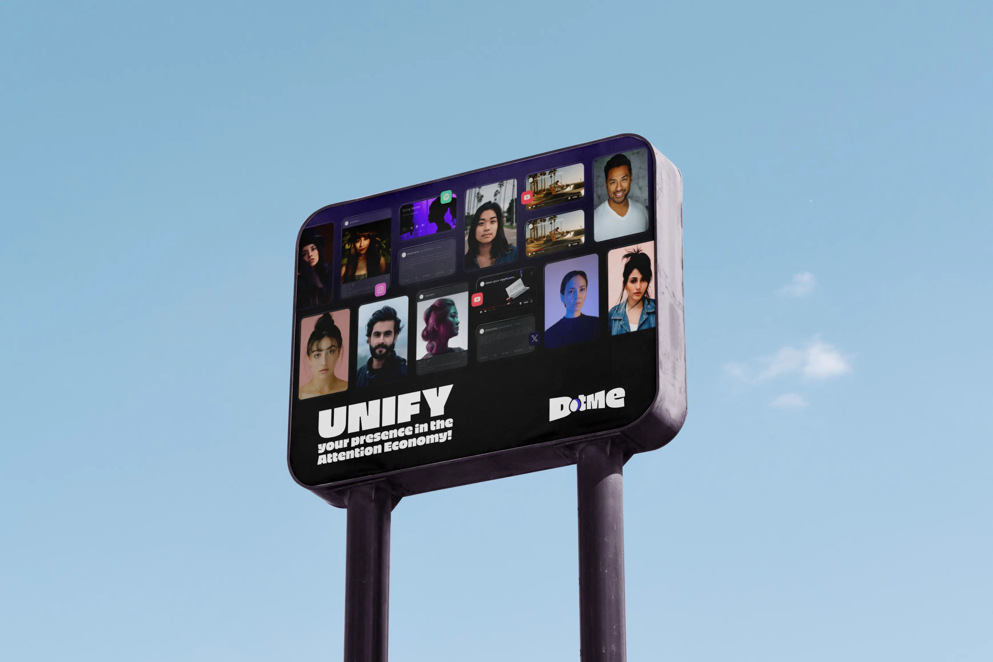
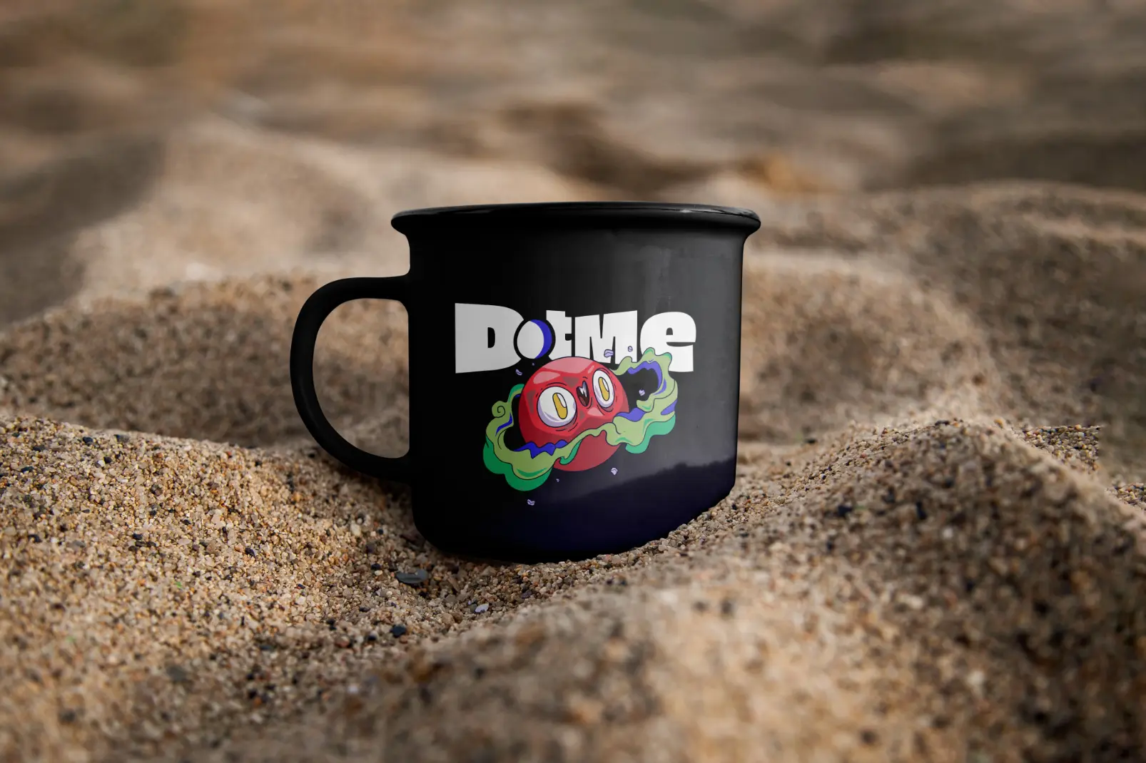
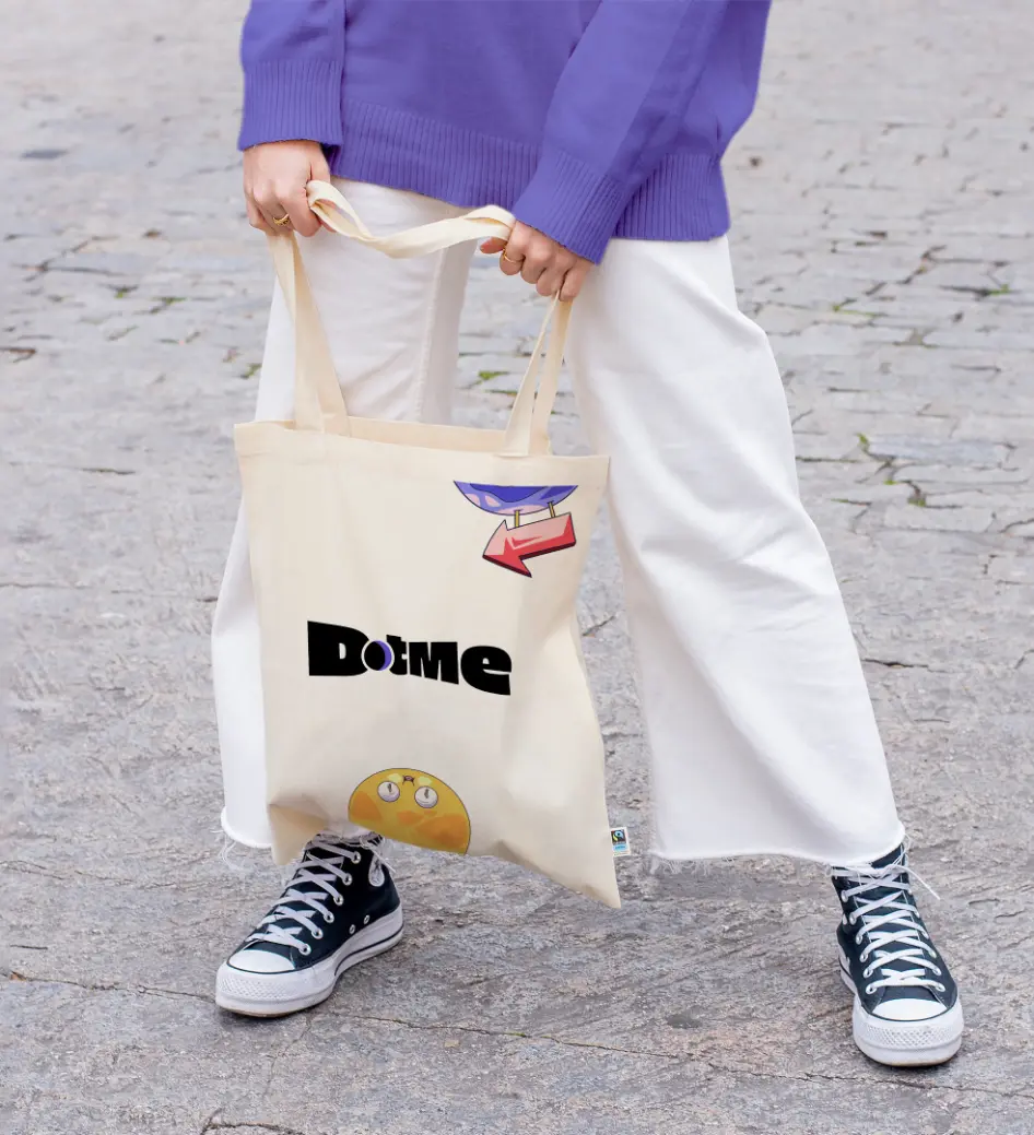


DotMe’s identity system was built to flex. The logo is clean but supercharged. The colour palette is confident. Typography walks the line between tech-forward and lifestyle-aware. The interface moves like the people using it; fast, intentional, and built for connection.
We stripped away anything that looked like filler or unfunctional. What stayed was sleek, stylish, and wired for scale.


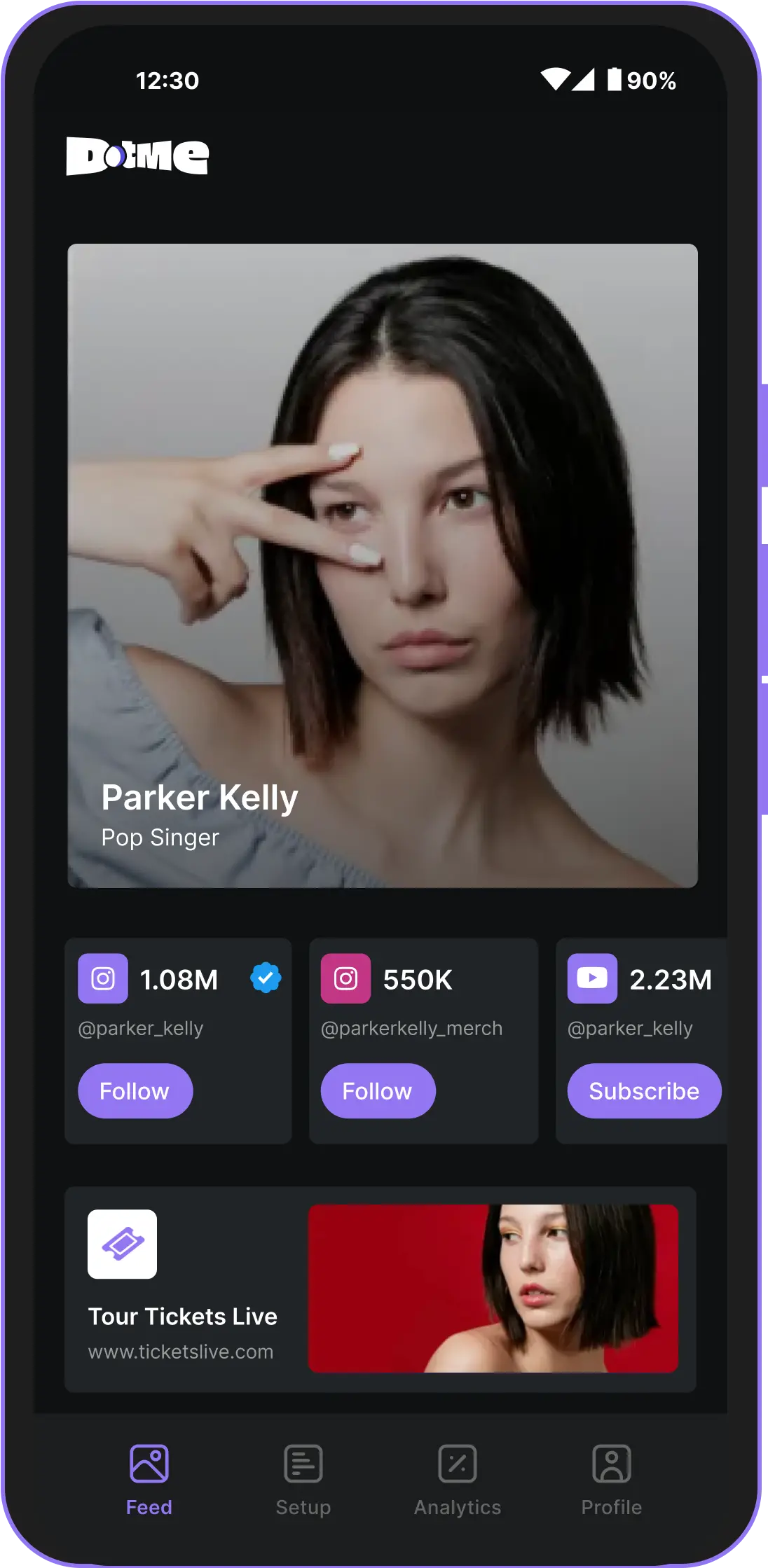
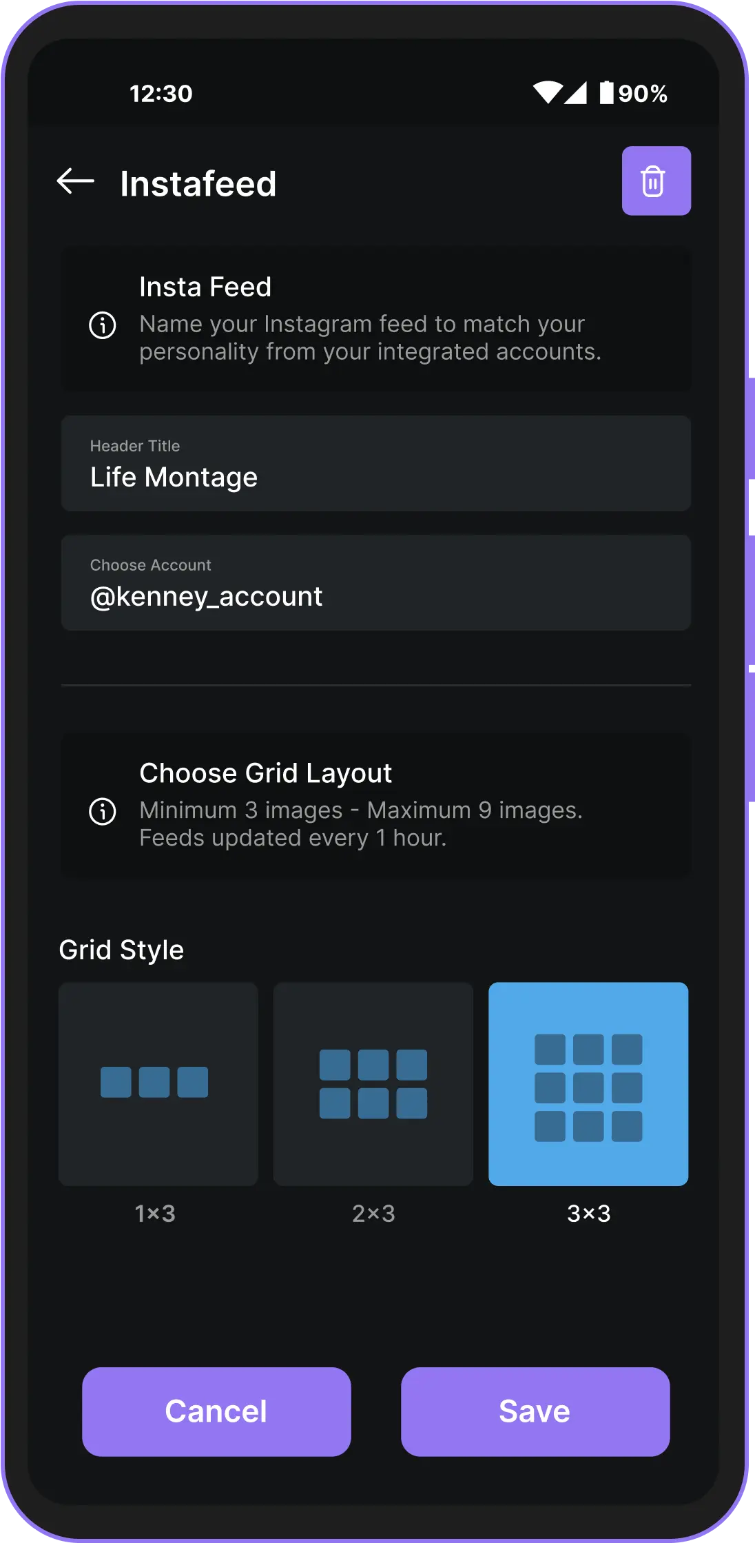
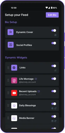
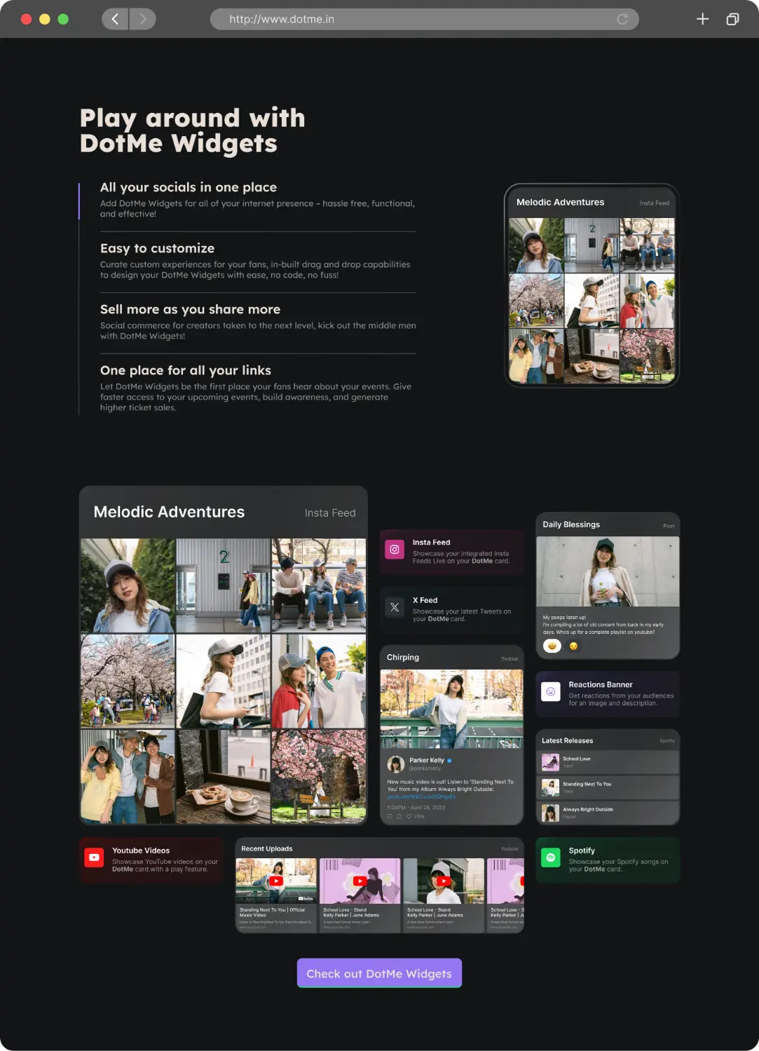

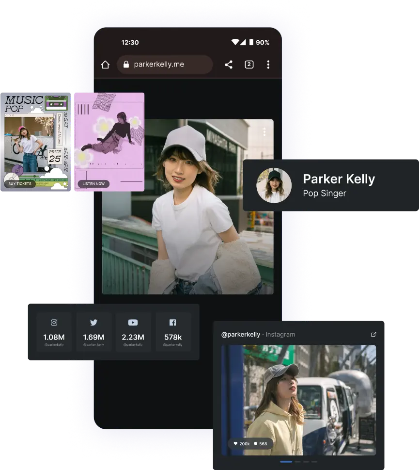


DotMe’s brand shows up with clarity and suave. Every detail was chosen for high digital fluency. It feels right on your screen, in your feed, or in front of an investor. It is what a next-gen tool should look like i.e. clear enough to trust, sharp enough to desire.
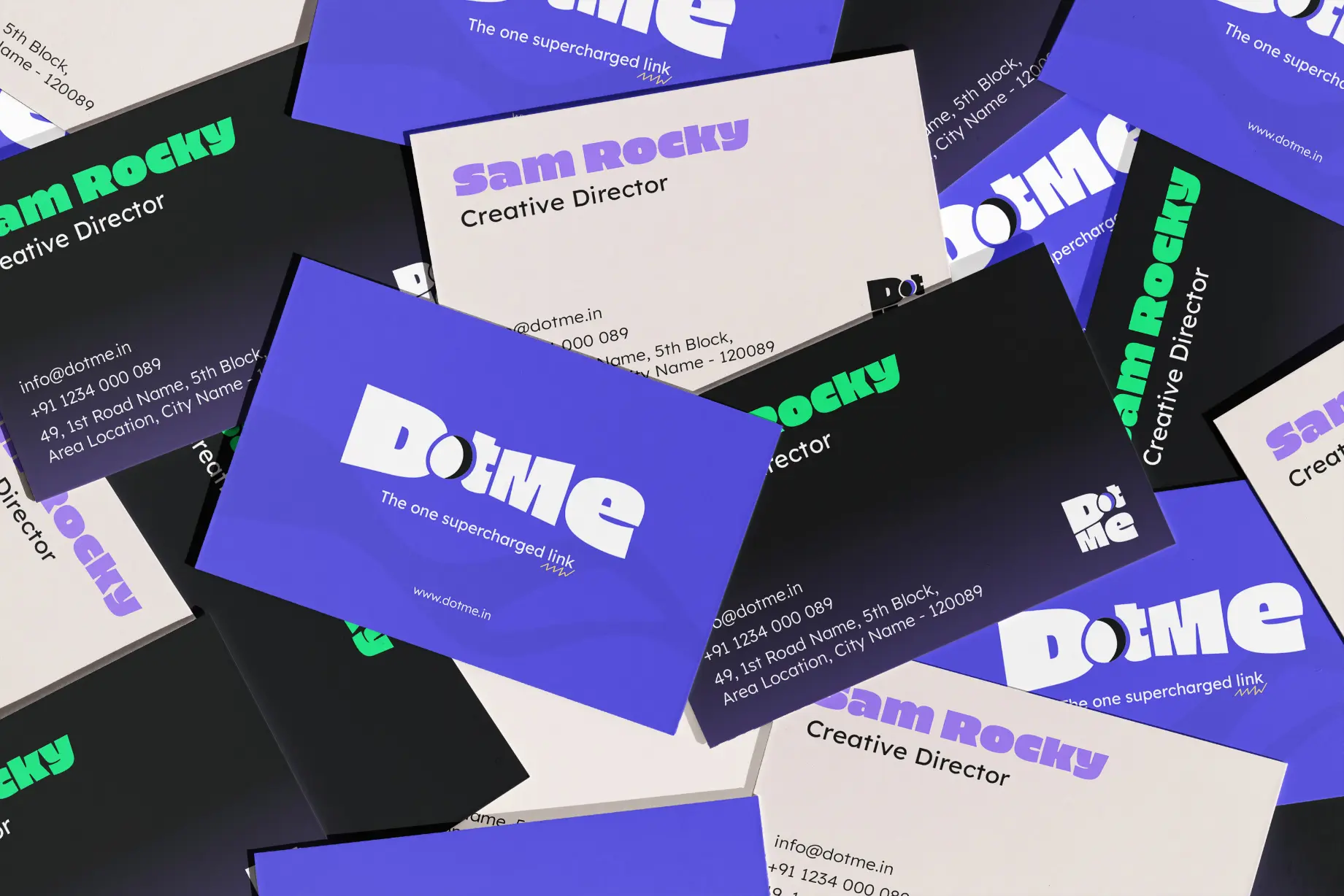
DotMe did not just launch. It landed. The brand earned its space in a competitive market by being unapologetically polished and unmistakably relevant. It brought creators the tools they needed, with a system they actually wanted to use. And that made all the difference.