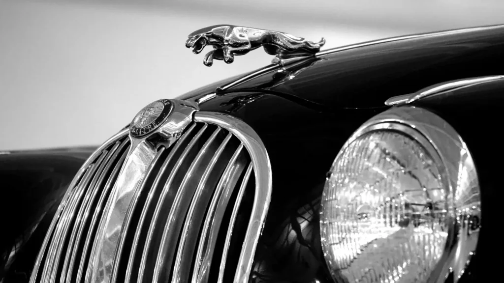
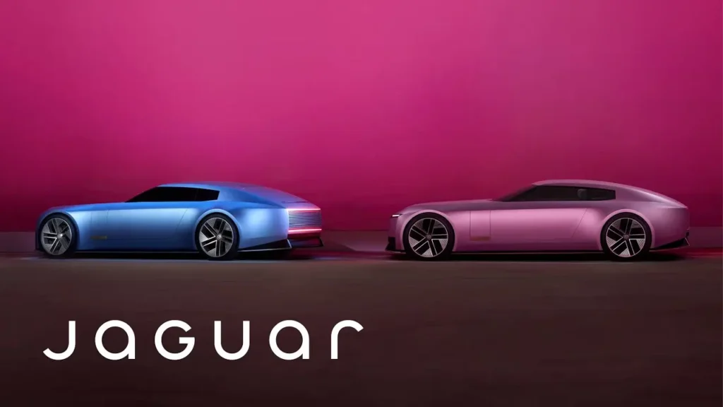
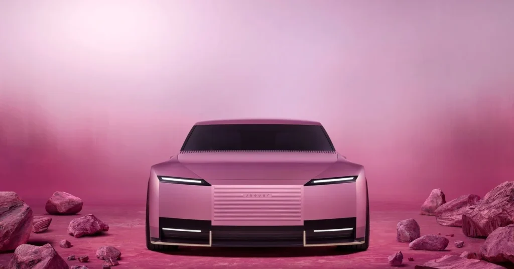
In 2024, the automotive world was taken by surprise when Jaguar revealed its highly anticipated Jaguar’s Rebranding. Known for its iconic leaping cat logo and its blend of power, luxury, and performance, Jaguar has long been synonymous with class and elegance. However, the company’s decision to embrace a minimalist design overhaul- complete with a simplified logo and sleek new visual identity- has divided opinions across the globe.
For years, minimalist rebranding has been a trend embraced by many brands in search of modernity and innovation. From Apple to Mercedes-Benz, minimalism has often signaled a shift toward sophistication, appealing to younger, eco-conscious consumers. But Jaguar’s attempt to adopt this minimalist approach raised eyebrows for many long-time fans, who felt that the iconic “leaper” was an inseparable part of the brand’s character.
This blog explores the controversies and conversations surrounding the Jaguar rebrand, diving into why it chose this bold new direction, how minimalism is reshaping branding across industries, and whether Jaguar’s gamble will pay off. Let’s break down the reactions, the rationale, and the future of the iconic British automaker.

Jaguar, a legendary name in the automotive industry, has been synonymous with performance, luxury, and sophistication since its founding in 1935. Known for its stunning designs and high-end cars, the brand’s identity was built around concepts like speed, power, and prestige. Jaguar cars were not just vehicles; they were symbols of status, the epitome of automotive excellence.
However, in an era where brands must constantly evolve to stay relevant, Jaguar found itself at a crossroads. The shift towards electric vehicles (EVs) and the broader push for sustainability created an opportunity for Jaguar to refresh its image and connect with a new generation of consumers.

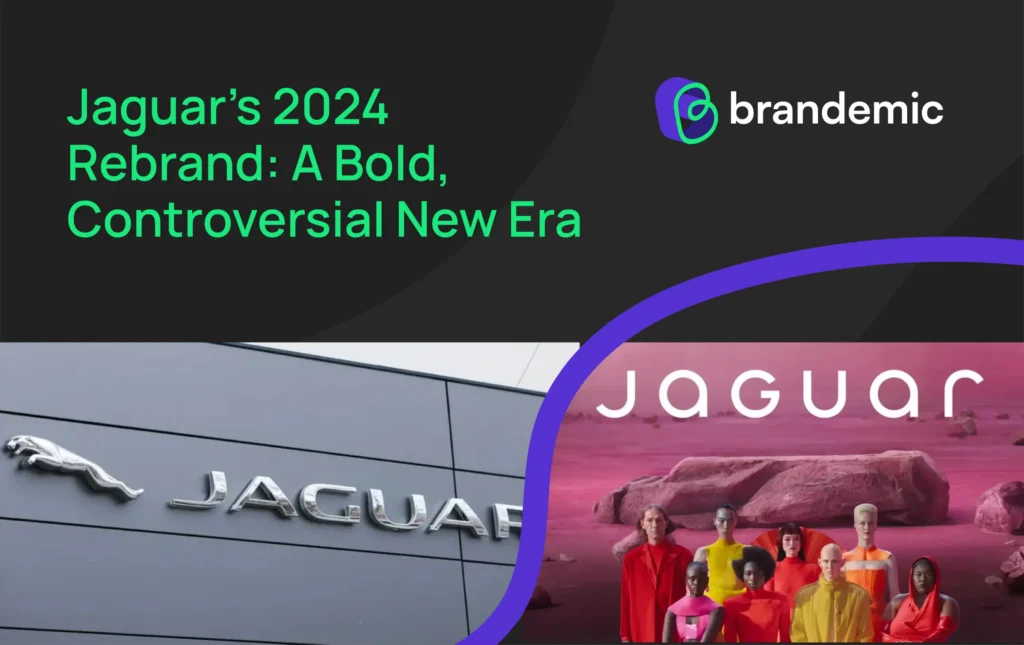
In 2024, Jaguar unveiled a complete overhaul of its brand identity, leaving behind much of its traditional imagery. The most noticeable change was the new logo, which stripped away the iconic “leaper” (the leaping jaguar) in favor of a minimalist, geometric wordmark. The bold and modern approach was in stark contrast to the intricate designs of Jaguar’s past. The new logo now features a sleek “JAGUAR” wordmark with mixed upper and lower case letters, signaling a shift toward a cleaner, more contemporary aesthetic.
The rebranding also brought in a new color palette, incorporating bold, vibrant hues inspired by primary colors. These bright shades, paired with edgy visuals featuring diverse models in high fashion rather than cars, signified a move away from traditional luxury to something more inclusive, artistic, and forward-thinking.

The move toward minimalism in design has been gaining traction in recent years, especially within the automotive industry. Brands like Audi, Tesla, and Mercedes-Benz have embraced simpler, more streamlined logos and branding elements. The idea is to convey sophistication and modernity through simplicity, often signaling innovation and cutting-edge technology.
For Jaguar, this rebranding is part of a broader strategy to align with its shift toward electric vehicles and sustainable practices. According to Jaguar’s Managing Director, Rawdon Glover, the brand aimed to create a “fearless” identity that would resonate with a younger, more diverse audience. By embracing modernism, Jaguar is positioning itself as an aspirational and creative force within the luxury automotive sector.
However, while minimalism can be a great tool for some brands, for others, it can feel like a loss of character. This has been the crux of the backlash from many Jaguar fans and critics. The new logo and visual language, some argue, strip away the very essence of what made Jaguar iconic. In focusing on a clean, abstract look, the brand risks losing its identity as a symbol of speed, elegance, and power.
The reaction to Jaguar’s new look has been nothing short of polarized. On social media, users have been quick to express their displeasure with the new design. Some critics have claimed that the new logo feels more aligned with “organic” or “ethically sourced health supplements” than a performance vehicle brand. Others, particularly on platforms like Reddit and Twitter, have pointed out that the sleek, geometric look is too far removed from Jaguar’s powerful legacy.
Interestingly, even high-profile individuals like Elon Musk have weighed in on the rebranding, although their responses have been less about the design itself and more about Jaguar’s transformation into an electric vehicle brand. This only adds to the discussion about whether Jaguar’s rebrand is truly about a new identity or simply a reflection of the company’s pivot towards a different future.
Elon Musk asking what everyone is thinking about that Jaguar Ad. 😂 https://t.co/bziQbCG5k8
— Samye (@sammyscottt) November 19, 2024
Jaguar’s response to the backlash has been consistent. The company has not shied away from criticism. Instead, it has embraced the discourse, repeatedly stating that the rebrand is a “renaissance” and that the new direction is a deliberate break from the past. According to their PR team, this change was essential to reclaim Jaguar’s originality and better reflect the brand’s focus on creativity, innovation, and sustainability.
Despite the mixed feedback, Jaguar seems committed to its vision. The company is planning a comprehensive rollout of this new identity, focusing on modern luxury and artistic expression. The brand’s PR team has stated that the journey is just beginning, and they are excited to showcase the new visual language during key events such as the Miami Art Week

While Jaguar’s new minimalist approach is certainly radical, it’s not without precedent. Some of the most successful brands in the world have adopted minimalist designs to great effect. Apple, for example, embraced a simple, clean logo that resonated with its ethos of innovation and simplicity. Likewise, the sleek design of Tesla’s logo aligns perfectly with its modern, forward-thinking brand image.
Yet, not all rebrands are successful. Brands like Tropicana and Gap faced significant backlash after their attempts at minimalism in the 2000s, leading to quick reversals. The critical difference here, however, is that Jaguar is betting on a long-term cultural shift towards sustainability and the luxury of simplicity. Whether this gamble will pay off remains to be seen.
Jaguar’s rebranding is a bold statement about the future of luxury, performance, and sustainability. By taking a minimalist approach, Jaguar is attempting to redefine what it means to be a high-end, forward-thinking car brand in a world increasingly concerned with environmental impact and design purity. However, whether this rebranding effort will win over the brand’s traditional fanbase while attracting a new, younger audience is a delicate balance.
The response to the rebrand, especially from loyalists, shows that a brand’s identity is not just about its visual language but also its emotional connection with consumers. Jaguar may have shaken things up, but it’s clear that the debate over the brand’s new look is far from over. The coming months will reveal if this rebrand truly repositions Jaguar as a modern luxury powerhouse or if it risks losing touch with its legacy.
This transformation- while exciting- is not the end, but rather a new beginning for one of the world’s most storied brands.
Jaguar’s shift to a minimalist logo aligns with its move toward becoming an all-electric luxury brand. The clean, simplified design reflects modernity, innovation, and the future-forward approach the brand aims to embody. This rebrand is part of Jaguar’s broader “Reimagine” strategy, introduced to reposition the brand in the competitive EV market.
The rebrand has sparked mixed reactions. While some appreciate the sleek and contemporary design, others feel the logo has lost the character and dynamism of its leaping Jaguar emblem. Many enthusiasts argue that the previous design better captured Jaguar’s legacy of elegance and performance.
Yes, many luxury brands have embraced minimalism to appeal to modern, digital-first audiences. Companies like Burberry, BMW, and Volkswagen have adopted simpler logos for better scalability and relevance in digital mediums. However, this trend has been divisive, with critics pointing out that it sometimes dilutes the unique personality of iconic brands, as some argue has happened with Jaguar.
This site is protected by reCAPTCHA and the Google Privacy Policy and Terms of Service apply.