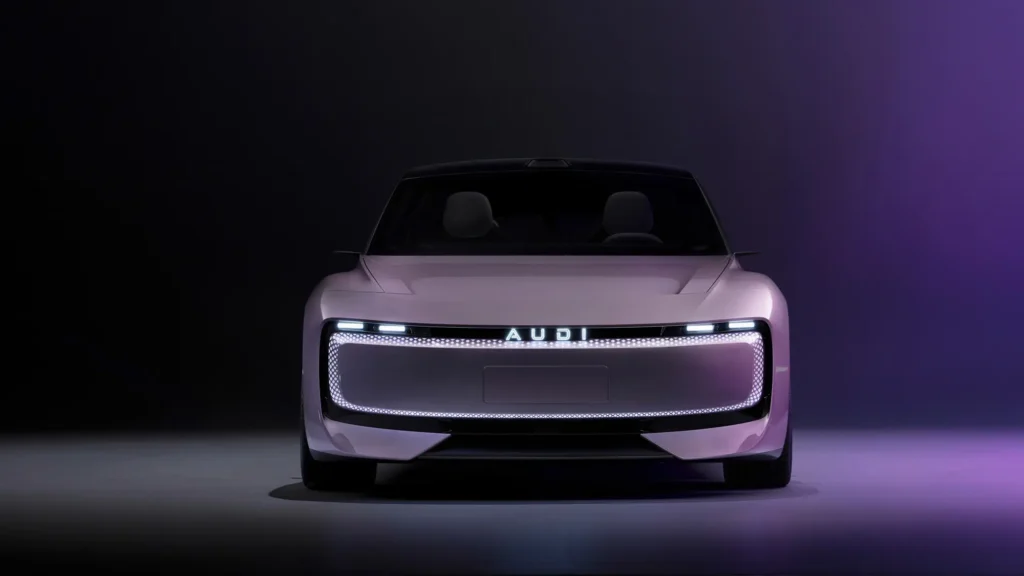
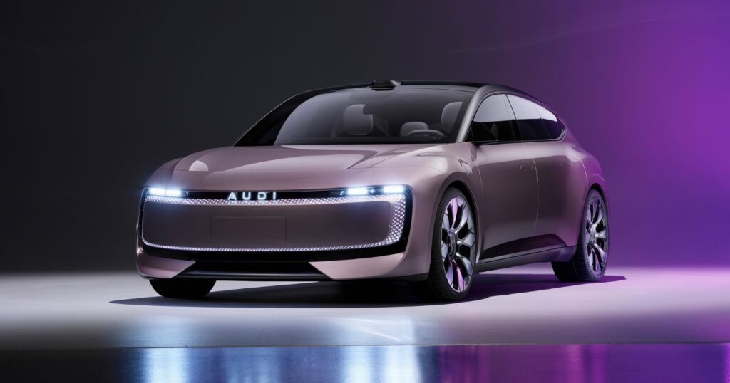
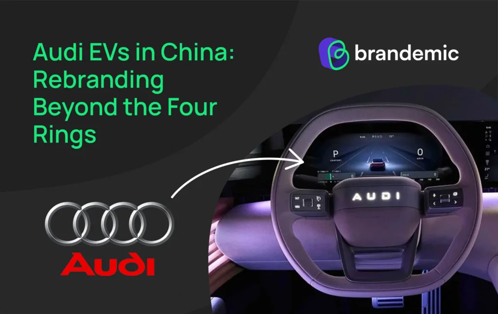
Audi, a brand synonymous with luxury, innovation, and its unmistakable four-ring logo has recently made waves in the automotive world with a daring branding experiment. As part of its strategy to dominate the ever-evolving Chinese EV market, Audi has launched a new sub-brand -AUDI- that departs from its iconic emblem in favor of a sleek, all-caps wordmark. This shift reflects not just a nod to local consumer preferences but also a bold step into uncharted territory for a legacy automaker steeped in tradition.
China, Audi’s largest market, is home to a rapidly growing base of younger, tech-savvy consumers who value modernity and sustainability. By embracing a minimalist aesthetic for its new electric vehicle lineup, Audi is signaling its readiness to adapt to a market that thrives on reinvention. But this move has also sparked global debate: Is Audi’s decision an inspired evolution or a step too far from its heritage? Let’s delve into the history, the strategy, and the mixed reactions to this bold rebranding initiative.

Audi’s journey as a brand is synonymous with innovation, engineering prowess, and luxury- a legacy encapsulated in its iconic four-ring logo. This emblem traces its roots to 1932, when four independent manufacturers- Audi, DKW, Horch, and Wanderer- merged to form Auto Union AG, the precursor to the Audi we know today. Each ring represents one of these founding brands, symbolizing unity and collaboration.
Through decades of evolution, the rings have stood as a constant, representing premium quality, cutting-edge technology, and timeless design. Whether it’s the Quattro revolution in all-wheel-drive systems or the sleek aesthetics of its modern electric lineup, Audi has maintained a visual identity that’s both aspirational and instantly recognizable.
The four rings are more than a logo they’re a symbol of trust and prestige that resonates globally. In an age of increasing brand minimalism, Audi’s logo has managed to evolve subtly while preserving its core identity. The recent move in China, however, challenges this legacy by stripping away the rings in favor of a localized, text-based logo, sparking intense debate about balancing tradition with market-specific adaptation.
This rich history and the symbolic weight of the rings set the stage for exploring Audi’s rationale for this unprecedented shift and its implications for branding in a globalized, yet regionally nuanced, market.

When Audi decided to forgo its globally recognized four-ring logo for the launch of its electric vehicle (EV) lineup in China, it sent ripples across the automotive and branding worlds. This marked a radical departure for a brand deeply tied to its iconic emblem, especially for a product as significant as its EVs.
China is the largest EV market in the world, and Audi’s move reflects a calculated attempt to resonate with this critical audience. Instead of the rings, Audi replaced its logo with a Chinese character wordmark on the vehicles a minimalist yet culturally specific design. This shift aligns with a broader trend of global companies tailoring their branding strategies for specific markets to forge deeper connections with local consumers.
Audi’s leadership has described the change as an effort to reflect a “forward-looking, digital-first identity” while paying homage to its Chinese audience. Their focus on localization highlights the growing importance of cultural sensitivity in branding, especially in competitive markets like China. Audi aims to tap into the tech-savvy, design-conscious millennial and Gen Z demographics who dominate the EV market in China.
The reactions to this change have been divisive:
The rebranding strategy underscores a broader debate within branding- when does adaptation for local markets cross into compromising global identity?

Audi’s push into the electric vehicle (EV) market is a significant shift for the brand, and their decision to drop the iconic four-ring logo for the China launch of their new EV lineup reflects the broader changes taking place within the automotive industry. As the world increasingly leans into sustainability and cleaner energy, the shift to electric mobility presents both an opportunity and a challenge for legacy carmakers like Audi.
The decision to leave out the traditional logo was not just about simplifying the design; it was also about emphasizing the futuristic, high-tech nature of their new EVs. Audi’s leadership has often stated that they see the future of the brand as being more than just a maker of luxury vehicles- it’s about being a leader in innovation and sustainable mobility. The four rings, representing Audi’s legacy of precision and luxury, may have seemed like a symbol of the past, especially as the company seeks to carve out a new identity for its electric cars.
But this decision speaks to a larger trend in the automotive industry, where brands like Audi are reimagining their identities to align with a new era of electric vehicles. Whether it’s a temporary rebranding for a new market or a long-term strategy, Audi’s choice to evolve alongside the changing automotive landscape indicates a shift toward prioritizing clean energy and innovation over tradition.

In recent years, many brands have embraced minimalism in their rebranding efforts, including big names like Apple and Mastercard. While the trend has been wildly successful for certain companies, it doesn’t always resonate across the board. Audi’s decision to strip away its iconic four-ring logo for its China EV launch is a prime example of a minimalist approach that raises questions about the trade-offs between simplicity and character.
Minimalism works when it aligns with a brand’s identity and audience expectations. For companies like Apple, simplicity became a symbol of modernity, sophistication, and cutting-edge technology, contributing to its status as one of the world’s most recognizable brands. Similarly, Mastercard’s simplified logo with interlocking circles reflected clarity and timelessness, essential traits for a financial brand.
However, the risk with minimalism is that it can erase the essence that made a brand unique- we saw what happened with Jaguar’s rebranding. For Audi, its four-ring logo has represented a legacy of luxury, performance, and precision- values deeply rooted in its identity. Stripping that down, particularly for a new market like China, raises questions about whether the brand is losing an essential connection to its heritage.
The core challenge with minimalist rebranding is striking a balance between evolving with the times and maintaining what makes a brand feel distinct. While simplicity can enhance clarity and recognition, it can also strip away the emotional connection that a more complex, nuanced design conveys. For Audi, its decision to go minimalist for the EV launch will likely be a conversation starter, but only time will tell if it will be embraced by long-time fans or feel too detached from the brand’s original spirit.
Audi’s decision stems from its strategy to appeal to China’s younger EV consumers by introducing a fresh, localized identity.
The AUDI sub-brand focuses on high-performance EVs tailored for the Chinese market, combining Audi’s engineering expertise with modern branding strategies.
No, the four rings remain central to Audi’s global identity. The change applies exclusively to the AUDI sub-brand in China.