A company’s logo is more than just a visual mark. It embodies its identity, values, and long-term strategy. In 2024, Walmart unveiled a logo redesign, opting for a minimalist wordmark logo that reflects the shift toward modern, digital-first branding. This rebrand replaces the company’s previous bold, uppercase typography with a softer, lowercase approach, aligning with current industry trends seen in brands like Google, Burberry, and Kia.
As one of the largest retailers in the world, Walmart’s branding decisions have a ripple effect across the industry. But does this new look enhance its image, or does it risk losing its long-standing brand recognition? With mixed reactions from consumers and industry experts, Walmart’s rebranding highlights the ongoing debate in modern logo design- is minimalism strengthening brand identity or making it generic?
Walmart’s logo has undergone several transformations since the company was founded in 1962. Each redesign reflects the company’s expansion, modernization, and shift in brand perception.
Each change represents a calculated decision- from emphasizing corporate strength to prioritizing approachability and digital scalability.
Walmart’s new logo redesign is not just a visual update but a strategic shift in brand positioning. As the retail giant continues its digital transformation, the new design reflects its goal of being more approachable, modern, and digitally adaptable.
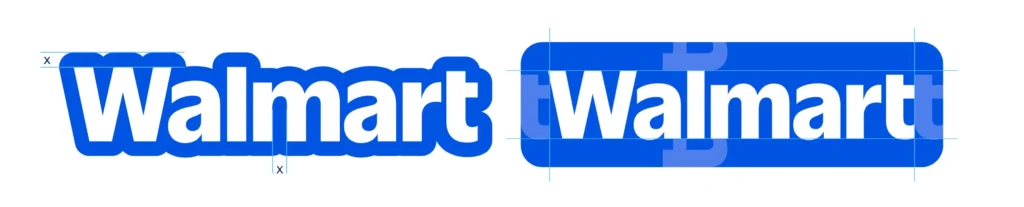
The most immediate and striking change in Walmart’s new logo is its transition to lowercase typography. Historically, Walmart has used uppercase or capitalized letters to maintain brand authority and corporate dominance. However, with shifting consumer expectations, brands are now prioritizing relatability and accessibility over formality. By moving to a fully lowercase wordmark, Walmart aligns itself with modern branding trends followed by Google, Airbnb, Spotify, and Slack- all of which use lowercase typography to appear friendlier, more casual, and digitally adaptable.
Lowercase lettering is often associated with:
In essence, this design choice helps Walmart modernize its visual identity while remaining relevant to digital-first consumers.
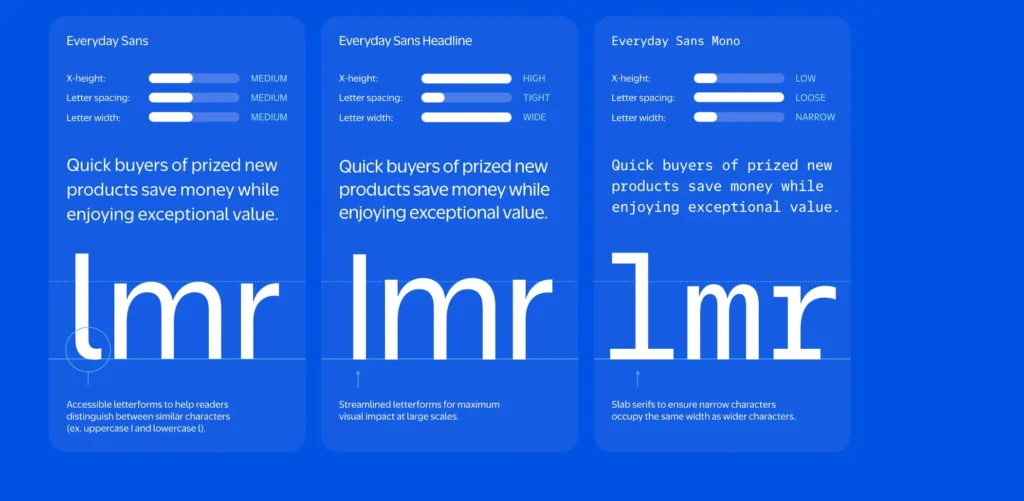
Beyond the typographical shift, Walmart has also refined its lettering style by opting for a softer, rounded sans-serif font. This change is particularly important for branding consistency across screens, where sleek, clean fonts enhance readability.
Previously, Walmart’s font had sharp edges and strong, bold lettering, reinforcing its dominance as a retail leader. However, as branding trends have evolved, many brands have embraced rounder, smoother fonts to create a warmer and more inviting presence.
The new font offers several advantages:
By incorporating this softer, fluid typeface, Walmart ensures that its brand remains flexible, modern, and seamlessly integrated into digital interfaces.
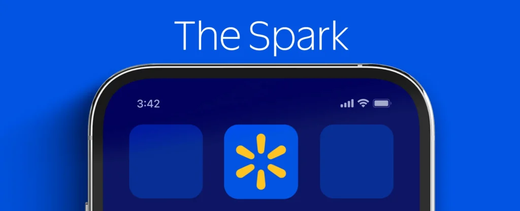
Despite significant changes in typography and typeface, Walmart has retained its signature yellow spark icon. This decision reflects a crucial balance between modernization and brand continuity. The yellow spark was introduced in 2008 as part of Walmart’s effort to redefine its brand image from a low-cost retail chain to a brand focused on quality, service, and innovation. It symbolizes warmth, friendliness, and customer-centric service.
By keeping this icon, Walmart ensures that:
In many logo redesigns, brands face backlash when they completely overhaul their identity, making it unrecognizable to their audience. By keeping the yellow spark, Walmart successfully refreshes its brand without losing its core visual identity.
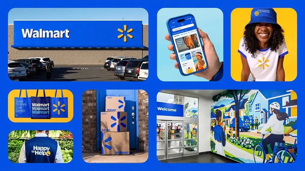
A major reason behind Walmart’s logo redesign is digital optimization. In an era where most consumers engage with brands online first- through e-commerce, social media, or mobile apps- logos need to be highly adaptable and visually effective across all digital touchpoints.
The previous Walmart logo was designed with physical branding in mind, particularly for storefront signage, product packaging, and print advertising. However, as Walmart expands its digital presence, a more streamlined, screen-friendly logo was necessary.
The new wordmark offers digital benefits:
As Walmart continues to invest in e-commerce, digital grocery delivery, and AI-powered shopping experiences, this redesign sets a foundation for a more flexible and future-ready brand identity.
Wordmark logos have become the go-to choice for brands looking to establish a clean, professional, and versatile identity in the digital age. Unlike symbol-based logos, wordmark logos rely solely on typography to create a strong brand impression. Walmart’s decision to transition to a simplified, lowercase wordmark logo reflects a broader industry trend where brands prioritize clarity, adaptability, and modern aesthetics.
But why are brands shifting toward wordmark logos?
The dominance of mobile-first experiences means brands need logos that remain legible across all screen sizes. A clean wordmark design ensures that branding stays recognizable on social media profiles, e-commerce platforms, and mobile apps, without requiring frequent resizing or complex adjustments.
A study by Siegel+Gale found that brands with simpler logos are twice as likely to be remembered by consumers. Wordmark logos reduce visual clutter, allowing audiences to associate the brand with its name instantly.
A wordmark logo maintains a uniform visual identity across packaging, signage, merchandise, and digital platforms. Unlike icon-based logos, which may require modifications for different backgrounds, a well-designed wordmark ensures seamless integration across multiple channels.
Lowercase typography and rounded letterforms create a perception of friendliness and accessibility. This is why brands like Google, Airbnb, and Spotify have embraced lowercase wordmarks- it softens their corporate image, making them feel more customer-centric.
Over the past five years, major brands have undergone logo simplifications to align with evolving consumer preferences. Companies like Kia, Burberry, Nissan, and Balmain have replaced complex or serif-styled wordmarks with modern, streamlined typography. Walmart’s new logo follows this global trend while maintaining its signature blue and yellow color scheme for brand continuity.
While wordmark logos offer clear advantages, they also come with potential risks. If a wordmark is too generic, it can blend into a sea of similar-looking brands. This has been a common criticism of Walmart’s new logo, with some consumers arguing that it lacks distinctiveness compared to previous versions.
For brands considering a logo redesign, the key takeaway from Walmart’s approach is this: simplicity should enhance brand identity, not strip it of personality.
Like most major logo redesigns, Walmart’s new branding has sparked mixed reactions. While design experts praise its modern adaptability, many consumers question whether the change was necessary.
Walmart's first logo change in nearly 17 years consists of subtle changes almost imperceptible to anyone not paying close attention. https://t.co/C72BCERfXB pic.twitter.com/YTJdCPQkNv
— FORTUNE (@FortuneMagazine) January 14, 2025
Walmart spent $1.25MM on their new logo… pic.twitter.com/yUXNIx2oj9
— David Santa Carla 🦇 (@TheOnlyDSC) January 14, 2025
Despite the criticism, Walmart’s long-term brand equity is unlikely to suffer. Historically, even controversial logo redesigns (such as Google’s 2015 switch to a sans-serif font) eventually gain acceptance. The key for Walmart will be reinforcing its new logo across customer touchpoints to solidify brand recognition.
The Walmart logo redesign represents a calculated shift toward modern, digital-first branding. While some praise its sleek, approachable aesthetic, others argue that it lacks the boldness of previous designs. The mixed reception highlights the challenges of balancing brand evolution with consumer expectations. As more brands embrace minimalist wordmark logos, the question remains: Is simplicity making brands more memorable or more forgettable? The ultimate success of Walmart’s new logo will depend on how effectively it is integrated across customer experiences, marketing campaigns, and retail environments.
For businesses considering rebranding, Walmart’s approach serves as a case study in how modern branding is evolving. The key takeaway? A well-executed logo redesign should enhance brand identity, not dilute it.
Walmart redesigned its logo to align with modern branding trends, making it more approachable, digitally scalable, and customer-friendly while retaining brand familiarity.
The new Walmart logo is a wordmark logo, featuring lowercase typography and a softer sans-serif font, optimised for digital branding.
Wordmark logos offer clarity, adaptability, and simplicity, making them ideal for digital branding, but they must be distinctive enough to maintain brand identity.