K'luxe

kluxe

ABOUT

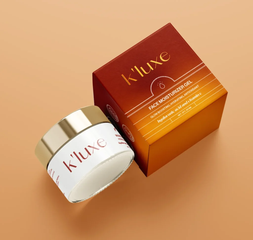
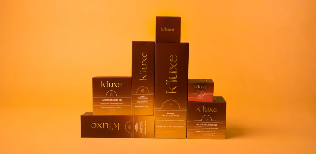
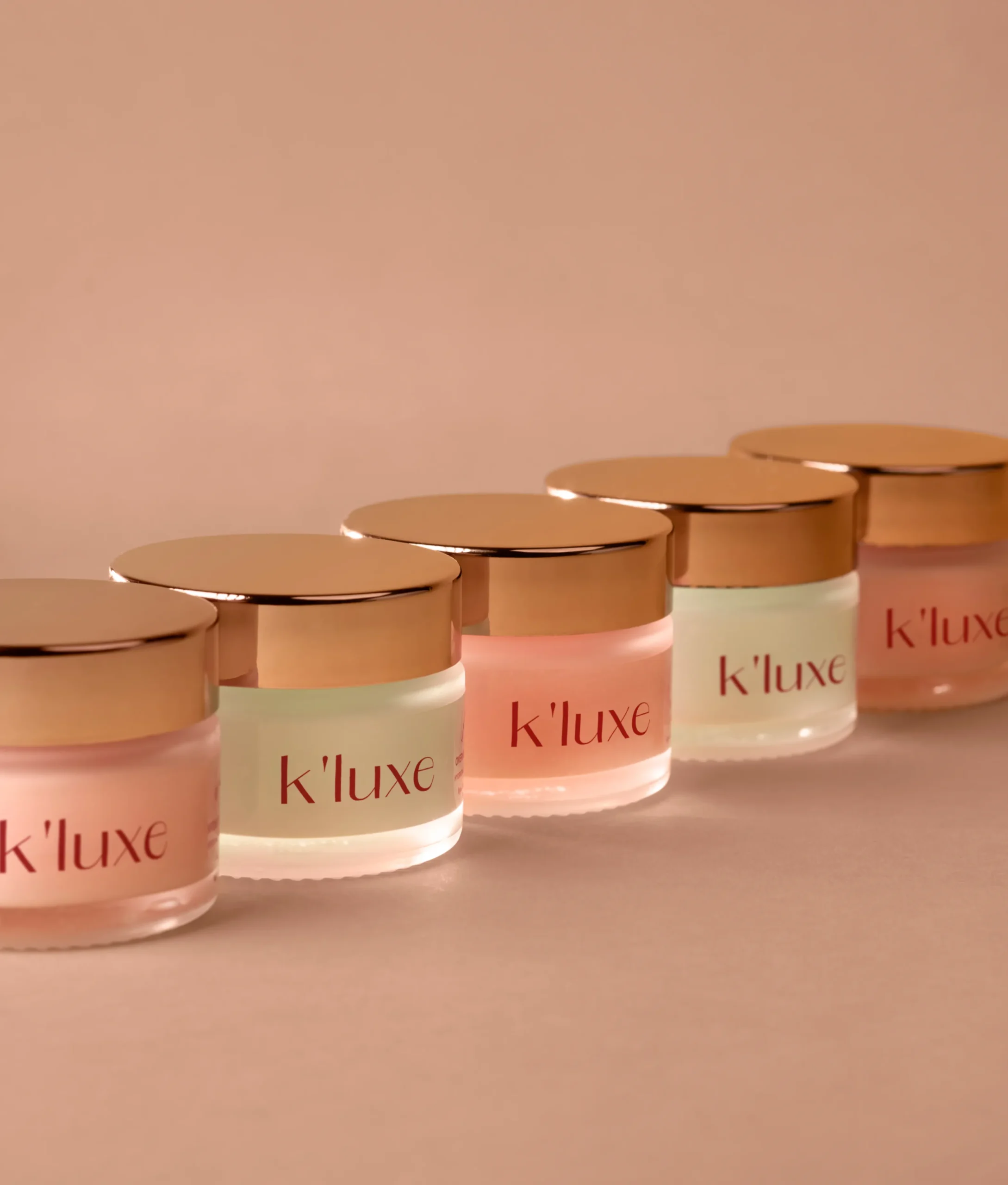
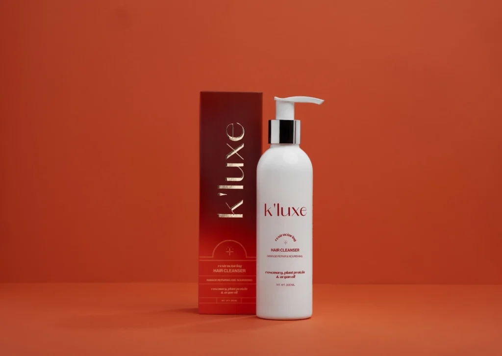
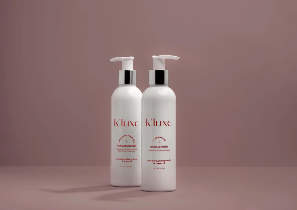
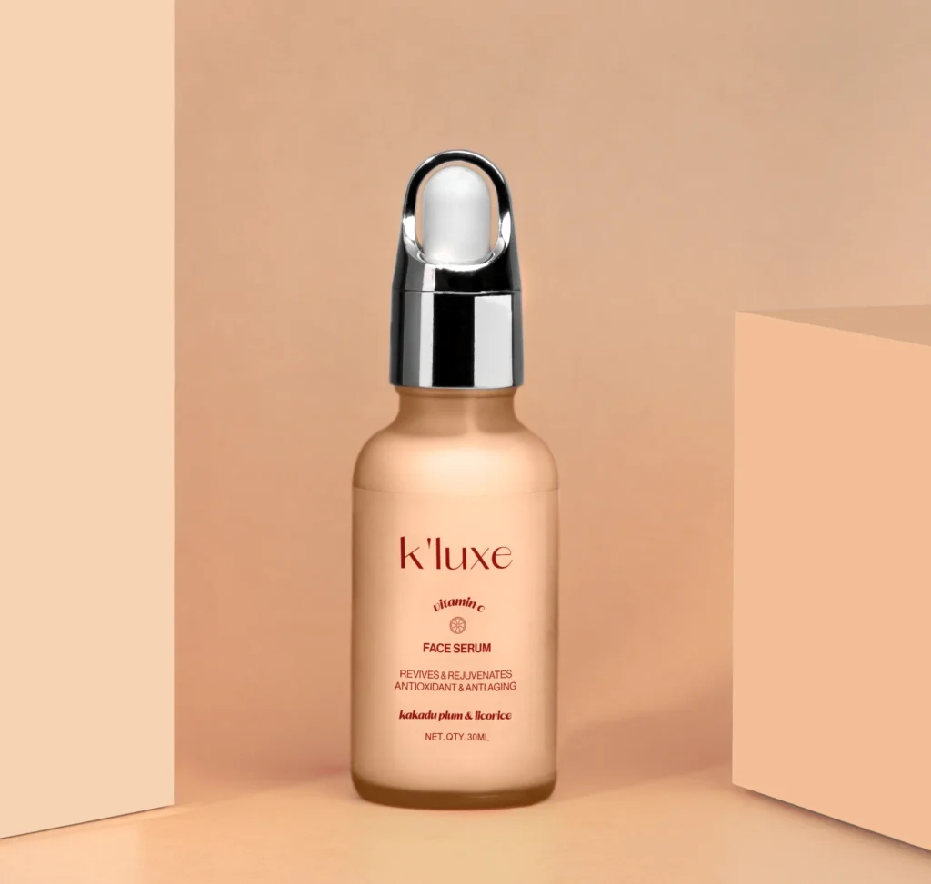
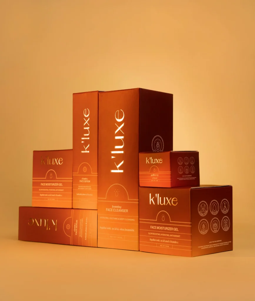
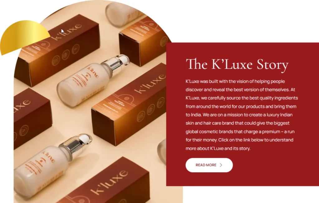
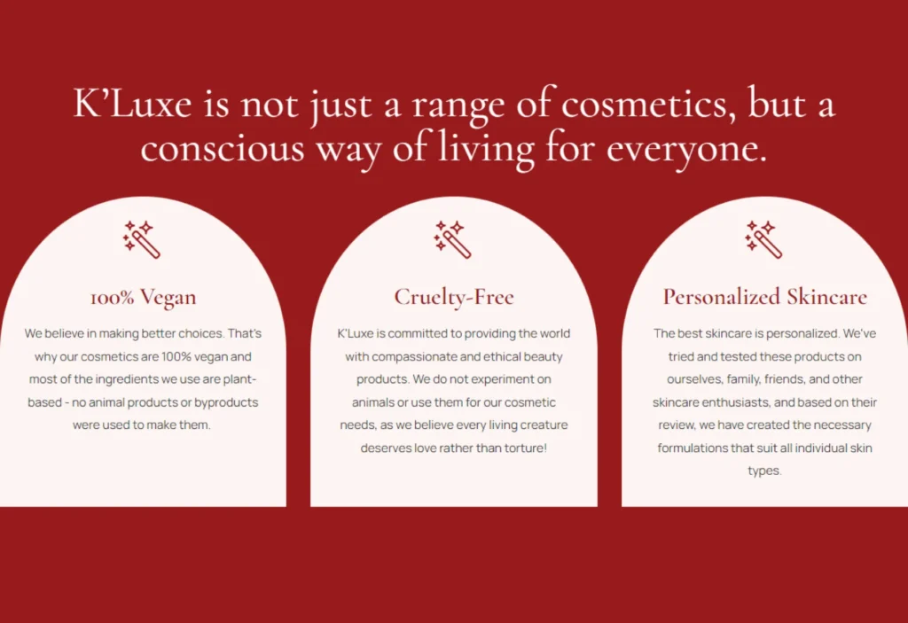
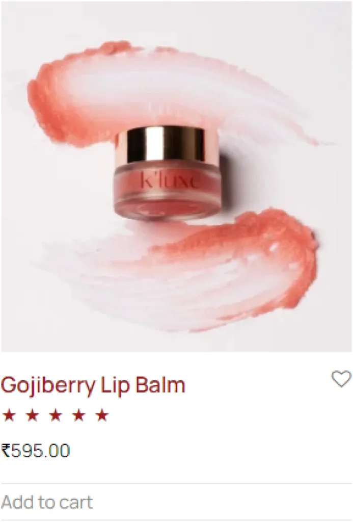
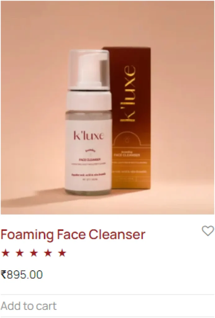
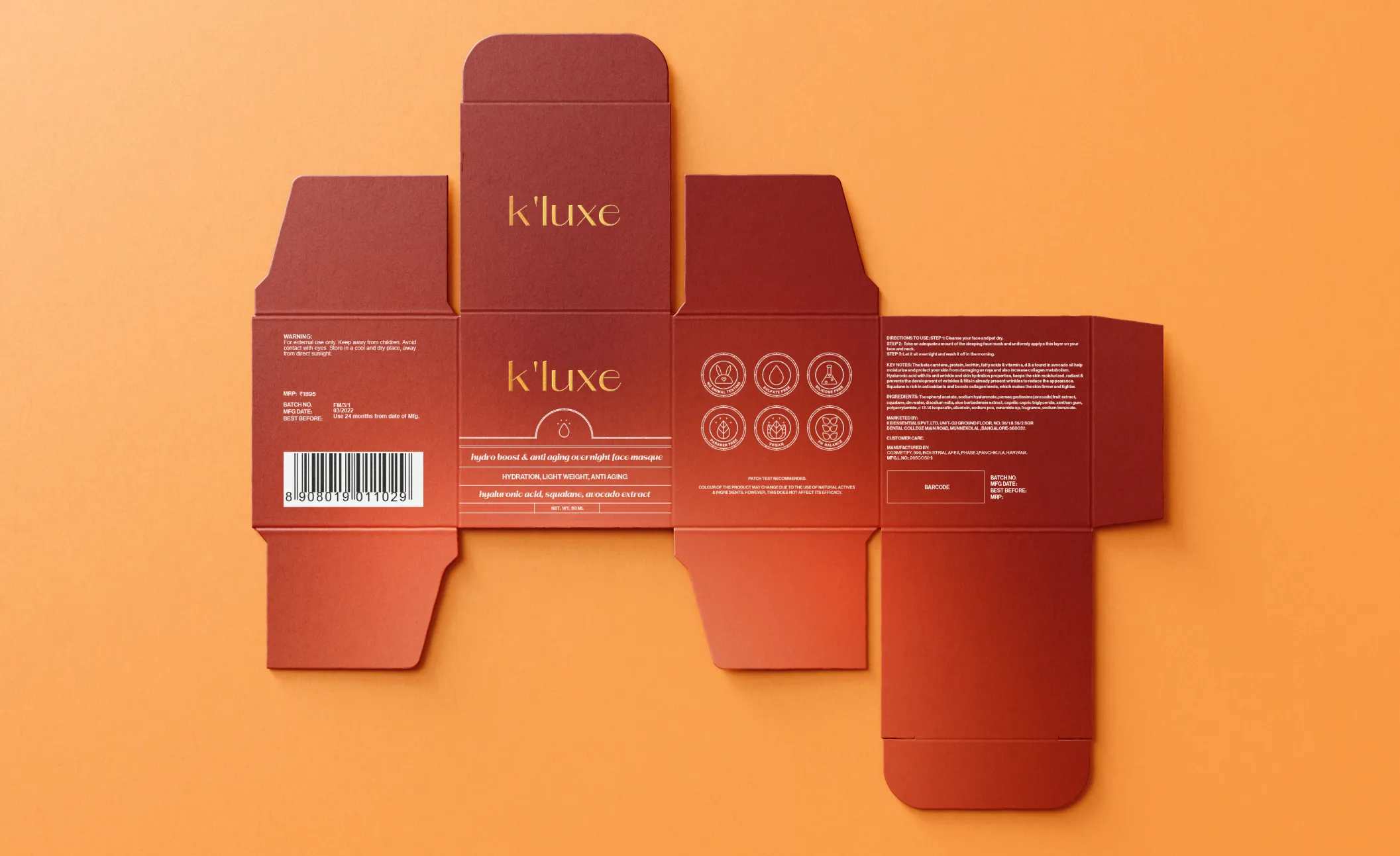
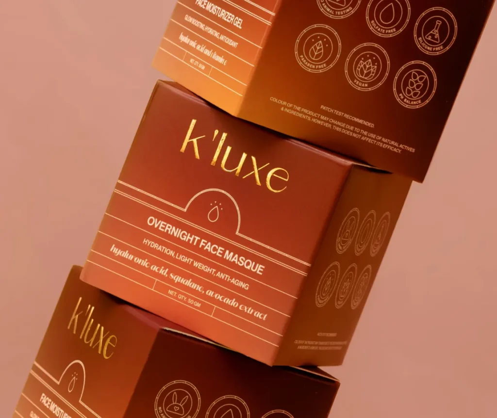
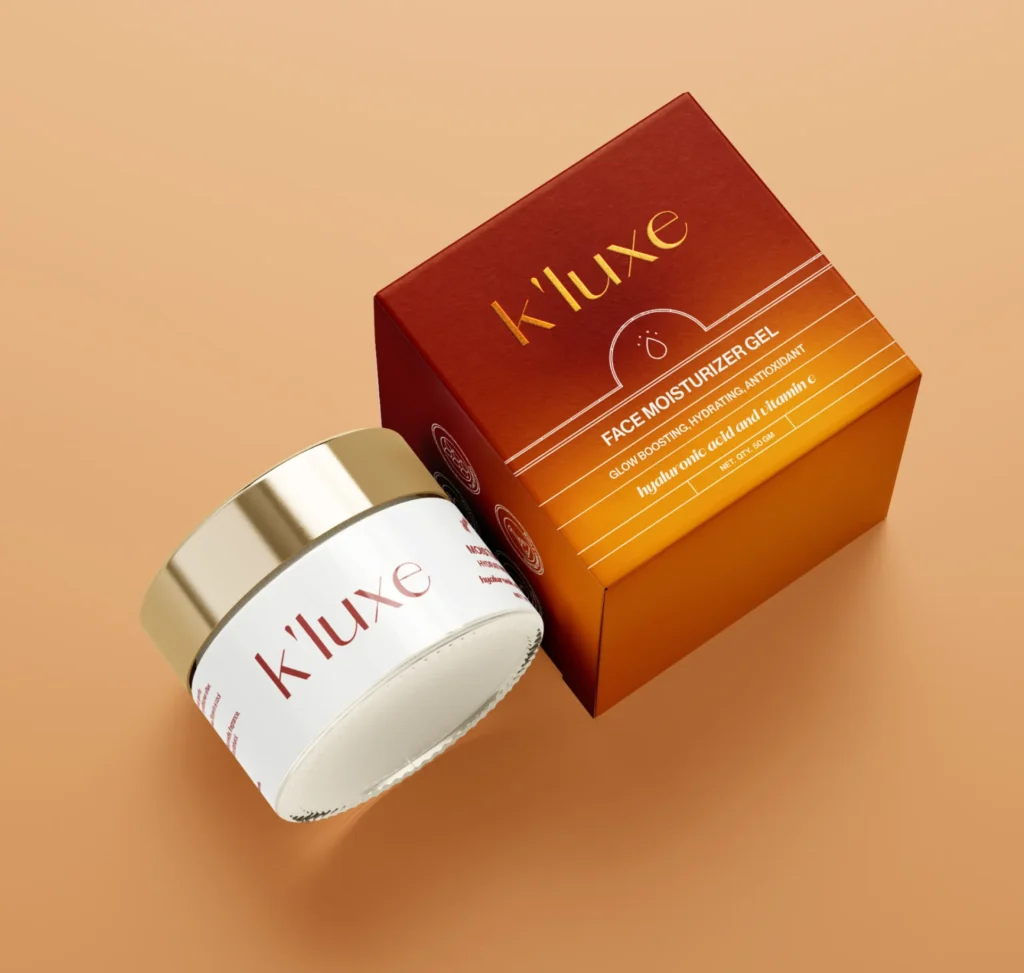
K’Luxe is a luxury skincare brand based out of Bangalore, India, with a vision of enabling people across the globe to discover and reveal the best version of themselves, making them feel confident, bold, and empowered. K’Luxe found an important market gap. The brand focused on sourcing the best raw materials from across the globe and using them for their products. They were also highly focused on making all their products vegan and cruelty-free.

SCOPE

INDUSTRY

brandemic-kluxe-boxes
brandemic-kluxe-jar-mockup
brandemic-kluxe-products

CHALLENGES

Positioning
Is Everything

01

To make the product stand out from hundreds of brands vying for consumer attention, each promising to deliver the perfect blend of style and function.

02

To position K’luxe as a luxury skincare brand that uses a minimalistic approach for its visual identity.

03

We had to ensure that the brand stood for luxury and minimalism but still stood out in a highly saturated market of skincare products.

04

The probability of looking similar to or getting mixed with other brands that used a gradient in their packaging identity.

SOLUTION

Simple & Significant

A minimal design with a touch of luxury to create an impression that is both trust-building and unforgettable. The logo was created as a simple typeface to keep minimalism in the focus and establish the brand as a luxury brand. The colours, gold, and terracotta, are inspired by the raw and glamorous aspects of nature. These neutral colours blend with other warm tones to give each product an identity of its own.
brandemic-kluxe-jars

Minimal, Classy, Inspired By Nature

IDENTITY

K’luxe is a beauty and skincare brand that promises its users high quality and healthy products that would make them look and feel glamorous. Hence, the brand was positioned as a luxurious skincare brand that uses a minimalistic approach for its visual identity.

The colours, gold, and terracotta, were inspired by the raw and glamorous aspects of nature. These neutral colours blend with other warm tones to give each product an identity of its own.

brandemic-kluxe-1
brandemic-kluxe-logo-2
brandemic-kluxe-final

LOGO VARIATIONS

kluxe-white-logo
brandemic-kluxe-color-main
brandemic-kluxe-color-4
brandemic-kluxe-color-1
brandemic-kluxe-color-2
brandemic-kluxe-color-3
Group
Group-1
Group-2
Group-3
Group-4
Group-5
Group-6
Group-7

The Devil In
The Details

PACKAGING

For a skincare brand operating in the modern age, its packaging is everything.
brandemic-kluxe-hair-cleanser
brandemic-kluxe-products
brandemic-kluxe-face-gel
brandemic-kluxe-serum
The gradient plays a key role in the appearance of each product. The fusion of terracotta with warm tones created a strong sense of grandeur, setting each product apart from the other while maintaining harmony within the visual identity. One of the biggest challenges that we faced during the process was the probability of looking similar to, or getting mixed with other brands that used a gradient in their packaging identity. To stand out from the crowd, geometrical elements were used in the layouts and other visual elements. The clean, sharp lines enhanced the luxurious appearance of the packaging, while maintaining a neat and minimal layout.
brandemic-kluxe-products
brandemic-kluxe-lipbalm

Seamless Experience

WEB DEVELOPMENT

The perfect mix of story-telling, brand recall, technology, and user experience.
brandemic-kluxe-web-1
brandemic-kluxe-web-2
brandemic-kluxe-web-5

Digital Real Estate That Resonates With The Brand Language

The K’Luxe website was built keeping all brand elements and the vibe of the brand in mind. We ensured a seamless user experience that minimised clicks and solidified the positioning.

brandemic-kluxe-web-4
brandemic-kluxe-web-3
brandemic-kluxe-face-masque
brandemic-kluxe-box-outline
brandemic-kluxe-packaging
brandemic-kluxe-face
brandemic-kluxe-boxes

IMPACT

Thought Driven Design That Creates Unforgettable Impression

With the entire branding exercise of K’Luxe, we were successfully able to position the product as a luxury product, and the market received the design really well. We saw early adoption of the product. We were able to generate sales for the products almost immediately though the brand was super new and the pricing was higher than most of the products in the market.

Make The Move

REACH OUT

If you’re looking for a holistic agency to work on your big dream, just say the magic words!

More
Good Stuff

An iconic club with legendary members

Homegrown and organic bath and body brand

madebybrandemic