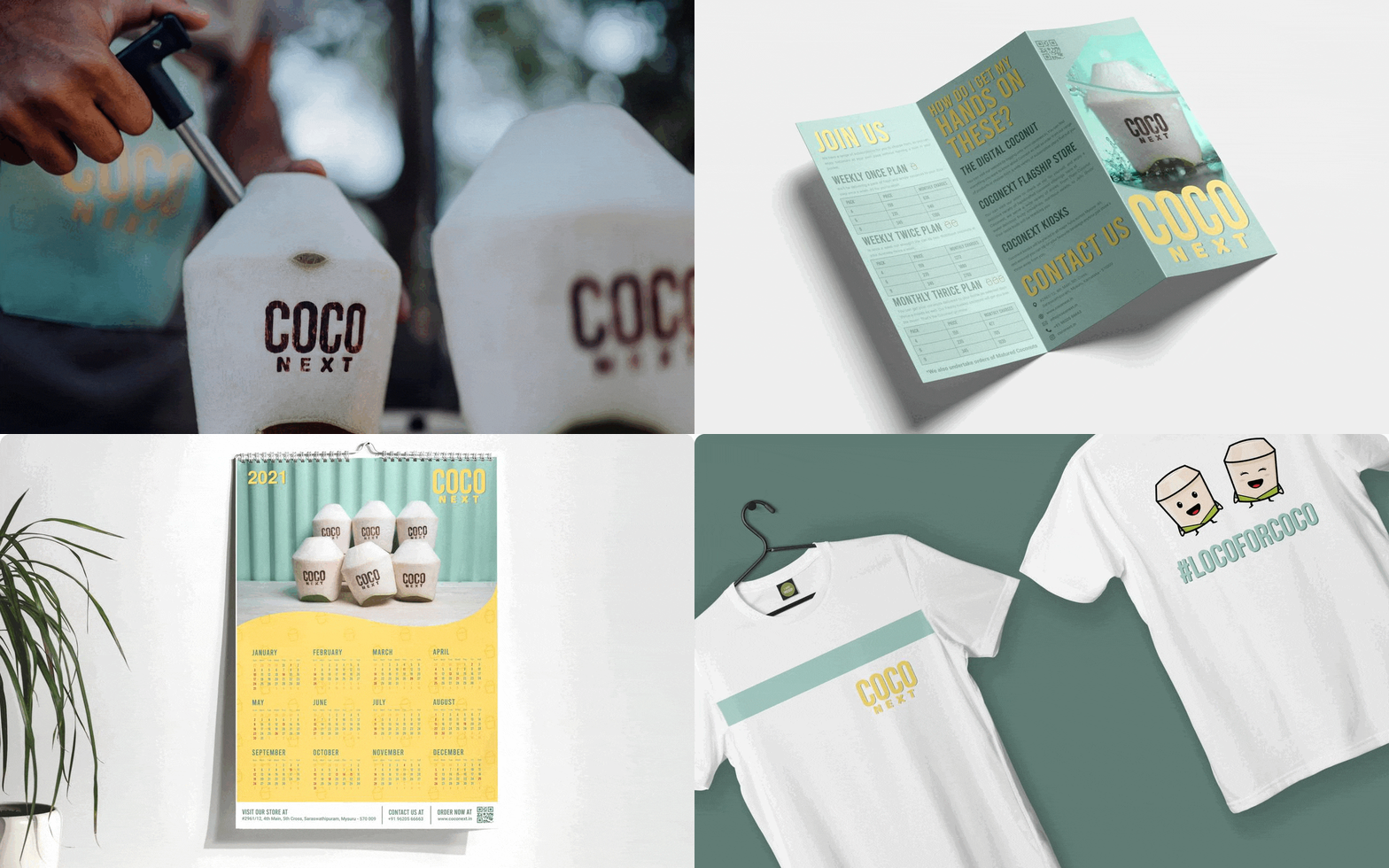
Coconext

foxglove-awards-gold
brandemic-foxglove-awards-silver
image 53
branemic-coconext

ABOUT

A project from the FMCG sector, but this time with a crazy twist. We were approached by Coconext team to build their design and structural framework, along with store branding, Website User Interface, and marketing plan.

The Coconext project was tricky since it required us to position the product strongly for a particular market segment. There were complexities as the product was being sold in three different models kiosks, subscriptions, and a flagship store. Giving a unified brand identity that was fun, quirky and chill was one of the most challenging yet fun tasks we’ve had at Brandemic.
SCOPE

INDUSTRY

FMCG - D2C/B2B

The Ultimate Guide to Branding: How to Build a Brand That Connects with Your Audience - Brandemic
coconext-brandemic-2
coconext-brandemic-3
coconext-brandemic-4

CHALLENGES

Positioning
Is Everything

01

To position the product strategically for a particular market segment.

02

Give a unified brand identity that was fun, futuristic, and had a tropical vibe.

03

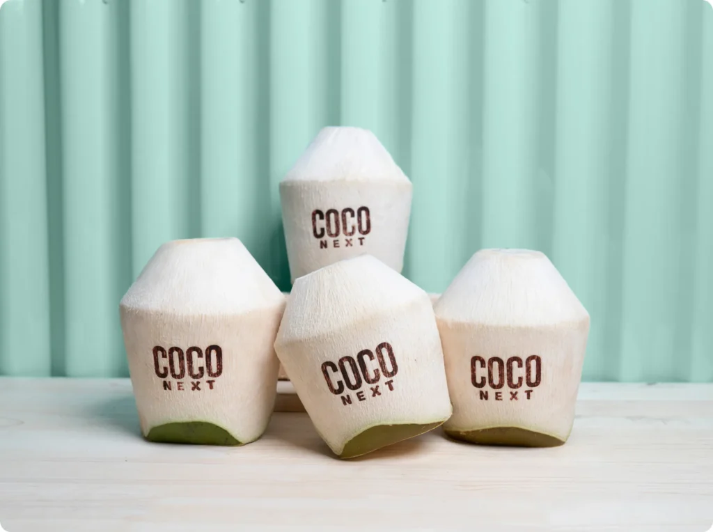
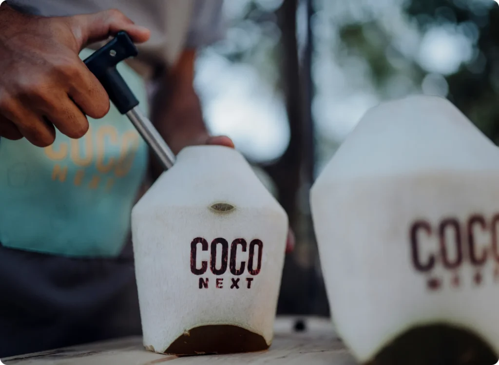
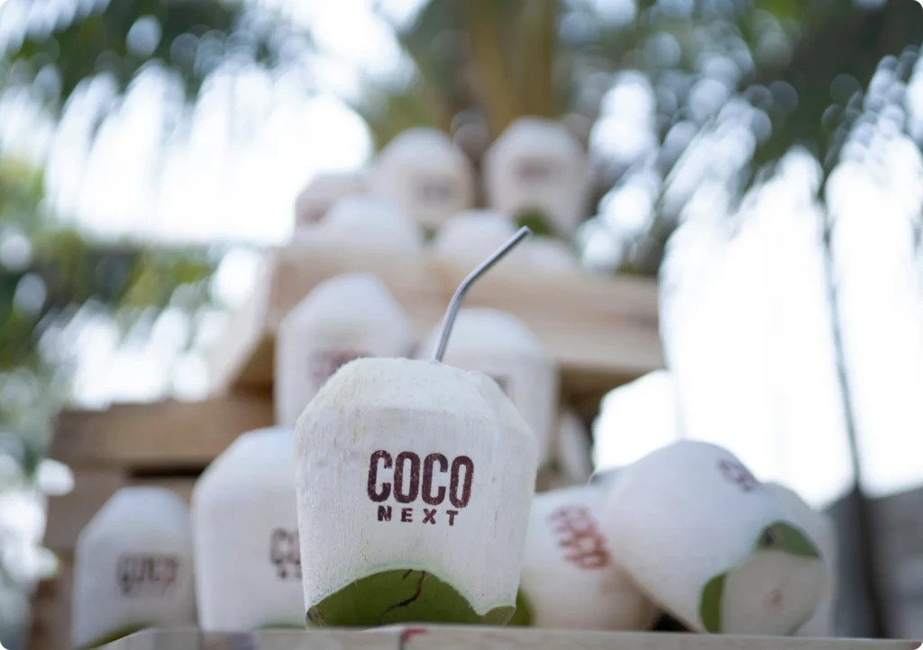
The logo had to be minimalistic because the same logo would be heat-sealed on the coconuts and details could get lost while doing so.

04

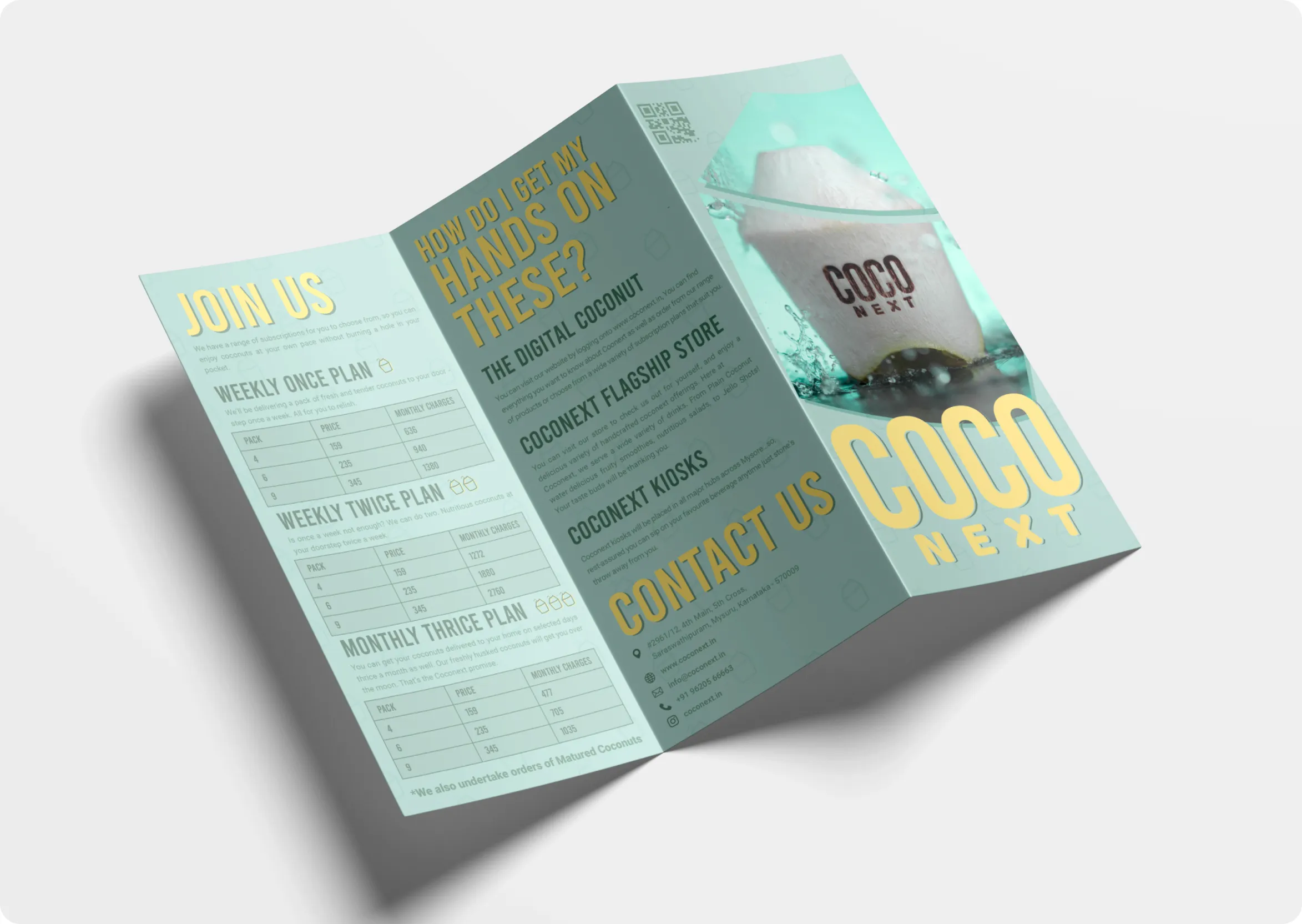
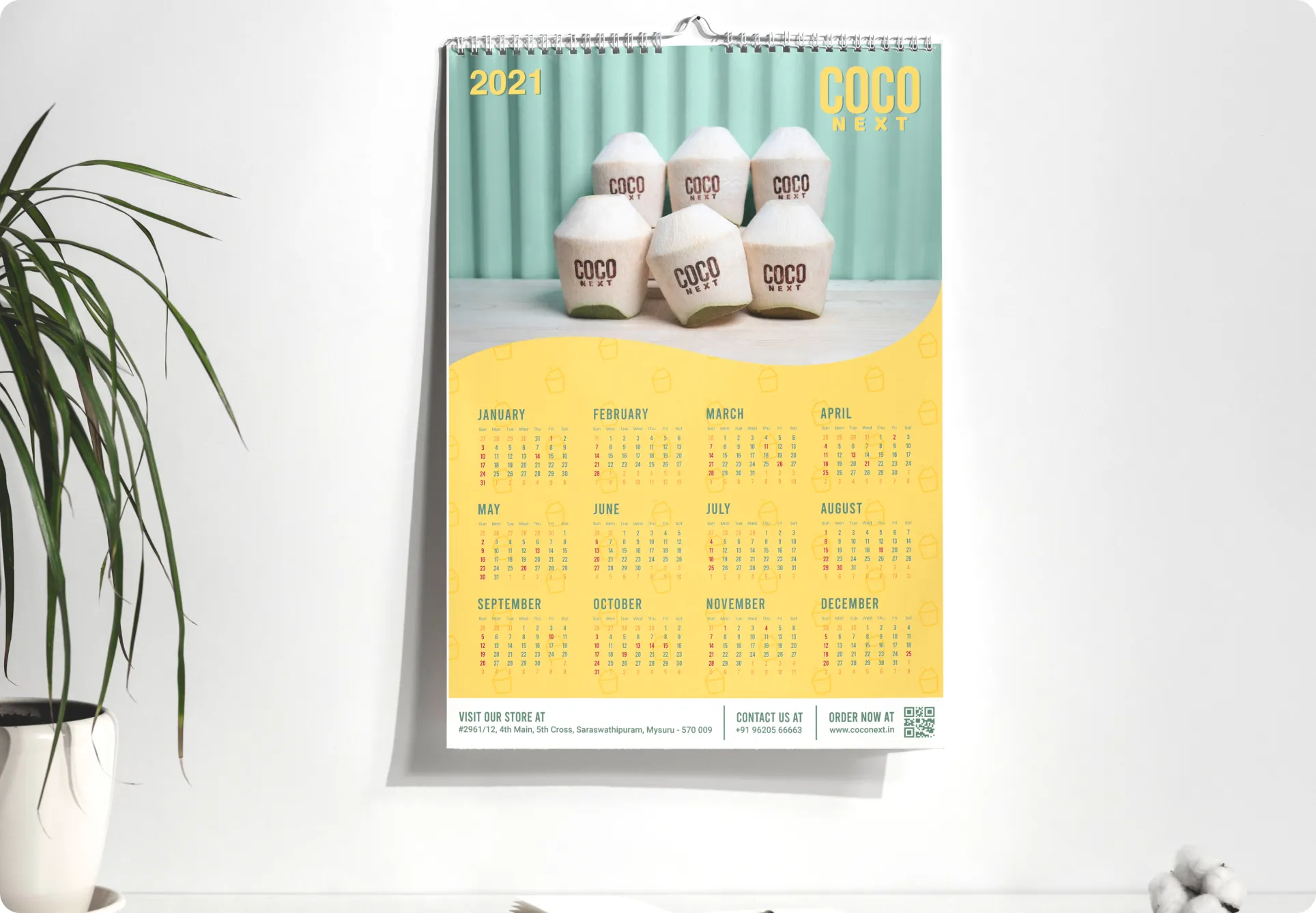
The same identity had to scale across multiple models.

SOLUTION

Fun, Futuristic, & Tropical

The service of the brand cools down people, that being the main selling point something more tech-savvy/modem/classic/retro won’t fit the brand’s motives. The design is developed around PSYCHEDELIC GOLD VIBES. TROPICAL. BEACH. PLAYFUL. MULTI USER GROUP to arrive at a very minimal simple and easy-to-scale typeface and an icon-based logo. These keywords also helped in finding the appropriate colors.
coco
loco

As Quirky
As It Gets

IDENTITY

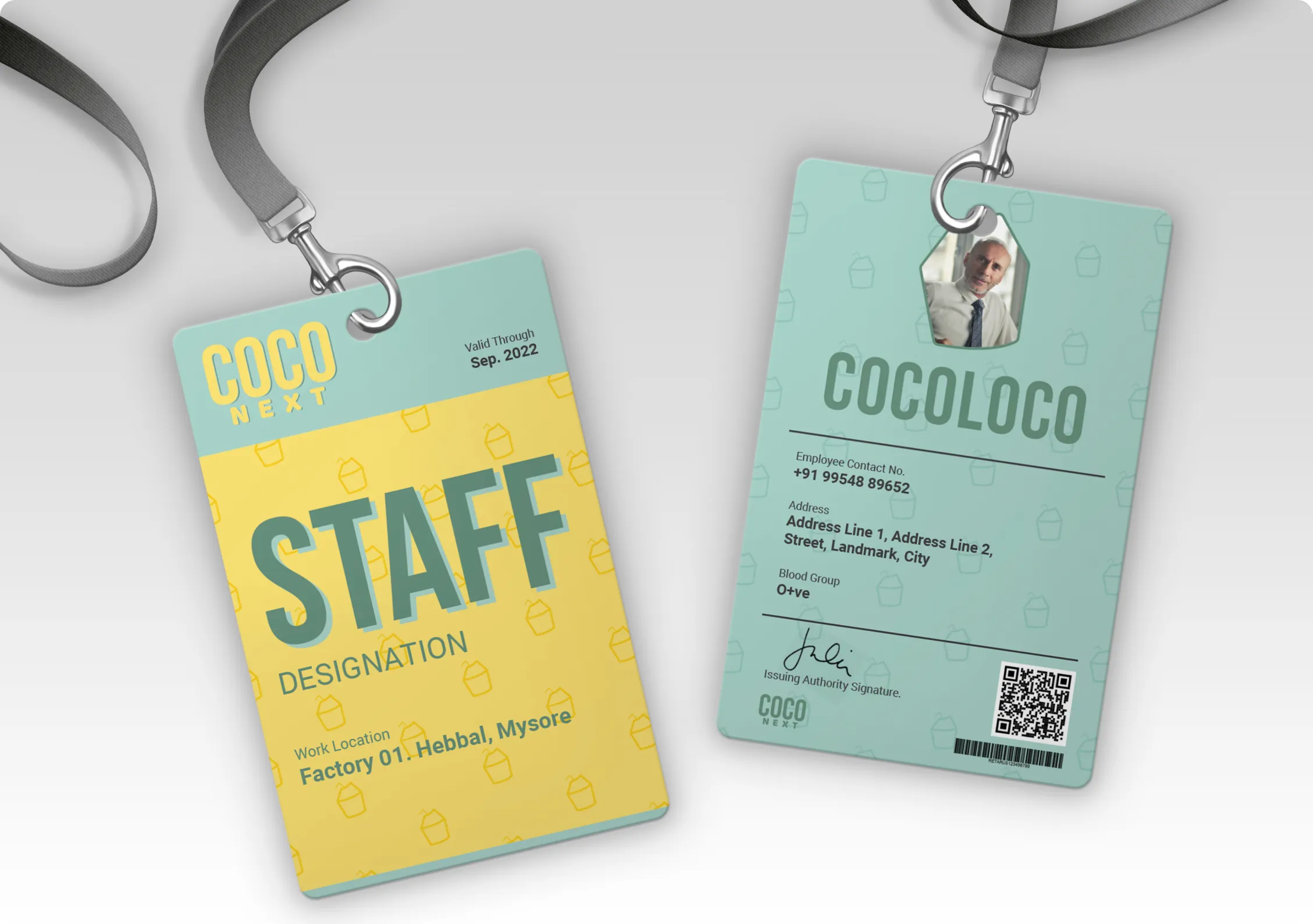
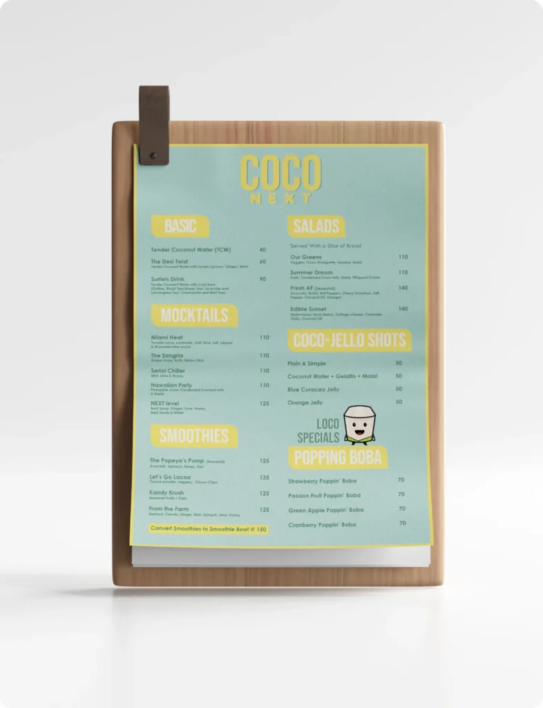
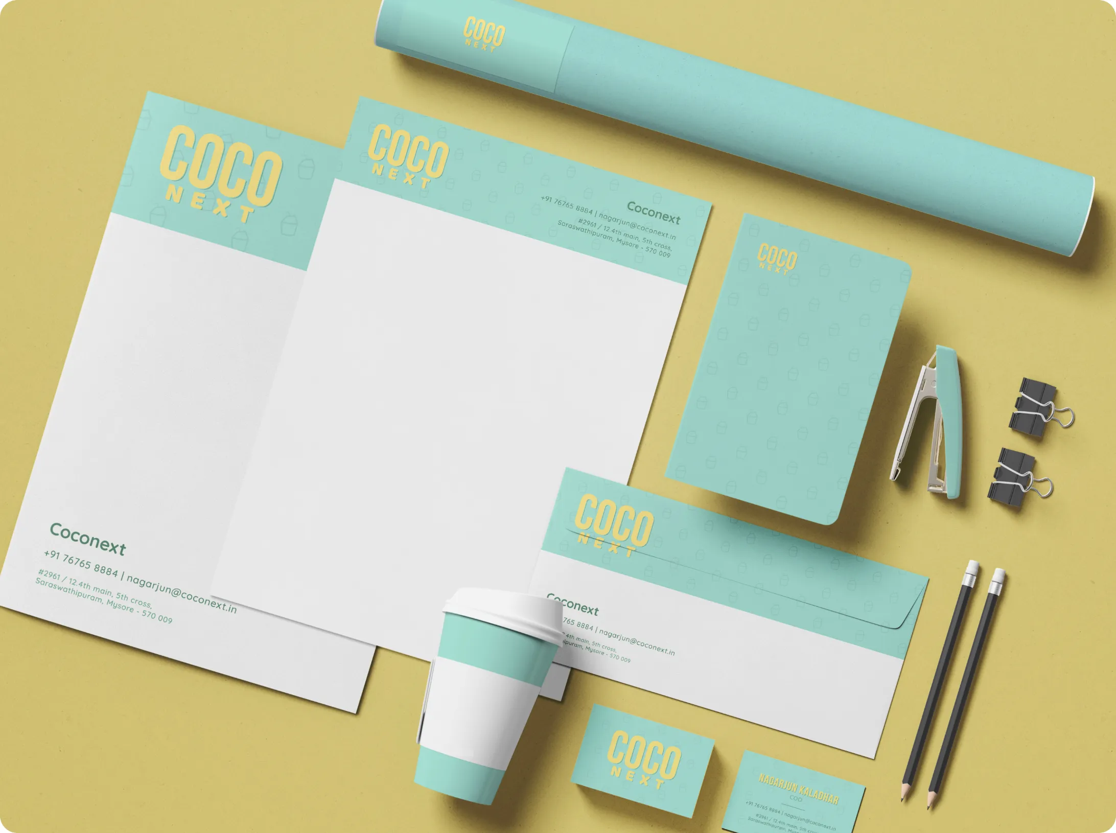
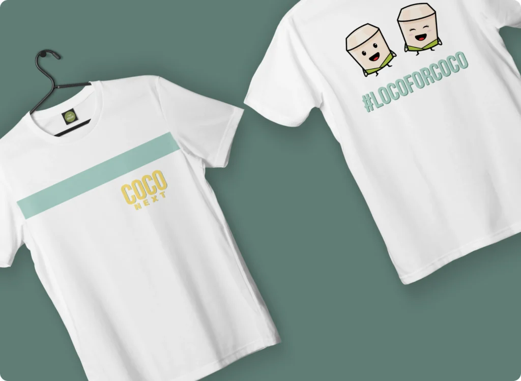
We worked with Coconext to create effective brand positioning strategies and a holistic design system. We created over 20 iterations of the logo to arrive at the final design. We paired it with a quirky tone of voice and two brand mascots – Coco & Loco.
coconext-brandemic-logo-variation-1
coconext-brandemic-logo-variation-2
coconext-brandemic-logo-variation-3
coco-next-logo
coconext-rectangle-1
coconext-rectangle-2
coconext-rectangle-3
coconext-rectangle-4
coconext-rectangle-5
coconext-brandemic-6
coconext-brandemic-7
coconext-brandemic-5
coconext-brandemic-8
coconext-brandemic-9
coconext-brandemic-10

Quirky &
Minimal (How?)

WEB UI

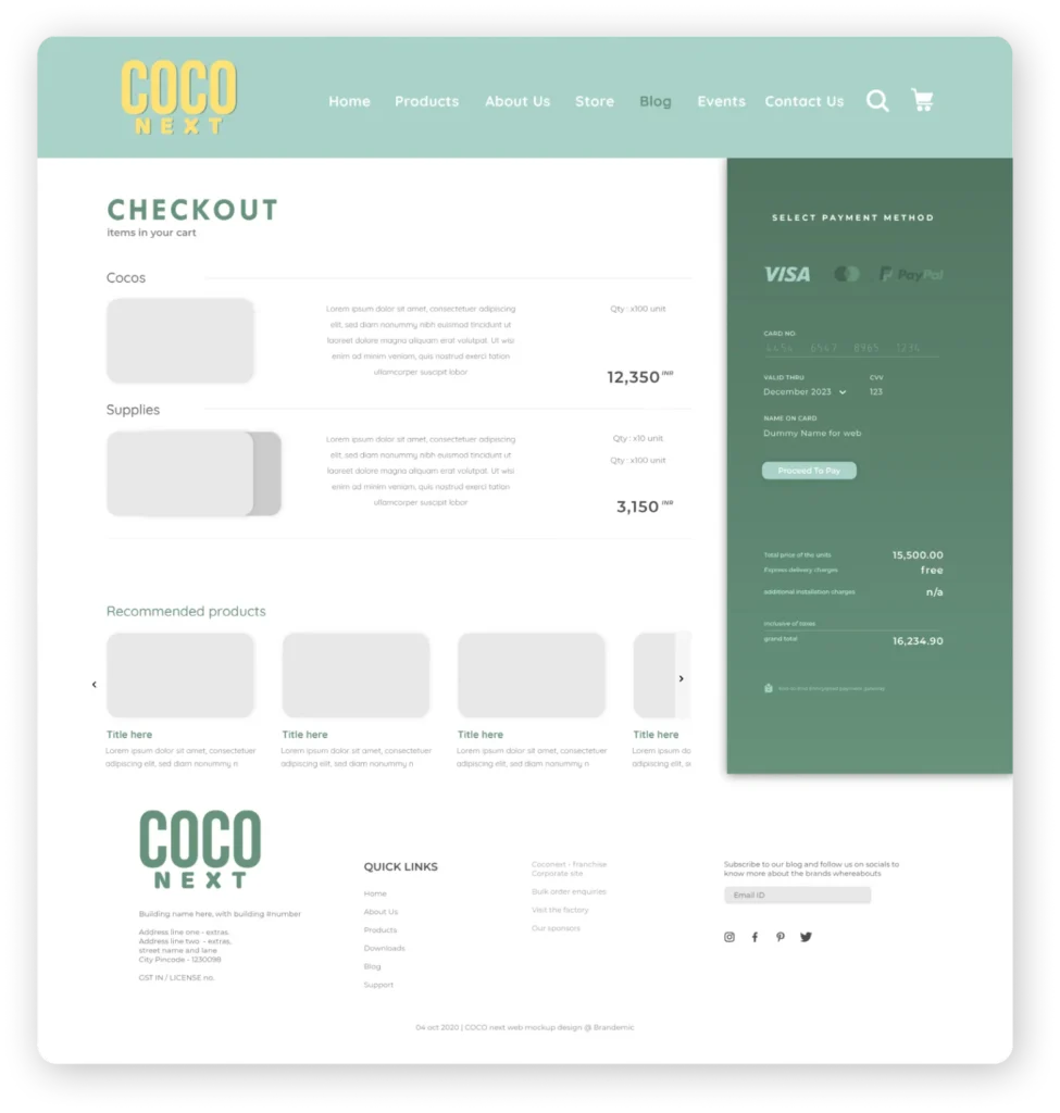
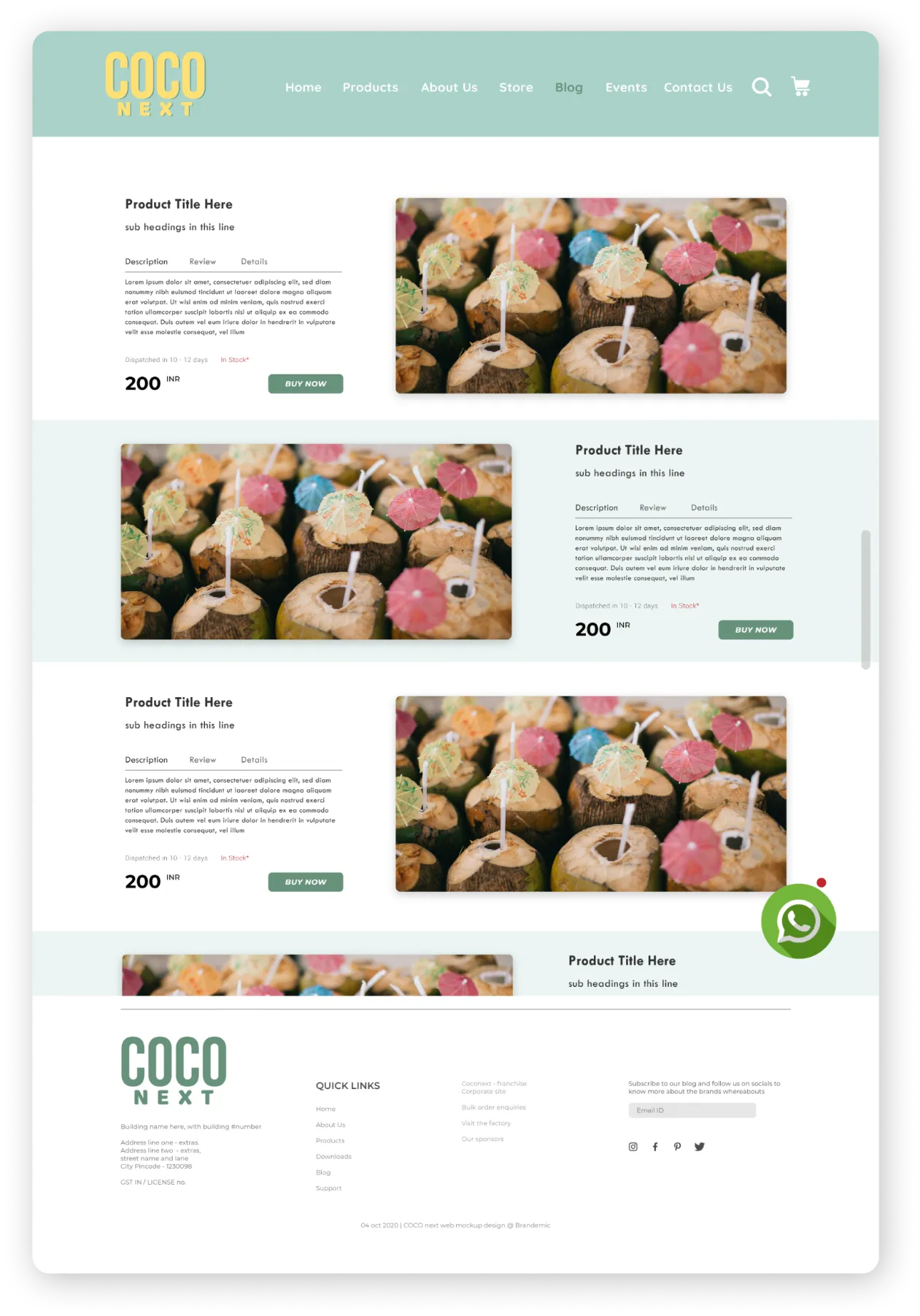
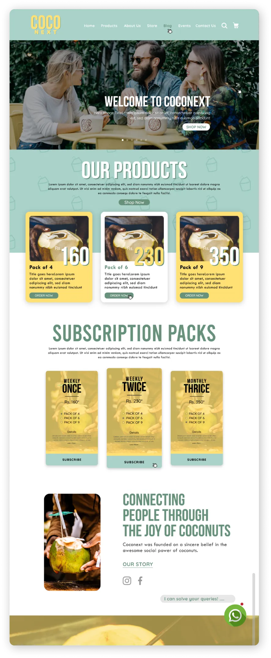
The UI design for Coconext was kept clean and minimal with a focus on easy navigation. However, the content gave it a touch of quirkiness to create uniformity in communication across all brand collaterals creating a strong brand voice. It had multiple touchpoints and multiple business models that we had to simplify in terms of navigation and understanding.
coconext-brandemic-web-3
coconext-brandemic-web-2
coconext-brandemic-web-1

IMPACT

Go Loco
With Coco

Coconext’s’ design language was an instant hit. People recognised the whole vibe of the brand and associated it with a fun and chill brand that does innovative things. The branding became an inspiration for people in the city of Mysore as it made them realise the value of creating a brand language and a story. The mascots Loco and Coco were used across all the marketing activities making the brand gain popularity amongst their target audience.

Make The Move

REACH OUT

If you’re looking for a holistic agency to work on your big dream, just say the magic words!

More
Good Stuff

YAS

Interior studio obsessed with design and detailing

Holistic wellness centre focused on yoga, organic food, and slow living

madebybrandemic