Thank you! Your submission has been received!
Oops! Something went wrong while submitting the form.
Fueling Focus, Powering Ambition.
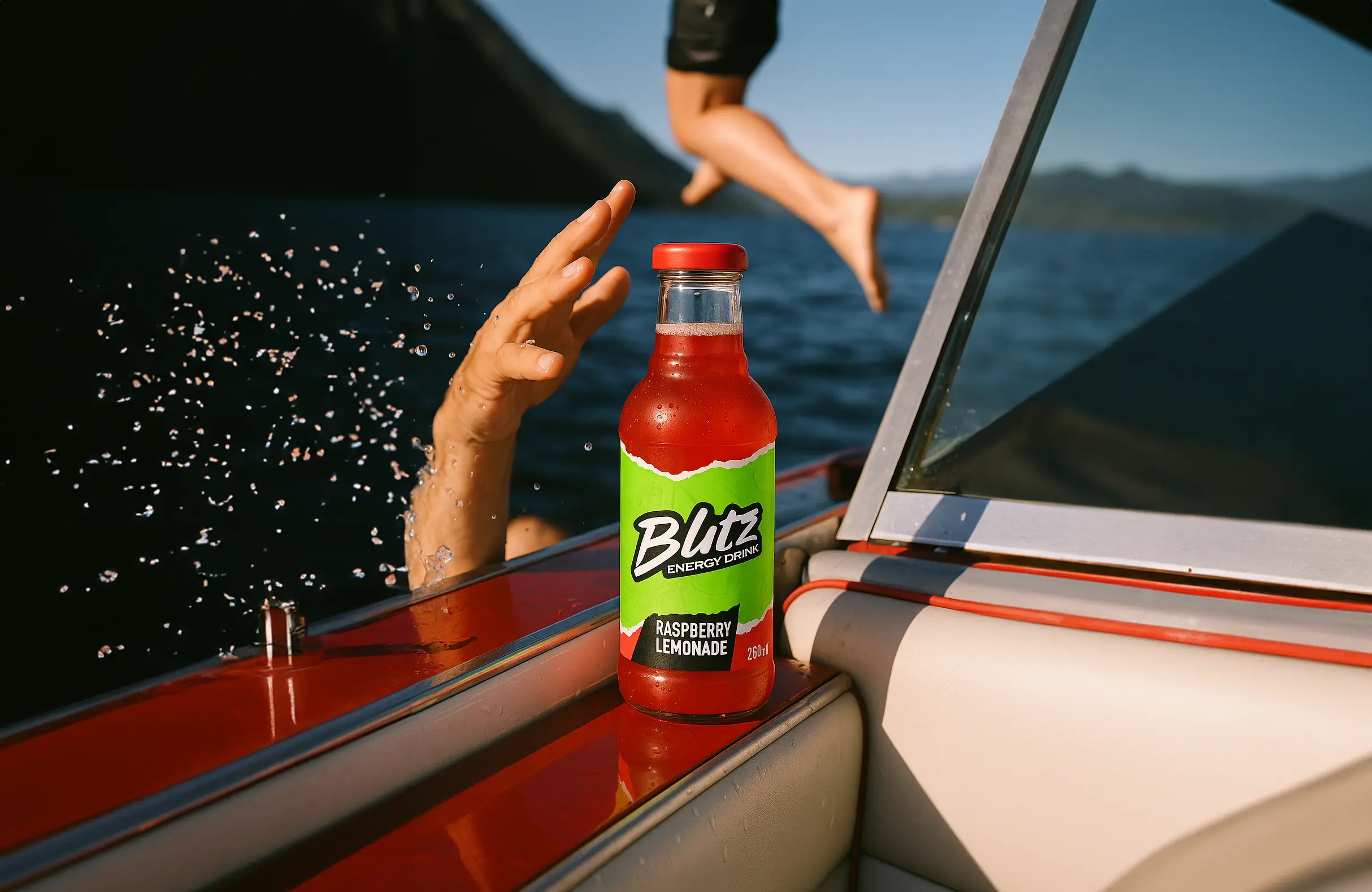
Blitz by Iceberg is an energy drink crafted for those who demand more from their day. Fueled by a blend of high-performance ingredients, Blitz sharpens focus, boosts energy, and enhances productivity. Whether you're tackling a busy schedule or pushing your limits, Blitz is the perfect companion to keep you sharp, energized, and at your best. Built for those who refuse to settle, Blitz offers a sustained, performance-driven experience designed to power your ambition and help you reach the top.
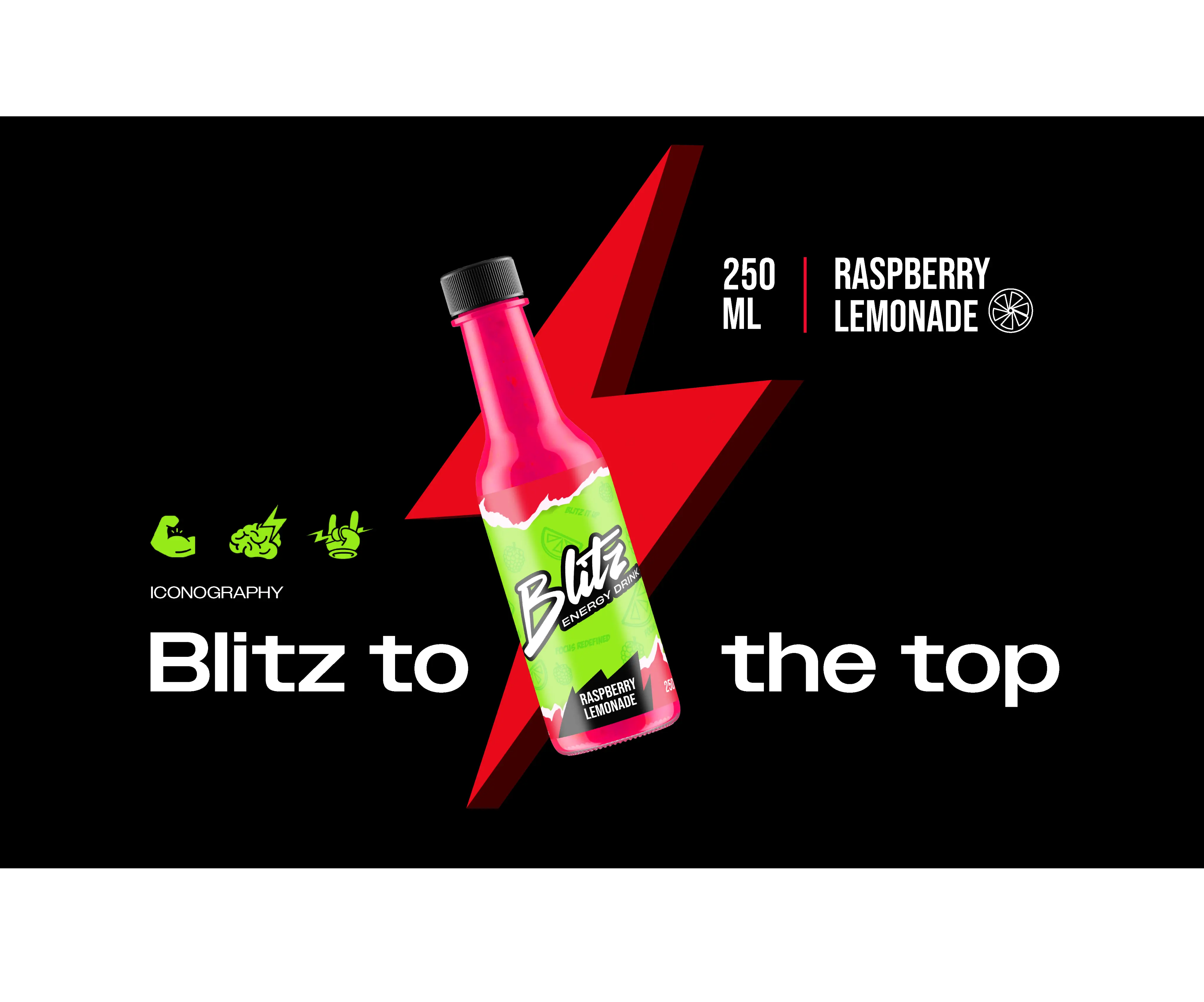
Crafting an identity that breaks through the clutter in the Indian market.
Visually representing the power of enhanced focus and performance.
Perfecting color balance for packaging that pops on shelves.
Building a cohesive, unforgettable brand that leaves a lasting impression.
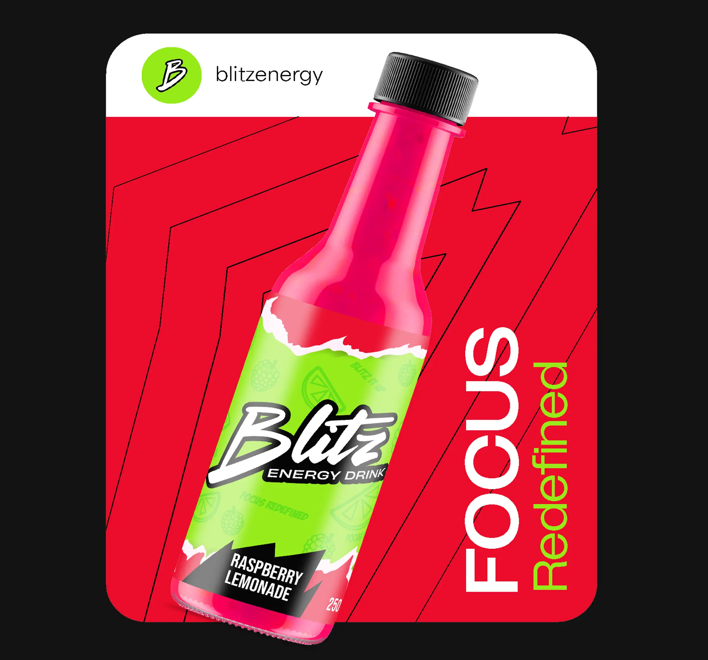
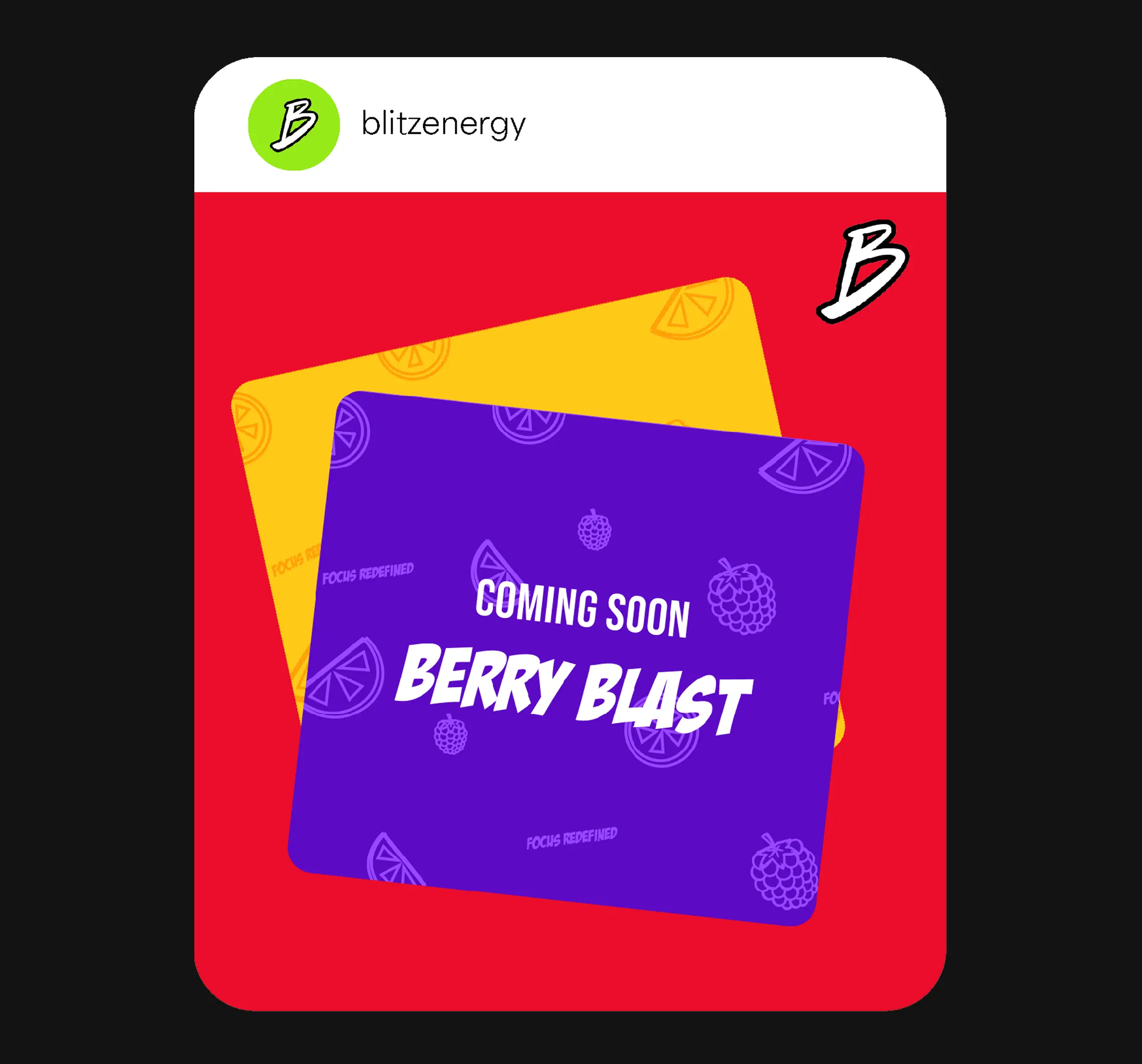


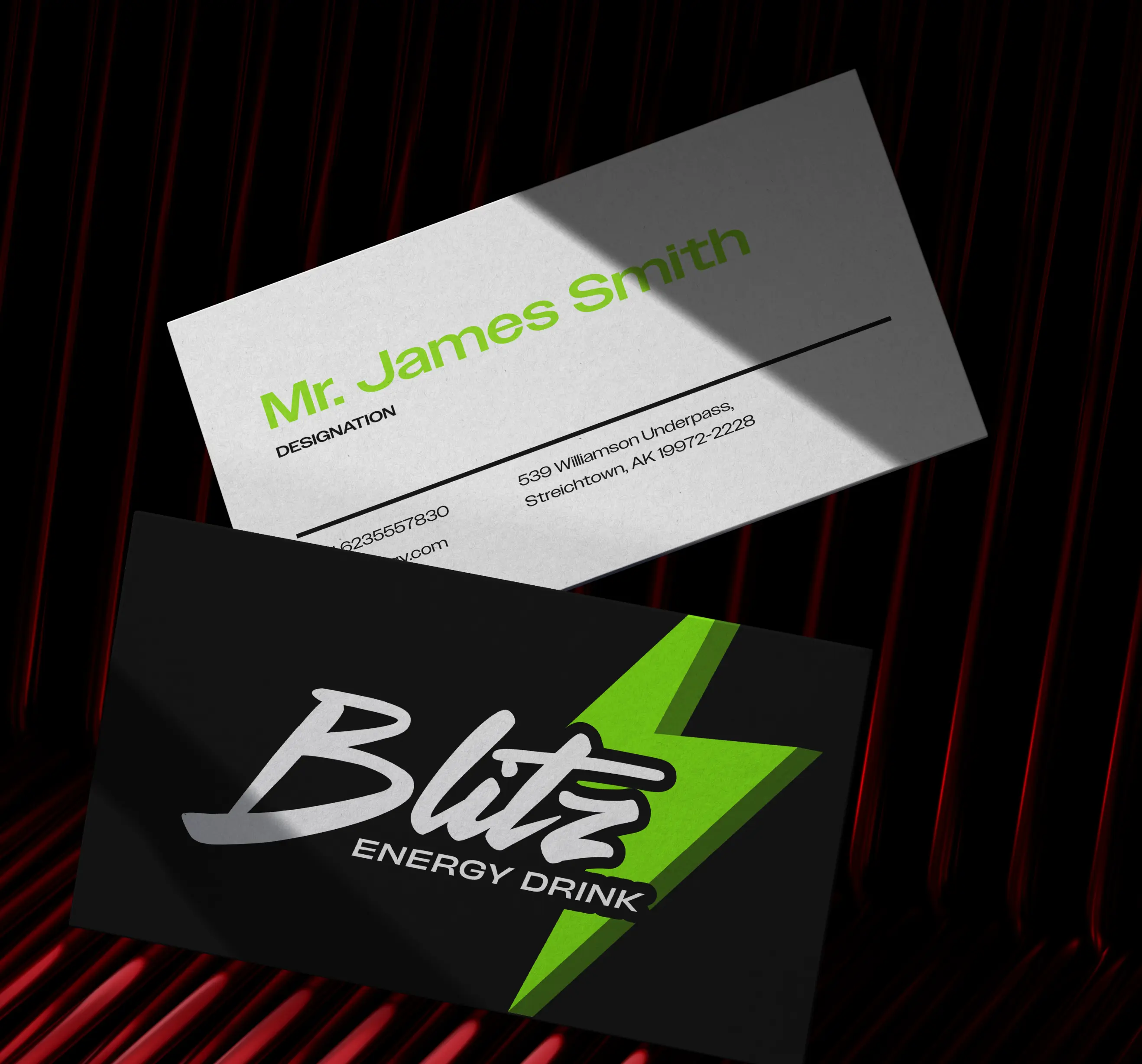
The Blitz logo blends sharp, dynamic design with clean, bold typography, symbolizing the energy and focus the brand delivers. The color palette pulses with vibrant energy, representing vitality and performance. The modular design system flexes across digital and physical spaces—whether on the web or packaging—ensuring a cohesive, high-impact brand presence. Blitz’s identity is built to stand out, capturing attention while reinforcing its commitment to peak performance and productivity.






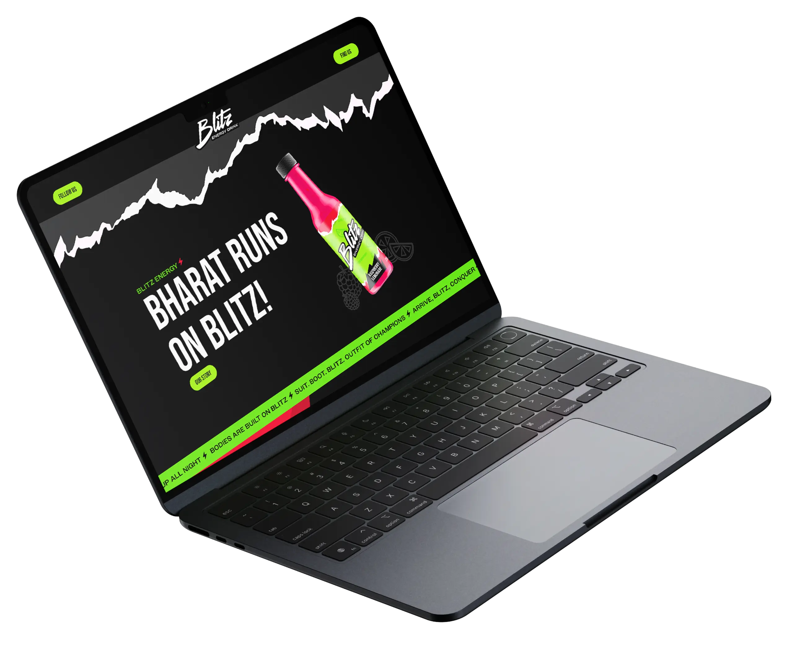
The Blitz logo is a bold, handwritten script that radiates energy and strength. Its sharp, angular lines and dynamic zig-zag elements capture the essence of speed, movement, and precision, symbolizing the brand’s relentless drive and focus.
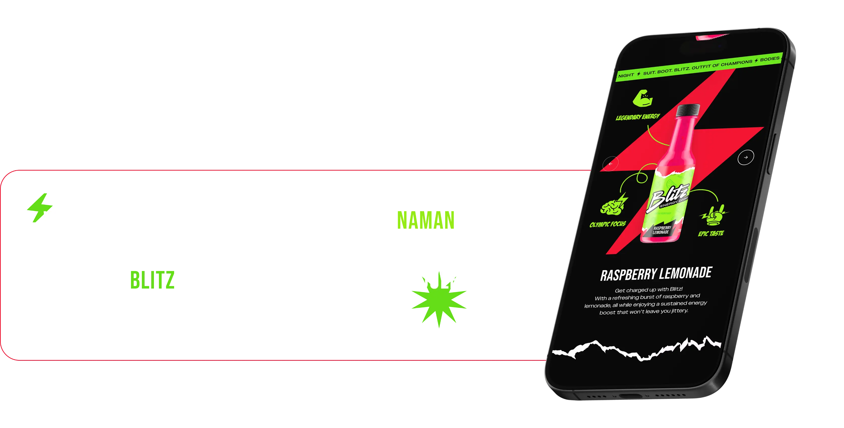
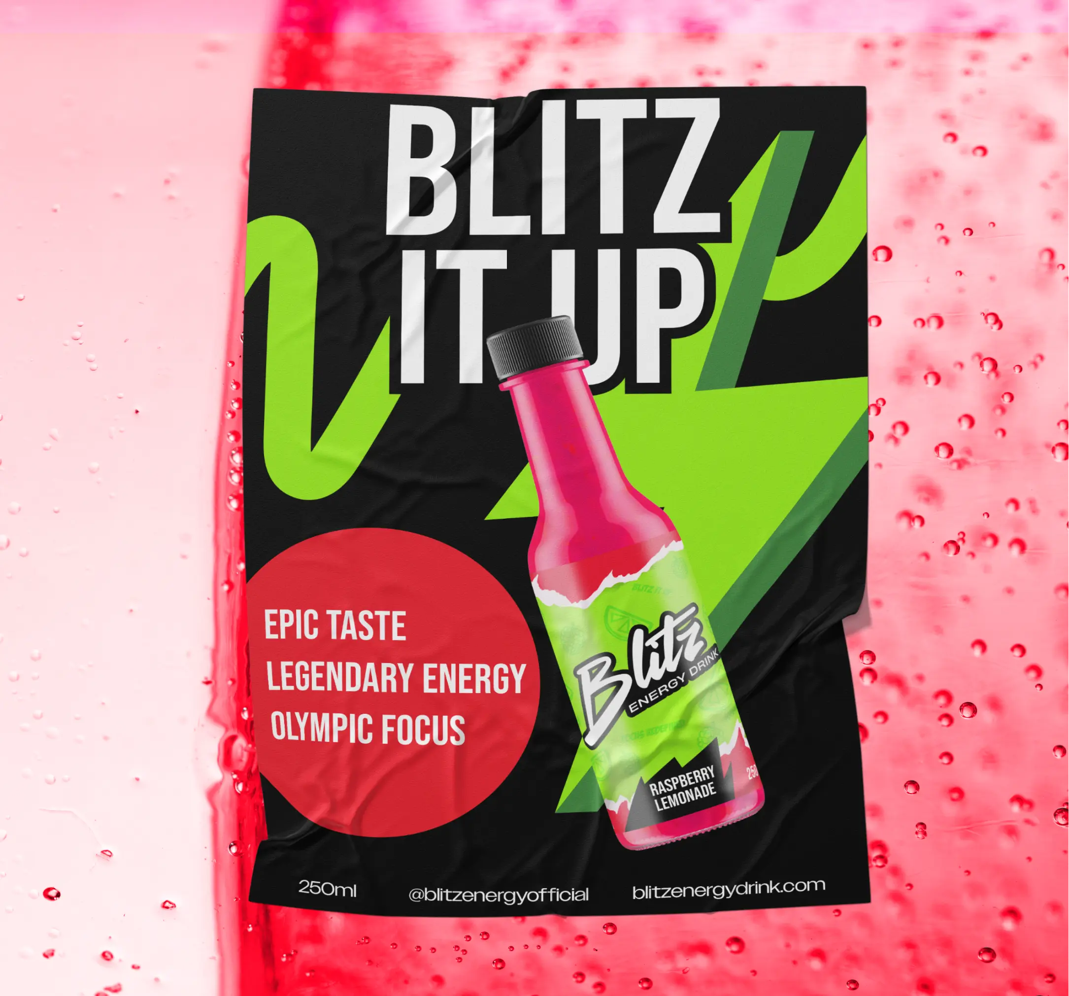
The branding and packaging for Blitz elevate its market presence, crafting a bold, dynamic identity that resonates with young professionals and knowledge workers. The striking design, featuring energetic colors like red and neon green, demands attention, ensuring Blitz stands out on shelves. By aligning with the brand’s core promise of boosting mental performance and vitality, Blitz is more than an energy drink; it’s a tool for success. This distinctive identity drives brand recognition, fosters loyalty, and sets Blitz apart from competitors focused solely on physical performance.