PayPal has been a dominant force in the digital payments industry for over two decades, evolving from a pioneering online payment solution to a global fintech powerhouse. In September 2024, the company unveiled a major logo redesign, marking its first significant visual update in years. Designed in collaboration with Pentagram, this rebranding aims to reflect PayPal’s transformation into a broader financial services provider rather than just an online payment processor.
As with any major brand overhaul, the public reaction has been divisive. While some praise the new look as a sleek, modern refresh, others argue that it dilutes the company’s established identity. The shift to a new wordmark, refined “PP” monogram, and updated color scheme is a bold departure from the familiar italicized, dual-blue branding that many associate with trust and financial security.
But why did PayPal make this change? Was it simply an effort to modernize its image, or does this rebrand signal a deeper strategic shift in how the company wants to be perceived in an increasingly competitive fintech landscape? This article will break down PayPal’s logo redesign, the reasoning behind it, public perception, and how it compares to other major fintech rebrands.
As a pioneer in digital payments, PayPal has maintained a dominant presence in the fintech sector for over two decades. The company has consistently adapted to technological advancements and consumer demands, expanding beyond peer-to-peer transactions to become a comprehensive financial services provider, offering products like business loans, cryptocurrency transactions, and buy-now-pay-later (BNPL) solutions.
With the global digital payments market projected to reach approximately $12.55 trillion by 2027, expanding at a CAGR of 13.4% from 2020 to 2027, the industry is experiencing rapid growth and heightened competition. The rise of new fintech players like Stripe, Square (now Block), and Apple Pay has intensified the battle for consumer trust and digital market share, forcing PayPal to modernize its identity to stay ahead.
To sustain its leadership position and resonate with a diverse, global audience, PayPal recognized the necessity of evolving its brand identity. The rebranding aims to present a cleaner, more modern, and optimistic image, aligning with contemporary design trends and user expectations. By adopting a simplified yet bold visual identity, PayPal is positioning itself as a next-generation financial services provider, emphasizing efficiency, security, and seamless digital experiences.
This strategic move reflects PayPal’s commitment to innovation, security, and user-centric services, ensuring its relevance in an increasingly crowded marketplace. Beyond cosmetic changes, the rebrand signals a larger transformation that aligns with shifting consumer behaviors, digital-first interactions, and PayPal’s expansion into emerging financial technologies like blockchain and AI-driven payments.
A brand’s logo is more than just a visual identity. It’s a symbol of trust, recognition, and credibility, especially for a company like PayPal, which handles millions of transactions globally every day. With its 2024 rebranding, PayPal has streamlined its logo to align with modern fintech aesthetics, making it more adaptable for digital platforms and user interfaces. This update, crafted in collaboration with Pentagram, introduces subtle yet impactful modifications that reflect PayPal’s evolution as a full-scale financial services provider rather than just a payment facilitator.

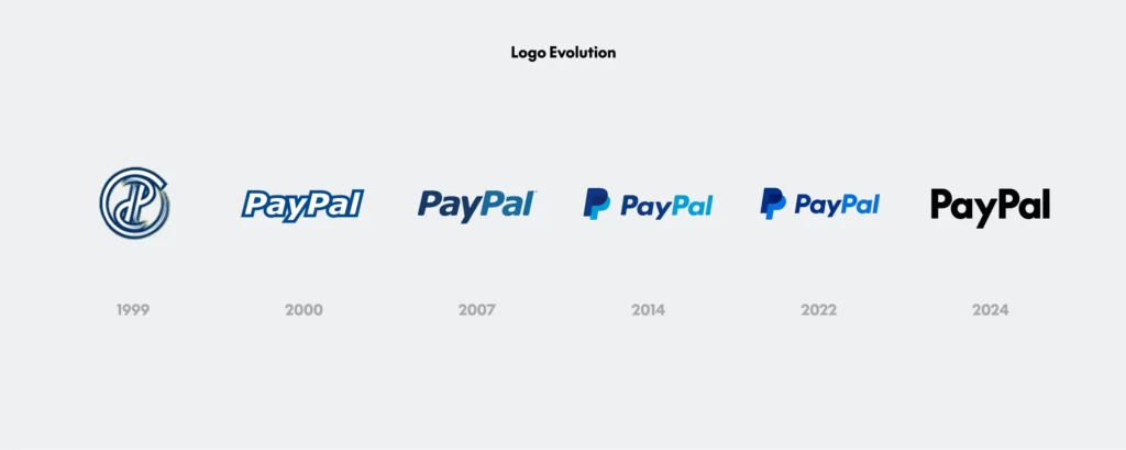
One of the most notable changes is the replacement of the italicized, dual-blue wordmark with a new, upright black wordmark in a custom-designed typeface called PayPal Pro. This typeface is based on LL Supreme, a modern take on Futura, created by Lineto Type Foundry. The new font conveys stability, confidence, and simplicity, moving away from the slanted, motion-driven design of the previous logo.
The iconic double P monogram has been subtly reshaped, featuring sharper, de-rounded corners for a more contemporary and geometric look. The overlapping letters now create a medium blue hue, serving as a subtle nod to PayPal’s subsidiary, Venmo, and reinforcing the brand’s connectivity within its ecosystem.
Moving away from its signature dual blue shades, PayPal has introduced a minimalist black-and-white wordmark while retaining blue as an accent color. This strategic shift helps differentiate PayPal from the growing number of fintech brands that use blue-dominant color schemes and allows for greater contrast and legibility across digital platforms.
A key component of the rebrand is the introduction of motion design elements, making PayPal’s logo feel interactive and dynamic. Inspired by user behaviors like tapping, swiping, and flipping, the new design is optimized for mobile and web interfaces, ensuring a seamless digital experience across various devices.
This rebranding signals PayPal’s commitment to modernity, simplicity, and adaptability, ensuring that its visual identity remains cohesive, future-ready, and aligned with evolving user expectations.
As with any major brand overhaul, the public reaction to PayPal’s logo redesign has been mixed. While some users appreciate the sleek, modern refresh, others argue that it dilutes the company’s established identity and lacks the distinctiveness of its predecessor. The response has been especially strong on social media platforms like X (formerly Twitter), LinkedIn, and Reddit, where branding discussions often turn into heated debates.
Supporters of the new design praise its clean, professional look, noting that the updated wordmark and refined monogram feel more premium and sophisticated. Many in the design community see the transition as a necessary evolution for PayPal’s digital presence, particularly as fintech brands move toward more streamlined, adaptable visual identities that work across mobile apps, dark mode interfaces, and digital banking ecosystems.
However, critics argue that the loss of the italicized motion effect removes the sense of speed, agility, and energy that PayPal previously conveyed. Some long-time users feel that the black wordmark appears too generic, blending in with other corporate logos instead of standing out as a trusted fintech leader. Others worry that the shift away from its iconic dual-blue color scheme makes PayPal look less distinctive, reducing its immediate recognizability on digital platforms.
From a branding perspective, experts acknowledge that consumer resistance to logo changes is common, with initial backlash often softening over time. A 2023 study by Siegel+Gale, a global branding agency, found that 60% of consumers initially resist major logo changes, but within a year, most users adapt to and accept the new identity- especially when the company reinforces the branding through strong marketing campaigns. Whether PayPal’s new design will become widely embraced or remain a point of controversy depends on how well the company integrates it across its digital ecosystem and user experiences.
PayPal’s logo redesign aligns with a broader trend of fintech brands modernizing their identities to remain competitive in a rapidly evolving industry. Several companies have undertaken similar rebranding efforts, each with varying degrees of success:

In 2022, Stripe updated its logo, simplifying the wordmark while retaining its deep blue color scheme. The redesign focused on developer-friendly branding, reinforcing its technical prowess and reliability in payment processing. Unlike PayPal, Stripe chose evolution over revolution, ensuring the new design felt like a natural progression rather than a dramatic shift.
In 2021, Square rebranded as Block, reflecting its expansion beyond payment processing into blockchain and broader financial services. The logo change was more drastic, adopting a geometric, abstract aesthetic that emphasized its forward-thinking, Web3-focused ambitions. While some welcomed the futuristic look, others felt it lacked immediate brand recognition, proving that radical rebrands carry significant risks.
PayPal’s subsidiary, Venmo, has also undergone branding refinements, keeping its signature blue hue but simplifying its typography. The new design was part of a larger effort to align Venmo more closely with PayPal, ensuring a cohesive family of financial services brands.
These examples illustrate a key takeaway: while fintech brands are embracing minimalism, clean typography, and digital-friendly aesthetics, the success of a rebrand depends on balancing modernity with consumer familiarity. PayPal’s challenge will be ensuring that the new logo reinforces its trust and authority, rather than feeling like an unnecessary shift toward corporate minimalism.
PayPal’s 2024 logo redesign represents a bold step toward modernization, aligning with industry trends in fintech branding and digital optimization. The new wordmark, refined monogram, and streamlined color palette aim to position PayPal as a contemporary, forward-thinking financial services provider in an increasingly crowded and competitive landscape.
However, the public reaction has been polarizing. While some see the redesign as a sleek, necessary evolution, others argue that it lacks the distinctiveness of the previous branding, raising concerns about brand recognition and emotional connection. PayPal must now reinforce its identity through marketing, user experience, and consistent brand storytelling to ensure that the new design is embraced rather than rejected.
Looking ahead, the success of PayPal’s rebranding will depend on how effectively it leverages its new identity across all digital touchpoints, from app interfaces to online transactions and future product expansions. If executed well, this refresh could solidify PayPal’s place as a leader in fintech innovation—but if mishandled, it risks becoming another example of a corporate redesign that failed to resonate with its audience. Only time will tell if this modern update is a smart strategic move or a misstep in brand identity.
PayPal redesigned its logo to modernize its brand identity, reflecting its evolution in the digital payment industry and aiming to present a cleaner, more confident image that resonates with a global audience.
The new logo features an upright, black wordmark set in a custom typeface called “PayPal Pro,” a refined ‘PP’ monogram with sharper edges, and a streamlined color palette emphasizing black and white with blue accents.
Public reactions are mixed; some appreciate the modern design, while others feel it lacks uniqueness and deviates from PayPal’s traditional identity.