In a world where a brand’s logo can influence perceptions within seconds, companies are investing more than ever in design. A logo isn’t just a visual symbol; it’s the face of a brand, reflecting its values, promises, and personality. A vibrant color palette can evoke emotions, a unique font can hint at the brand’s essence, and a consistent design system ensures seamless recall.
When done right, a brand’s logo and identity transcend mere aesthetics- they become cultural icons. Enter Zomato, a brand whose simple yet powerful logo and branding strategy have turned a food delivery service into a globally recognized household name.

Founded in 2008 by Deepinder Goyal and Pankaj Chaddah, Zomato started as Foodiebay, a platform designed to provide easy access to restaurant menus for office workers. The journey from this humble beginning to becoming a global food-tech giant is nothing short of extraordinary. Deepinder Goyal, a graduate of IIT Delhi, found the spark for Zomato in the lack of a comprehensive, reliable platform for restaurant information. Over time, this vision expanded to include food delivery, online ordering, restaurant reservations, and even fine-dining reviews, reshaping how people interact with food.
Goyal’s leadership has been defined by a blend of innovation and resilience. Even during tough phases, including layoffs in 2016 and periods of market uncertainty, he has remained focused on scaling the brand globally. Zomato’s success isn’t only due to technology but also its commitment to making food discovery and delivery a seamless, enjoyable experience. Goyal himself has emphasized the importance of simplicity, saying, “Simple means you’ve got to keep at it; don’t take your eyes off the ball.”
In terms of brand and design, Goyal often emphasizes the importance of creating a strong, intuitive user experience. His vision is clear: Zomato’s identity must be as easy to use as it is to understand. As Zomato moved forward, it continued evolving its design strategy, understanding that a successful brand is both visually engaging and functionally practical.
This emphasis on design and branding has been integral to Zomato’s success. Their brand guidelines have focused on building trust, using color schemes, typography, and minimalistic design to create a lasting impression on users globally.
Zomato’s rise as a brand is intertwined with its thoughtful approach to design. Over the years, it has consistently refined its logo, tone, and branding strategy to align with changing consumer behaviors, market demands, and its global ambitions.
Zomato’s current logo is a masterclass in minimalist design. At first glance, it appears deceptively simple- a bold wordmark in vibrant red. But beneath this simplicity lies a complex thought process.
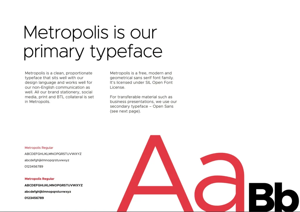
The font used for the Zomato logo, based on the open-source typeface Metropolis, was customized to meet Zomato’s unique needs. This version, called Okra, offers a clean, geometric aesthetic that’s both modern and approachable. It ensures legibility, whether viewed on a smartphone screen or a billboard.
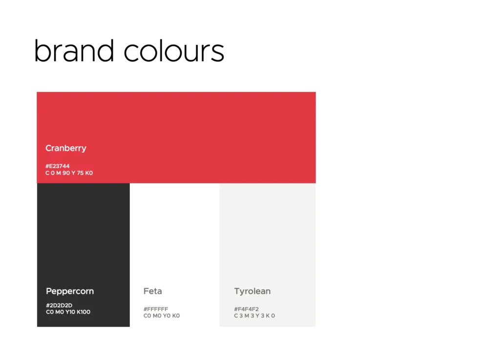
Zomato’s signature red (#E23744) isn’t just a design choice; it’s a psychological trigger. Red is a color long associated with passion, hunger, and excitement- qualities that align perfectly with food and dining. Studies suggest that red can even stimulate appetite, making it an ideal choice for a food-based brand.
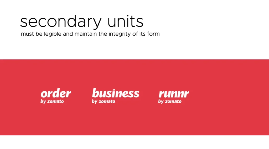
In today’s multi-platform world, a logo must be versatile. The Zomato logo scales effortlessly across devices and contexts, retaining its impact whether it’s part of an app icon, a delivery bag, or a marketing video.
To support its branding, Zomato developed Sushi, a comprehensive design system. Sushi ensures visual and functional consistency across all touchpoints. It includes:
This system isn’t just about aesthetics; it’s about creating intuitive, user-friendly experiences.
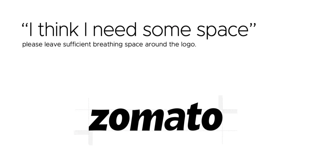
Zomato’s brand strategy is a testament to the power of consistency, innovation, and a deep understanding of consumer behavior. It goes beyond just the logo and colors; it’s a comprehensive identity that stretches across digital and physical experiences.
Zomato’s tone of voice has been a defining feature in its branding strategy. Playful, conversational, and bold, it’s a voice that connects with consumers on a personal level. Whether it’s through witty social media posts, creative campaigns, or quirky delivery box designs, Zomato has positioned itself as more than just a food delivery service. It’s a friend who understands your cravings and is always there to deliver.
One of the key elements that makes Zomato stand out is its ability to maintain a unified brand identity across all touchpoints. The mobile app, website, packaging, and even the uniforms of delivery personnel all carry the same visual language, color palette, and typography. This consistency reinforces trust and recognition in the brand.
Zomato’s global branding strategy is an interesting study in localization. While the logo and color palette remain consistent, the brand has adapted its messaging and campaigns to fit diverse cultural contexts. Whether it’s partnering with restaurants in Dubai, running quirky ads in India, or positioning itself as a lifestyle brand in the US, Zomato has skillfully balanced global recognition with local relevance.
Sushi, Zomato’s design system, is a huge contributor to this consistent branding. By using a set of pre-designed components and style guidelines, Zomato ensures that every user interaction- whether on mobile or desktop- is aligned with the brand’s values. The emphasis on usability and scalability has made Zomato’s interface not only functional but also visually appealing, reinforcing the brand’s identity at every user touchpoint.
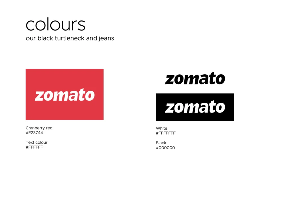
When it comes to colors, Zomato doesn’t just choose shades for visual appeal- they’re chosen for emotional impact. The iconic Zomato Red (#E23744) is a prime example of color psychology in branding.
These color choices are also meticulously documented in the Zomato brand guidelines, which dictate the exact color codes and how each color should be used in different applications. This level of attention to detail ensures that Zomato’s branding is both uniform and adaptable, no matter the medium.
Zomato’s ability to craft and tell stories has been a pivotal factor in its success. The brand isn’t just delivering food; it’s delivering experiences.
In conclusion, Zomato’s branding is a perfect blend of strategic design, effective color psychology, and consistent storytelling. It’s a brand that understands its audience’s desires and cultural nuances, and it communicates these insights through a carefully curated design system and a cohesive identity.
From its iconic red logo to the brand’s witty tone and powerful design system, Zomato has mastered the art of branding. As the food delivery and restaurant discovery industry continues to evolve, Zomato’s commitment to maintaining a consistent, innovative, and human-centric brand identity ensures that it will remain a leader for years to come.
The Zomato logo uses a custom-designed font that aligns with its clean and modern branding. It is similar to sans-serif fonts like Proxima Nova but tailored for Zomato to ensure consistency and recognition across its platforms. The simplicity of the font reflects the brand’s focus on clarity and approachability.
Zomato’s primary logo color is a vibrant red (#CB202D), symbolizing passion, energy, and appetite- qualities that perfectly align with its identity as a food-tech giant. The consistent use of this color enhances its recall value and distinguishes it from competitors.
Zomato adopted a minimalist branding approach to enhance versatility and appeal across digital and offline platforms. By simplifying its logo and design elements, Zomato ensured its branding remained consistent and impactful, whether on app screens, restaurant menus, or social media. In line with its updated brand guidelines, the focus is on creating a seamless and recognizable experience for users globally.