Rebranding means burning the house down and rebuilding it, but keeping the kitchen that makes everyone feel at home. That was the brief (unspoken, but crystal clear) when Chin Lung walked into the Brandemic.
A legacy bar. A new brewery dream. And a cult following that spanned generations. Our challenge? Rebrand without erasing. Modernize without gentrifying. And look damn good doing it.
This is how we pulled it off in 90 days.
Every rebrand teaches you something. Chin Lung taught us this:
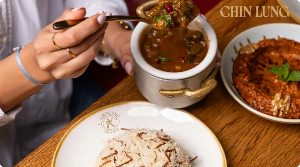
There are bars, and then there’s Chin Lung. Since 1960, it’s been that sacred in-between space in Bangalore – where college kids drank with uncles, where smoke curled around storytelling, and where the prices never caught up with inflation. It wasn’t just affordable, it was democratic. Honest. Loud. Kind of grimy, but charming. The kind of place you remembered, even if the beer made sure you didn’t remember much else.
But time doesn’t stop. Chin Lung was growing up. Evolving from a local hangout into a community brewery. Same soul, new ambition. The only problem? The brand didn’t look like where it was going.
That’s where we came in.
Let’s get this out of the way: rebranding is not about slapping on a shiny new logo and calling it a day. Rebranding means looking a brand in the eye, peeling back the layers, and asking, “Who are you now? Who do you want to be? And how do we get people to believe it without losing who you were?”
It’s not just a graphic design project. It’s cultural anthropology with better typography.
Chin Lung didn’t need reinvention. It needed translation. The rebranding strategy we built for them was rooted in integrity, not novelty. We weren’t trying to sanitize its history. We were trying to find a future where the regulars still felt at home, and the new crowd felt like they’d just discovered something timeless.
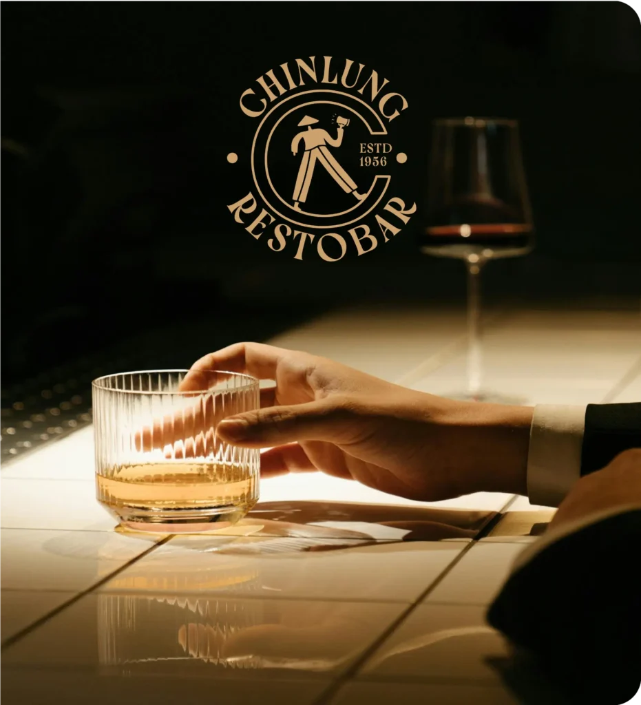
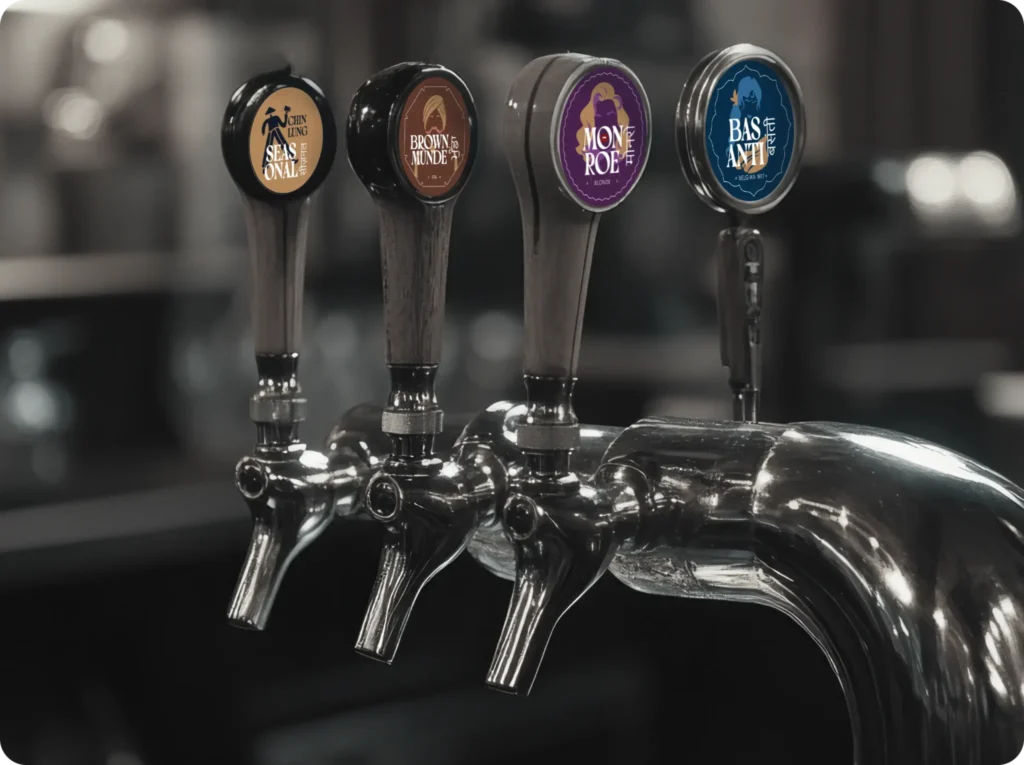
Rebranding without recognition loss is the trick. Chin Lung couldn’t lose its identity in the rebrand — it had to gain clarity. We started with the identity system. Custom logotype. A face that didn’t feel like it came out of a type catalog, but from a guy who’d been pouring beers since ‘76. Confident, legible, rugged but polished.
And then: the mascot.
This wasn’t a gimmick. It was the brand’s voice given form. A character born out of memory and myth. Approachable but not basic. Clever but not forced. It didn’t try to be cute. It just felt like it belonged.
The logo and mascot combo became the cornerstone. The system expanded from there — scalable, extendable, usable. A true identity system that could flex from pint glasses to posters to social posts without ever feeling inconsistent.
We’re not here to throw hex codes around. We’re here to build emotion.
Color is mood. And for Chin Lung, it had to feel lived-in. Trusted. Iconic.
We built the palette around three anchors: a deep navy blue (authority, depth, permanence), a golden yellow (warmth, beer, brass taps), and a creamy off-white (room to breathe). Together, it felt like an old leather booth, a frothy head of beer, and a neon glow at midnight. Modern but familiar.
That palette became part of the storytelling. The kind of visual frequency that starts to feel like music: consistent, rhythmic, hard to forget.
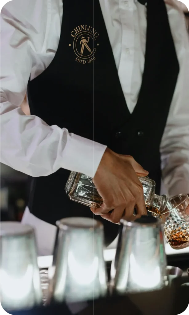
Chin Lung wasn’t just renovating a space. It was reimagining what it could be. The shift to brewery wasn’t cosmetic. It meant they were stepping into a new space in the market. More premium. More design-conscious. But they still had to feel like they belonged to the people.
That’s where a strong rebranding strategy makes the difference.
We created a brand system that could scale. That means adaptable type hierarchies, icon sets that match the personality, visual motifs that could run across in-store and on-can design, and tone of voice guidelines that didn’t read like a marketing manual.
It was comprehensive. Thoughtful. But more importantly, it was usable by everyone who touched the brand.
The best rebranding logos don’t feel trendy. They feel inevitable. Like they were just waiting to be drawn.
Our logotype for Chin Lung is strong but not over-designed. It balances vintage references with contemporary weight. It’s flexible in a lockup, on its own, or as part of a container. It works small. It holds big. And most importantly, it doesn’t need to explain itself.
Because when you get it right, a logo doesn’t ask for attention. It earns it.
Design gets you noticed. Voice gets you remembered.
We gave Chin Lung a verbal identity that sounded like your funniest, smartest friend at the bar. The one who knows when to throw a punchline and when to get real. The one who doesn’t try too hard to impress you, because they don’t need to.
Every line – from taglines to menu intros – was crafted with care. Irreverent. Honest. Playfully grounded. We didn’t sanitize. We didn’t overbrand. We let the character lead.
It was a voice that could sit across billboards, menus, social handles and even staff tees and never feel out of place.
Three months. That’s all we had. Not a single day more.
We knew the stakes. Rebranding in 90 days isn’t a sprint; it’s a disciplined marathon with no margin for fluff. We worked in pods. Sprints. Live design sessions. Quick feedback loops with the Chin Lung team. Everyone bought in. Everyone pushed hard. Everyone cared.
And we didn’t cut corners. We cut excuses.
Because when you’re rebranding a piece of Bangalore’s soul, you don’t get to phone it in.
You can design the most beautiful brand in the world. But if it doesn’t stick with the people who made the original matter? It’s just packaging.
Chin Lung had culture. Community. Chaos. Charm.
We leaned into that. We didn’t try to clean it up. We gave it a sharper megaphone. One that let the old voices stay loud, while inviting new ones to the table.
That’s the core of a meaningful rebrand. It doesn’t alienate. It amplifies.
What happened post-launch? People noticed.
The design rolled out. The mascot got posted. The new coasters got stolen (a sign of brand success we don’t talk about enough). Footfall increased. People lingered longer. Social traffic climbed. Staff felt more connected. And suddenly, Chin Lung wasn’t just back — it was bigger than it’s ever been.
The rebrand didn’t reinvent Chin Lung. It reintroduced it.
To evolve without erasing. The rebranding strategy was all about honoring Chin Lung’s legacy, the smoky tables, loyal regulars and unfiltered charm — while designing an identity that could stand tall in a new era as a community bar and brewery. It wasn’t about becoming something new. It was about becoming more truly itself.
Because a brand this iconic needed a face, not just a font. The mascot gave Chin Lung character, recall, and personality across platforms. It wasn’t cute for the sake of cute. It was culture, condensed into a character.
A logo redesign is just the tip of the iceberg. Rebranding means rethinking your brand’s voice, tone, story, visuals, emotional resonance, everything. It’s a full reset with purpose. What we did with Chin Lung was a full rebranding strategy, not just a visual upgrade.
We didn’t silence the past, we gave it a louder mic. Everything from the tone of voice to the visual cues was built to respect the old while welcoming the new. That’s why the rebrand felt authentic, not alienating.
Yes. But only if you’re clear, committed, and collaborative. With Chin Lung, we had sharp direction, a deeply invested team, and zero fluff. Fast doesn’t mean rushed. It means focused and we were razor sharp on what mattered.