Bumble, one of the most prominent players in the online dating space, recently unveiled a refreshed logo as part of its evolving brand identity. The redesign marks a new phase for the company as it adapts to an increasingly competitive dating app landscape while also expanding its influence beyond dating and into social networking and professional connections.
The update, while subtle, signals a shift in Bumble’s strategic direction- one that emphasizes modernity, inclusivity, and digital adaptability. But is this just a simple aesthetic change, or does it represent a deeper transformation in Bumble’s brand identity? This blog explores the redesign, its impact on brand perception, Bumble’s latest marketing strategies- including its high-profile partnership with Amelia Dimoldenberg’s Chicken Shop Date- and the company’s position in the dating app industry.
Brands frequently update their logos to maintain relevance, ensure consistency across platforms, and adapt to shifting consumer preferences. Whether it’s a minor tweak or a complete overhaul, logo redesigns are often rooted in strategic objectives rather than mere visual appeal.
As digital interactions become the primary touchpoints for brands, logos must be adaptable across various formats. From mobile apps and social media to merchandise and advertisements, a logo needs to maintain clarity and recognizability in every context. Flat, simplified logos are increasingly favored because they scale seamlessly across different digital environments.
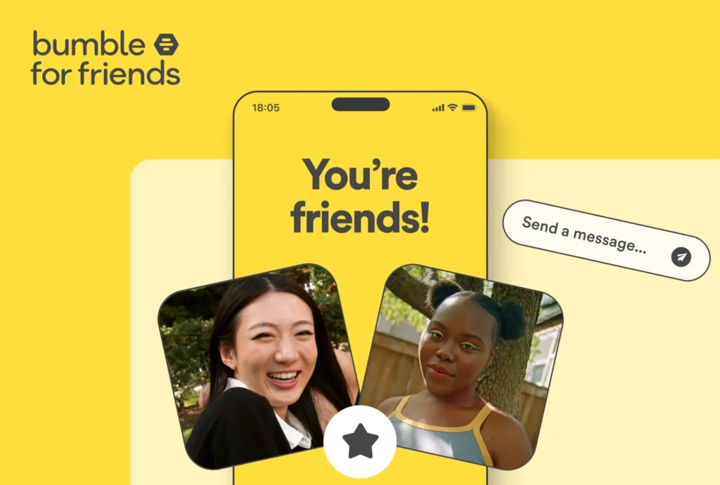
For brands looking to expand their reach or refine their messaging, a logo redesign can serve as a visual representation of a broader strategic shift. Bumble has gradually evolved from a dating app into a multifaceted platform offering networking (Bumble Bizz) and friendships (Bumble BFF). A refined logo aligns with this broader positioning, appealing to a wider audience beyond just dating app users.
The online dating industry is more competitive than ever. With Tinder, Hinge, and newer players vying for market share, Bumble must continuously innovate to maintain its relevance. According to Statista, Bumble had approximately 45 million monthly active users in 2023, but competition remains fierce. A branding refresh helps reinforce its leadership position while signaling innovation.
Rebranding is a financial investment. Major brands typically allocate significant budgets for a redesign, factoring in research, rollout costs, marketing, and UI/UX adjustments. Industry estimates suggest that a comprehensive rebranding effort can cost anywhere from $1 million to $10 million, depending on the scope. While Bumble hasn’t disclosed its redesign budget, the update is undoubtedly part of a larger brand investment.
Bumble’s latest logo redesign stays true to the brand’s core identity but introduces subtle refinements that align with modern digital branding trends. While at first glance the changes may seem minor, they play a significant role in enhancing brand consistency, readability, and adaptability across various platforms.
Here’s a closer look at what has changed:
One of the most noticeable updates is the shift in Bumble’s typeface. The previous font had a rounded, slightly playful aesthetic that emphasized approachability, but the new typeface is cleaner, sharper, and more modern.
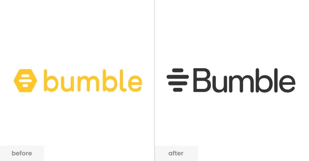
Bumble’s iconic hexagonal “hive” symbol remains intact, but its edges have been subtly refined, making the design cleaner and more polished. The update embraces a minimalist approach, a trend many modern brands are adopting to improve versatility and recognition across digital and physical touchpoints.
Related: Walmart Logo Redesign: A Minimalist Wordmark Transformation
Bumble’s signature yellow remains a defining feature of the brand, but the new redesign introduces slight refinements to its contrast and saturation.
Bumble’s branding has always centered around empowerment, inclusivity, and modern dating dynamics. The logo’s refinement ensures that it remains fresh, digitally optimized, and visually aligned with the sleek, minimalistic aesthetics dominating tech branding today.
Related: Jaguar’s Rebranding Controversy
Beyond the logo refresh, Bumble has been making waves with innovative marketing strategies. A prime example is its recent partnership with Amelia Dimoldenberg’s Chicken Shop Date, a wildly popular YouTube series known for its awkwardly charming interviews with celebrities.
By integrating pop culture into its marketing, Bumble strengthens its connection with younger users while reinforcing its position as a fun, modern, and socially aware dating platform.
Bumble isn’t the only dating app that has refined its brand identity in recent years. Let’s compare how other major players have updated their visual branding:
Bumble’s redesign aligns with these broader industry shifts, ensuring it remains competitive in an era where branding plays a critical role in user acquisition and retention.
Logos are more than just design elements and they shape how consumers perceive a brand. Bumble’s refreshed logo reflects a brand that is modern, adaptable, and forward-thinking. But what does consumer psychology say about logo updates?
Bumble’s success with this transition will depend on how effectively it integrates the new logo into its broader brand ecosystem, including app design, social media, and marketing campaigns.
As with any major branding update, reactions have been mixed. While many users appreciate the cleaner look, some long-time fans feel that the changes are too subtle to be impactful.
Bumble’s logo redesign is a subtle but strategic shift that reinforces its modern, digital-first identity. Paired with innovative marketing moves like the Chicken Shop Date collaboration, Bumble is positioning itself as a relevant, culturally attuned brand in the competitive online dating space.
While not a drastic departure, the update ensures that Bumble remains fresh, recognizable, and adaptable across platforms. Whether this refresh will contribute to long-term brand growth remains to be seen, but one thing is certain: Bumble is evolving, and it’s doing so with a keen eye on the future.
To modernize its brand identity, enhance digital adaptability, and maintain relevance in an evolving market.
Initial data suggests a positive impact, with increased app downloads and social media engagement.
To connect with Gen Z audiences using humor, pop culture, and a fresh brand approach.