In the ever-evolving world of UI design, two trends have recently captured the attention of designers and users alike: Neumorphism and Glassmorphism. These visually striking styles offer unique aesthetics and user experiences, but which one is truly superior? Buckle up, because we’re about to dive deep into the glitzy, glamorous battle of Neumorphism vs Glassmorphism.
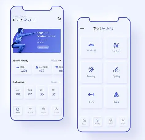
Neumorphism, also known as “new skeuomorphism,” is a design trend that emerged in 2020, and it’s all about creating a soft, almost tangible interface. This style combines the flat design of minimalism with a hint of realism, using subtle shadows and highlights to mimic physical objects. The result? A sleek, modern look that feels surprisingly approachable.

Neumorphism’s appeal lies in its ability to create depth without overwhelming the user. The soft, diffused shadows and highlights make buttons and cards appear as if they’re gently rising from the screen, inviting interaction. It’s a design language that whispers rather than shouts, and for many, that’s a refreshing change.
The aesthetics of Neumorphism are often described as smooth and seamless. The design elements seem to float within the interface, creating a harmonious and calming visual experience. This can be particularly appealing in applications where a relaxing user experience is paramount, such as meditation apps or wellness platforms.
However, Neumorphism isn’t without its critics. Some argue that its subtlety can lead to usability issues, particularly for those with visual impairments. The lack of contrast between elements can make it difficult to distinguish buttons from the background, potentially leading to a frustrating user experience. Despite these concerns, Neumorphism continues to be a popular choice for designers looking to add a touch of elegance to their interfaces.
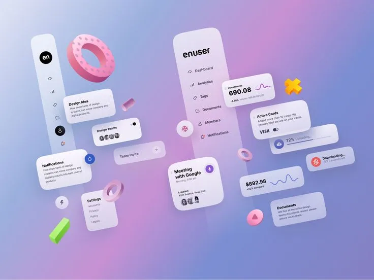
Glassmorphism, on the other hand, is all about transparency and frosted glass effects. This trend takes inspiration from the translucent, layered look of glass, creating interfaces that feel light, airy, and futuristic. By combining blurred backgrounds with semi-transparent elements, Glassmorphism creates a sense of depth and dimension that’s both eye-catching and functional.

One of the key strengths of Glassmorphism is its versatility. Whether you’re designing a sleek dashboard for a fintech app or a whimsical interface for a creative portfolio, this style can be adapted to suit a wide range of applications. The transparency effect also allows for greater emphasis on background imagery, making it a great choice for brands that want to showcase their visual brand identity.
Glassmorphism’s design language often incorporates vibrant colors and gradients, adding a dynamic quality to the interface. The use of frosted glass can create a stunning visual contrast that highlights key elements and creates a sense of visual hierarchy. This can be particularly effective in guiding the user’s attention to important information or actions within the interface.
But like Neumorphism, Glassmorphism has its downsides. The heavy reliance on blur and transparency can be taxing on devices, potentially leading to performance issues on older hardware. Additionally, poor implementation of the frosted glass effect can result in a cluttered, confusing interface. Despite these challenges, Glassmorphism remains a popular choice for designers looking to create visually stunning, modern interfaces.
When it comes to pure aesthetics, both Neumorphism and Glassmorphism have their unique charms. Neumorphism’s soft, tactile design can make interfaces feel warm and inviting, while Glassmorphism’s sleek, futuristic look can create a sense of sophistication and modernity.
Neumorphism’s use of subtle shadows and highlights gives it a three-dimensional quality that’s reminiscent of physical objects. This can create a sense of familiarity and comfort for users, making digital interfaces feel more intuitive and user-friendly. The minimalistic approach also means that Neumorphism can easily blend with a variety of design styles, making it a versatile choice for many applications.

Glassmorphism, on the other hand, offers a more dramatic visual impact. The transparency and blur effects can create a striking contrast between foreground and background elements, drawing the user’s attention to key areas of the interface. This can be particularly effective in applications where visual hierarchy is important, such as dashboards and data visualization tools. The futuristic aesthetic of Glassmorphism can also help convey a sense of innovation and cutting-edge technology, making it a popular choice for tech brands.
The interplay of light and color in Glassmorphism designs can create a mesmerizing effect that captivates users. The layered, translucent elements add a sense of depth and complexity to the interface, making it visually engaging and intriguing. This can be particularly appealing in applications that aim to impress users with their visual sophistication and modernity.
Related: Emotional Design: How Aesthetics Influence User Behaviour
While aesthetics are important, usability and accessibility are crucial considerations in UI design. Neumorphism’s subtlety can sometimes come at the expense of clarity, particularly for users with visual impairments. The low contrast between elements can make it difficult to distinguish buttons and interactive elements, potentially leading to a frustrating user experience. Designers need to carefully balance the visual appeal of Neumorphism with the need for clear, accessible interfaces.
To address these usability concerns, designers can incorporate higher contrast and more pronounced shadows and highlights in their Neumorphic designs. Ensuring that interactive elements are clearly defined and easy to identify is crucial for maintaining a user-friendly interface. Additionally, providing alternative visual cues, such as tooltips or animations, can help enhance the usability of Neumorphic interfaces.
Glassmorphism, with its emphasis on transparency and blur effects, also presents challenges for usability and accessibility. The frosted glass effect can sometimes obscure background content, making it difficult to read or interact with. Additionally, the heavy use of transparency can be visually overwhelming for some users, leading to confusion and eye strain. To mitigate these issues, designers need to ensure that text and interactive elements are clearly visible and easy to read, even against complex backgrounds.
Implementing Glassmorphism with careful attention to contrast and readability is essential for maintaining usability. Ensuring that text remains legible against blurred backgrounds and that interactive elements stand out can help create a more accessible interface. Additionally, providing options for users to adjust the level of transparency and blur can enhance the overall user experience and accessibility of Glassmorphic designs.
Despite these challenges, both Neumorphism and Glassmorphism can be used to create highly usable and accessible interfaces. By carefully considering the needs of their users and implementing best practices in UI design, designers can leverage the unique strengths of these trends to create beautiful, functional interfaces.
Performance is another critical factor to consider when choosing between Neumorphism and Glassmorphism. Neumorphism’s use of subtle shadows and highlights can be relatively lightweight, making it a good choice for applications that need to run smoothly on a wide range of devices. However, poorly optimized Neumorphic designs can still lead to performance issues, particularly on older hardware.
To ensure optimal performance, designers should use efficient CSS and HTML techniques to implement Neumorphic elements. Minimizing the use of complex animations and excessive shadows can help maintain a smooth and responsive interface. Additionally, testing Neumorphic designs on a variety of devices can help identify and address any performance bottlenecks.
Glassmorphism, with its heavy reliance on blur and transparency effects, can be more demanding on devices. The real-time rendering of these effects can tax the GPU, leading to slower performance and increased battery drain on mobile devices. Designers need to carefully consider the performance implications of using Glassmorphism, particularly for applications that need to run on a variety of devices.
Optimizing Glassmorphic designs for performance involves using efficient CSS properties and minimizing the use of heavy blur and transparency effects. Leveraging hardware acceleration and optimizing image assets can also help improve performance. Testing Glassmorphic designs on different devices and adjusting the level of blur and transparency based on device capabilities can ensure a smooth and responsive user experience.
To optimize performance, designers can use techniques such as CSS will-change property, hardware acceleration, and optimizing image assets. By balancing the visual appeal of Glassmorphism with the need for smooth performance, designers can create stunning interfaces that don’t compromise on usability.
So, Neumorphism vs Glassmorphism – which one reigns supreme? The answer, as with many things in design, is: it depends. Both trends offer unique advantages and challenges, and the best choice ultimately depends on the specific needs and goals of your project.
If you’re looking for a soft, tactile design that’s both modern and approachable, Neumorphism may be the way to go. Its subtle shadows and highlights can create a sense of depth and realism that’s perfect for applications where a minimalist aesthetic is desired. Just be mindful of the potential usability issues and ensure that your design remains clear and accessible.
On the other hand, if you’re aiming for a sleek, futuristic look that emphasizes transparency and depth, Glassmorphism could be the ideal choice. Its frosted glass effects can create a striking visual impact that’s perfect for tech-forward brands and applications. However, be aware of the potential performance implications and ensure that your design remains usable and accessible for all users.
Glassmorphism’s ability to create a sense of depth and dimension can be particularly effective in applications that require a clear visual hierarchy and emphasis on key elements. Its futuristic aesthetic can also help convey a sense of innovation and cutting-edge technology, making it an ideal choice for tech-driven projects.
Ultimately, the choice between Neumorphism and Glassmorphism doesn’t have to be an either-or decision. Many designers are finding creative ways to combine elements of both trends, leveraging the strengths of each to create truly unique and engaging interfaces. By experimenting with different design elements and techniques, you can find the perfect balance that meets the needs of your project and delights your users.
Combining Neumorphism and Glassmorphism can create a visually stunning and highly functional interface that leverages the best of both worlds. The soft, tactile elements of Neumorphism can be enhanced by the dynamic transparency and blur effects of Glassmorphism, resulting in a rich and immersive user experience.
In the ever-changing landscape of UI design, trends will come and go. What’s important is to stay flexible, open-minded, and always focused on creating the best possible user experience. Whether you choose Neumorphism, Glassmorphism, or a combination of both, the key is to keep pushing the boundaries of what’s possible and never stop experimenting. So go ahead, embrace the future of UI design, and create something truly extraordinary.